Using a Popup Panel with a Link
Adding a Popup Panel to your report definition is simple and straightforward:

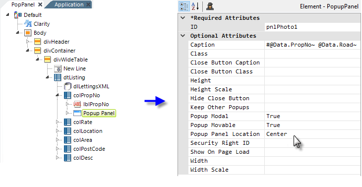
In the example above, a Popup Panel element (named
"pnlPhoto1") has been added to the definition in a Data Table
column. Its attributes have been set to control its behavior. ![]() The panel's caption will display data from the datalayer, through the use
of @Data tokens, which is why the Popup Pane has been placed as a
child-element beneath a Data Table Column element. Otherwise it could have
been placed anywhere in the definition.
The panel's caption will display data from the datalayer, through the use
of @Data tokens, which is why the Popup Pane has been placed as a
child-element beneath a Data Table Column element. Otherwise it could have
been placed anywhere in the definition.

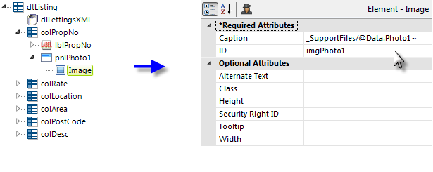
Next, below the Popup Panel element, an Image element has been
added, as shown above, and its Caption attribute set to data
returned from the datalayer that specifies the image filename.

Finally, a link has been created, which shows or hides the Popup Panel, by
adding an Action.Show Element element to the Label element
that displays the data in the report's Property Number column. Its
attributes are set to make it act upon the Popup Panel
("pnlPhoto1") and to cause the panel's visibility to
toggle, or alternate, between shown and hidden.

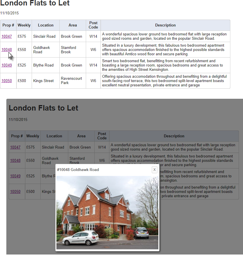
The examples above show the Data Table and what happens when one of the Property Number links is clicked. The report is disabled when the panel is displayed and the background is "grayed" out because the Popup Panel has been set to Modal.
![]() When you place a popup panel in a Data Table column, an
instance of the panel will be generated for every row in the Data Table. This could have performance implications when using large data
sets. Another technique, placing the Popup Panel element outside of
the Data Table, is discussed in Passing Parameters to a Popup Panel.
When you place a popup panel in a Data Table column, an
instance of the panel will be generated for every row in the Data Table. This could have performance implications when using large data
sets. Another technique, placing the Popup Panel element outside of
the Data Table, is discussed in Passing Parameters to a Popup Panel.