Using a Popup Panel with the onMouseOver Event
This example changes the definition in the previous example slightly so
that the Popup Panel will appear when the mouse hovers over an icon
in a Data Table column:

Starting with the example from Using a Popup Panel with a Link, in the definition
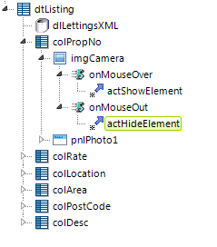
above the Property Number data has been replaced with an
Image element displaying a camera icon, with an
Event Handler element below it. The Event Handler has been set, as
shown, to fire when the onMouseOver event occurs. The
Action.Show Element element from the previous example has been
placed below the Event Handler.

For a little variety, a few changes have also been made to the Popup
Panel's attributes. The panel is no longer Modal and its pop-up
location has been set to be near the mouse cursor.

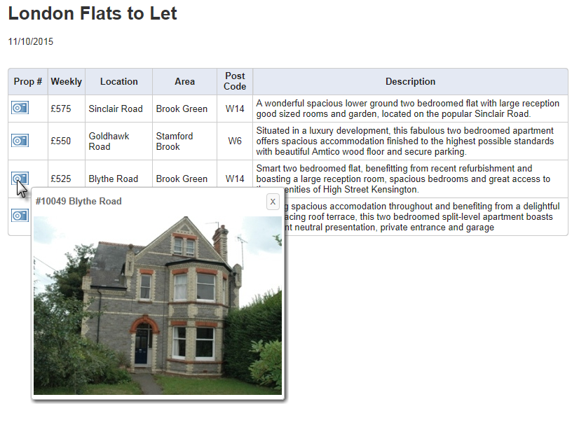
As shown above, when the cursor passes over the camera icon, the Popup Panel with its image appears. Because the panel isn't Modal, the cursor can continue to be moved over the other icons in turn.
This example works as expected but still requires you to click the Close
Button to hide the last photo displayed. Let's make the pop-up panel close
when the mouse leaves the icon. To do this, we'll use the "dual Event
Handler" technique:

In the example above, a second Event Handler element has been added beneath the Image element, set to fire on "onMouseOut" events. An copy of the Action.Show Element element we used to show the element is added beneath the second Event Handler (but here we're given it an ID of "actHideElement"). Because the Action elements use Toggle as their Display mode, one will show the pop-up and the other will hide it.
The only thing left to do is to set the Popup Panel element's Hide Close Button attribute to True.