The Tooltip Panel
Another variety of popup panel is available: the Tooltip Panel.
Like its namesake, the traditional "tooltip", the Tooltip Panel
element is used to supply additional information to the user, and it
appears when a user hovers their mouse over its parent element.

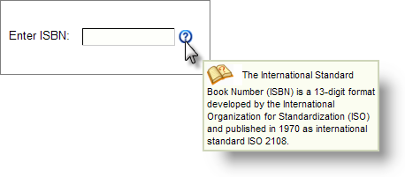
However, as shown above, this element is much more versatile than a regular tooltip, allowing you to control its size and include a range of other elements within it, including Labels, Images, and even Charts. The panel will be displayed just below and to the right of the mouse position.

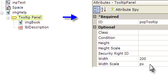
The definition snippet above shows how the Tooltip Panel element is used; it can be the child of a variety of other elements. No Event Handler element is required; the panel will appear and disappear automatically, based on mouse movements.
You can use an Event Handler in addition to a Tooltip Panel, but if you assign the onMouseOver event to the Event Handler, the Tooltip Panel will not work. Assigning other events, such as onClick, to the handler will not interfere with the Tooltip Panel.
![]() The Tooltip Panel element has a Condition attribute,
allowing you to control if, and when, it will appear.
The Tooltip Panel element has a Condition attribute,
allowing you to control if, and when, it will appear.