Cell Bar Gauges
This topic introduces developers to the Cell BarGauge element. As a child element of the Data Table Column, it provides a new method of depicting data values using color.
The Cell Bar Gauge element creates an in-cell, horizontal bar gauge which allows easy visual comparison of relative values in a single column. It looks like this:
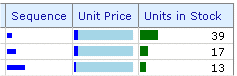
The example above shows part of a table with three data columns using the Cell Bar Gauge element. The first column, Sequence, is configured to display a plain horizontal bar who's length is based on the column's data value. The second column, Unit Price, is configured similarly but adds a background color for greater visual contrast. And the last column is configured to display both the bar and a label with the actual data value. Here are the report definition elements for the first part of the above example:
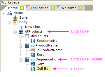
As shown above, the Cell Bar Gauge element is the child of a Data Table Column element, which is in turn the child of the Data Table element. The column with the Cell Bar Gauge can also use a Label element to display the actual data value along with the Cell Bar Gauge, or not, as desired.
 You cannot use the Cell Bar Gauge element in a
SubData Table.
You cannot use the Cell Bar Gauge element in a
SubData Table.
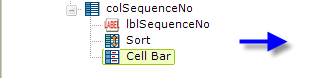
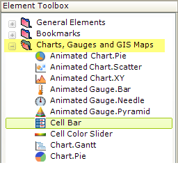
When a Data Table Column is selected, the Cell Bar Gauge child element can be found in the Charts and Gauges folder in the Suggestions panel, as shown above.
Setting Cell Bar Attributes
The attributes associated with the Cell Bar Gauge element in our example are shown below:
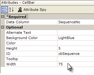
- (Required) The Data Column attribute has been set to the name of the data column retrieved in your Data Layer element (the actual column name, not the @Data.ColumnName~ token).
- The Alternate Text attribute is the text to be displayed if the bar gauge can't be rendered for some reason.
- The Background Color attribute sets a color for the background of the bar Here it's been set to LightBlue.
- The Color attribute sets the color for the part of the bar representing the data. The default color is Blue.
- Height and Width determine the physical size of the bar -
 it can be smaller than the cell itself; allowing you to put
both a Cell Bar Gauge and a Label in a column.
it can be smaller than the cell itself; allowing you to put
both a Cell Bar Gauge and a Label in a column.
- ID and Tooltip are the usual identifier and "hover
text" attributes.
What About the Data?
You don't need to do anything other than identify the data column. The Cell Bar Gauge element automatically evaluates all of the values for its column and adjusts the graphics segments that make up the bar accordingly, sizing them to provide a meaningful visual range of bar lengths.
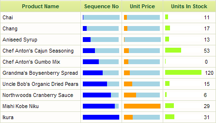
A example of a Data Table using Cell Bar Gauges is shown above.
The arrangement in the Units In Stock column was achieved by using both Cell Bar Gauge and Label elements, separated by a Space element, beneath the Data Table Column element. Set the gauge's Background Color attribute (to white, in the example) to get the data values to align on the right side of the column.
If you include and configure a Sort element in your Data Table Column, the Cell Bar Gauge will sort when the column header is clicked, just like any data value.
Cell Bars Can Be Links
Cell Bar Gauge elements, like Labels, can be links to other reports or URLs.
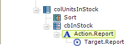
As shown above, the Cell Bar Gauge element can be a parent to any of the Action elements.