Series.Bubble - Using Multiple Series
You can add additional series to the chart by adding additional Series elements:

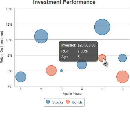
The example above shows two Series, one for each year, with a legend.

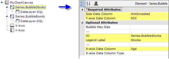
The example above shows the two Series elements, their datalayers, and X- and Y-Axis elements used to produce the previous chart. Should they overlap, you can adjust which bubbles appear "in front" of the others in the chart by changing the order of the Series elements in the definition. Setting the Series elements' Legend Label attribute will automatically cause the legend to be displayed.
 New for 14.2 Charts with multiple series or aggregations are encouraged to use the ChartCanvas element's attribute, Tooltip Split. This attribute allows you to split a chart's tooltip into one label per series, rather than per segment. The default value for this attribute is False. Once enabled, when hovering over a data point, it displays all the values for the series. This method is recommended over shared tooltips for charts with multiple line series, and as such, takes precedence over tooltip.shared.
![]() When using multiple series, you may be able to reduce the number of data queries and improve performance by using local data to read all of the data once, see Datalayers. Then, link its datalayer to share it to the series, see Link Datalayers. At each Series element, link its datalayer to the
shared Local Data datalayer and filter the data to meet the needs of each
individual series. You can combine different types of Series elements, for
example, Series.Bubble and Series.Line, to produce combinations of
visualizations.
When using multiple series, you may be able to reduce the number of data queries and improve performance by using local data to read all of the data once, see Datalayers. Then, link its datalayer to share it to the series, see Link Datalayers. At each Series element, link its datalayer to the
shared Local Data datalayer and filter the data to meet the needs of each
individual series. You can combine different types of Series elements, for
example, Series.Bubble and Series.Line, to produce combinations of
visualizations.