Using Input Selection Range
The Input Selection Range element enables the selection, at runtime, of a range of data values by drawing a selection area. This element is available for use with:
- Series.Area
- Series.Area Range
- Series.Area Spline
- Series.Area Spline Range
- Series.Bar
- Series.Bar Range
- Series.Bubble
- Series.Line
- Series.Scatter
- Series.Spline
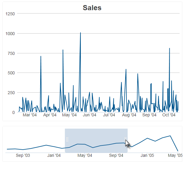
Here's an example:

In the example above, the upper chart displays the details of the time window selected in the lower chart.

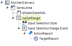
Input Selection Range works with two other elements, Input Selection Style and Input Selection Range Event, along with Action and Target elements, to produce the desired effect, as shown in the typical element arrangement above.
Input Selection Range
This element enables the user interaction and has the following attributes:
| Attribute | Description |
|---|---|
| Change Flag Element ID | Specifies the ID of an element to be set to indicate than an input value has been changed by the user. This is often an Input Hidden element. |
| Disable Clear Selection | Specifies whether the user can clear the selection area after it's been drawn (this is done by click outside the area). Specifying True prevents the user from doing this. Default: False |
| ID | This is the unique element ID. |
| Max X-axis ID | Specifies the name of a Request variable that will hold the value within the right-most edge of the selection area. Not needed if Selection Type is AreaYAxis. |
| Max Y-axis ID | Specifies the name of a Request variable that will hold the value within the top-most edge of the selection area. Not needed if Selection Type is AreaXAxis. |
| Min X-axis ID | Specifies the name of a Request variable that will hold the value within the left-most edge of the selection area. Not needed if Selection Type is AreaYAxis. |
| Min Y-axis ID | Specifies the name of a Request variable that will hold the value within the bottom-most edge of the selection area. Not needed if Selection Type is AreaXAxis. |
| Selection Type | Specifies how users interact with the chart: Options include: Area lets the user select points by drawing a rectangular region within X- and Y-axis charts. This and the following types are not supported for Funnel, Pyramid, and Pie series. AreaXAxis is the same as Area, except the Y-axis region fills the chart. Only the X-axis is selected by the user. The previous chart example uses this selection type to produce a selection area that can only be dragged left and right. AreaYAxis is the same as Area, except the X-axis region fills the chart. Only the Y-axis is selected by the user. Produces a selection area that can only be dragged up and down. |
In the target report or process task, all of the selected values can be referenced using the tokens named in the Min-Max X-Y Axis attributes. For example, if the attributes are specified as:
-
Max X-axis ID = myMaxX
Max Y-axis ID = myMaxY
Min X-axis ID = myMinX
Min Y-axis ID = myMinY
Selection Type = Area
and a selection is made, the resulting values can be found in the next report or process task using these tokens:
- @Request.myMaxX~
@Request.myMaxY~
@Request.myMinX~
@Request.myMinY~
The Validation.Required element is also available as a child element so a warning message can be displayed if the page is submitted without a chart area being selected.
![]() The Validation element's Class attribute will not be applied.
The Validation element's Class attribute will not be applied.
Input Selection Range Event
This element specifies, through its child elements, the action to be taken when an area selection is completed.
| Attribute | Description |
|---|---|
| ID | The unique element ID. |
| Selection Event | Specifies the type of event that will trigger the action. Options include: Change (the default) triggers the action when the status of selection area changes. AreaDrawn triggers the action when the drawing of the selection area ends. AreaCleared triggers the action when the selection area is cleared (by clicking outside of it). |
Input Selection Style
This element allows you to style the selection point or area.| Attribute | Description |
|---|---|
| Border Color | Not used with Input Selection Range. |
| Border Color Transparency | Not used with Input Selection Range. |
| Border Thickness | Not used with Input Selection Range. |
| Color | Not used with Input Selection Range. |
| Selection Area Color | When using an "Area" Selection Type, specifies the color of the selection rectangle background. Enter a color by name, decimal RGB value, or hex RGB value. Prefix hex values with the pound sign, e.g. #112233. |
| Selection Area Color Transparency | When using an "Area" Selection Type, specifies the transparency of the selection rectangle. The lowest value of 0 specifies that the line is opaque, with no transparency. At the other end of the scale, 15 specifies a completely transparent line. Use medium-level transparency to allow different chart layers to show through each other. |
| Transparency | Not used with Input Selection Range. |
When using Input Selection Range, you may want to turn off the automatic Quicktips generated by the chart. This is done by setting the Chart Canvas element's Auto Quicktip attribute to False.