Input Color Picker
The Input Color Picker was significantly improved in this release. Users of earlier Info v12 releases will see a subset of the features described here.
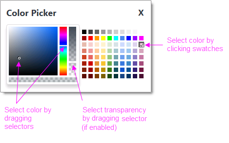
This element provides a visual interface for color selection. The current
color selection appears as an icon next to a palette icon.

Clicking either icon displays the Color Picker pop-up panel, as shown
above, from which new selections can be made.
Using It
This element shares many of the standard Input element attributes and
includes these special attributes:
| Attribute | Description |
|---|---|
Allow Transparency | Specifies whether the Color Picker pop-up panel will include a slider for selecting the transparency of the selected color. The default value is False. |
Color Picker Caption | Specifies a custom caption for the Color Picker pop-up panel. The default value is Color Picker. |
Default Value | Specifies the selected default color, by name, decimal RGB or RGBA value, or hex RGB value. Prefix hex values with the pound sign, like #112233. |
Popup Modal | Specifies whether or not the Color Picker pop-up panel will be "system modal". Modal pop-ups disable the rest of the page until the panel is closed and the disabled area behind the panel get shaded in transparent gray. |
Getting Its Data
The value associated with the color selected from the palette is available in the next Report or Process task with an @Request token. For example, if the element's ID is set to inpColors then the token @Request.inpColors~will equal that value. This value will always be in hex RGB format: #112233.
More Information
For additional information, see the Element Reference entry for
Input Color Picker.