Input Chart.List
A number of Classic Charts have been deprecated; they are still supported and will work, but their elements are no longer available in Studio. Use Chart Canvas Charts instead for all new development.
This element enables a Classic Chart to become an input control.
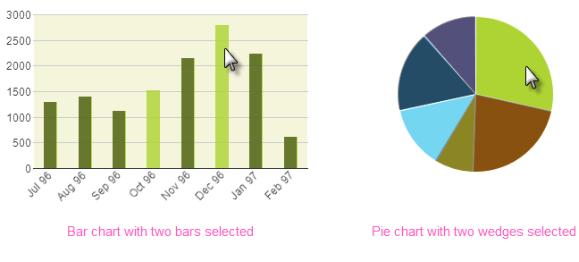
Once a static Bar or Pie chart has been made the child of
this element, users can select one or more bars, or one or more pie
regions, by clicking on them. When the page is submitted, the Label values
of the selected chart items are passed to the next report or process.

As shown above, the selected bars or wedges are displayed in a distinctly
different color from the other bars or wedges by default. If the data has
been grouped so that it's displayed as groups of several bars each, the
entire group will be selected when clicked, rather than individual bars
within the group.
Using It
This element shares many of the standard Input element attributes and
includes these special attributes:
| Attribute | Description |
|---|---|
Input Chart Value Column | Specifies the data column whose values which will be returned, such as the IDs for each selected bar in a Bar chart. The chart's Chart Label Column (aka: Label Data Column X-axis) is the default. |
Selected Color | Specifies the selected bar or wedge's color, by name, decimal RGB value, or hex RGB value. Prefix hex values with the pound sign, such as #112233. |
Selected Transparency | Specifies the transparency level of the selected bar or wedge. The lowest possible value of 0 indicates that the region is opaque, with no transparency. The other end of the scale, 15, indicates a completely transparent bar or wedge. |
Unselected Color | Specifies the color of unselected bars or wedges, by name, decimal RGB value, or hex RGB value. Prefix hex values with the pound sign, such as #112233. |
Unselected Transparency | Specifies the transparency level of the unselected bars or wedges. The lowest possible value of 0 indicates that the region is opaque, with no transparency. The other end of the scale, 15, indicates a completely transparent bar or wedge. |
This element cannot be used within an Input Grid element. A
child validation element, Validation.Required, is available to
ensure that a selection is made by the user, if desired.
Getting Its Data
The Label values of the selected bars or wedges are available in the next Report or Process task with an @Request token. For example, if the element's ID is set to inpMyPie then the token @Request.inpMyPie~will equal that value.
If no chart item is selected and the page is submitted, then this Request token will exist but it will be empty ("").
If multiple chart items are selected, the resulting Request token will contain a comma-separated list of selected values. When working use with SQL statements, it may be desirable to surround each individual value in the list with single quotes. This can be done using the SingleQuote token modifier. Thus
@Request.inpCLPie~
which has a value of 1,2,3
becomes
@SingleQuote.Request.inpCLPie~
which has a value of '1','2','3'
More Information
For additional information, see the Element Reference entry for Input Chart List.