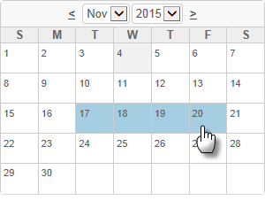
Date Picker
The Date Picker element displays a calendar on the page, rather than a text input box, and allows the user to select a date. It can be configured to allow selection of a range of dates by selecting the starting and ending date. Its behavior is closely related to the Input Date element's pop-up calendar.

The current date is highlighted with one color and the selected date (or range of dates) is highlighted with another. Colors can be configured with CSS by overriding style classes found in <yourApp>\rdTemplate\rdCalendar\rdDataCalendarStyle.css.
Using It
The Date Picker element shares many of the attributes of other Input elements and also has these additional attributes:
| Attribute | Description |
|---|---|
Border | Specifies the width of the border line, in pixels, drawn around the calendar. The default value is 1 pixel. |
Calendar Caption Format | Specifies the format of the text above the popup calendar. Set to None to prevent display of the caption row entirely. |
Cell Spacing | Specifies the width, in pixels, of the space between calendar cells. |
Dropdown Year and Month | Specifies if the calendar header will have a drop-down list for year and month selection, allowing the user to change years and months. When set to False, the drop-down lists are replaced by a caption with the current calendar year and month names. Default: True |
End Date Default Value | Specifies the default value for the "end" date in a date range and the ID to be used for that value. |
Input Date Reformat | Causes the date selected to be reformatted into one of several formats before being made available as a request variable. Date format information relevant to this attribute can be found in Format Data. |
Number of Dropdown Years | Specifies the number of years to be listed in the calendar's Year drop-down list. |
Number of Months | Specifies if 1, 2, or 3 monthly calendars are displayed. If Show Date Range (see below) is True, highlighting for selected dates in different months can span the calendars. |
Show Date Range | Specifies if a single date can be selected, or if a range of dates can be selected. If set to True, then all days in the range of dates selected will be highlighted. Default: False |
Weekday Caption Format | Specifies the format for the weekday name captions that appear across the top of the calendar. The default value is dd, which displays a single letter for each day; use ddd to display a weekday name abbreviation ("Mon"); use dddd to display the full weekday name ("Monday"); and set the value to None to prevent display of the weekday names. |
Width | Specifies the width of the element's calendar, in pixels or as a percent of its containing element. If left blank, a default value is automatically applied. |
Getting Its Data
The Date Picker automatically adds Input Hidden elements to your definition and they are assigned the date(s) selected in the calendar. The IDs of the Input Hidden elements are based on the ID attributes of the Date Picker element. The selected dates will be available in the next Report or Process task by using an @Request token. For example, if the Date Picker element's ID is set to inpHireDate, then the selected date will be available as the token @Request.inpHireDate~.
If Show Date Range is enabled to allow selection of a date range, then the starting date is available using an @Request token that includes the Date Picker element's ID, as above, and the ending date is available using an @Request token that includes the ID specified in the End Date Range ID attribute.
More Information
The globalization and localization information presented about the Input Date element also applies to the Date Picker element.
For additional information, see the Element Reference entry for Date Picker.