Series.Scatter - Using Multiple Series
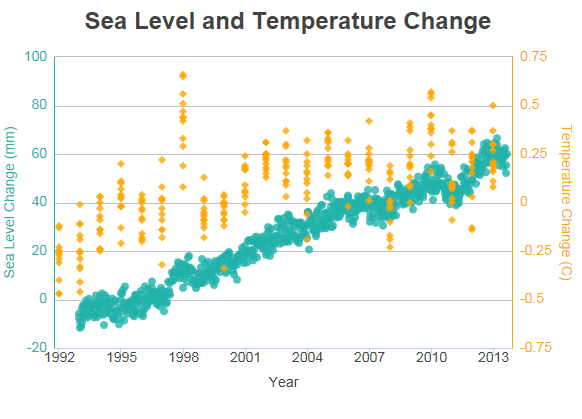
You can add additional series to the chart by adding additional Series elements:

The example above shows two Series but, because they have different data value scales, a secondary Y-axis has been added on the right side.Many charts that compare multiple data series over time can use the same data scale for all series, but that's not the case here, so a secondary Y-axis is necessary. To see how this extra axis is implemented, see the section below.

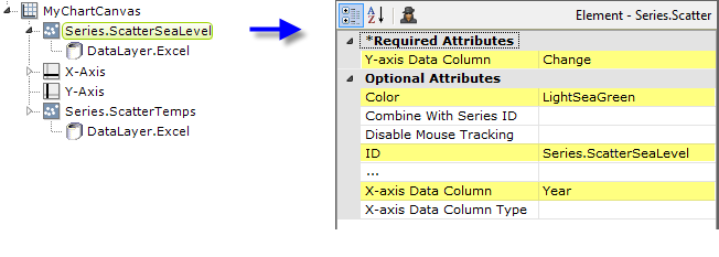
The example above shows the two Series elements, their datalayers, and X- and Y-Axis elements used to produce the previous chart. Should they overlap, you can adjust which symbols appear "in front" of the others in the chart by changing the order of the Series elements in the definition. Setting the Series elements' Legend Label attribute will automatically cause the legend to be displayed.
![]() When using multiple series, you may be able to reduce the number of data queries and improve performance by using local data to read all of the data once, see Datalayers. Then, link its datalayer to share it to the series, see Link Datalayers. At each Series element,
link its datalayer to the shared Local Data datalayer and filter the data to meet the needs of each individual series.
When using multiple series, you may be able to reduce the number of data queries and improve performance by using local data to read all of the data once, see Datalayers. Then, link its datalayer to share it to the series, see Link Datalayers. At each Series element,
link its datalayer to the shared Local Data datalayer and filter the data to meet the needs of each individual series.
You can combine different types of Series elements, for example, Series.Scatter and Series.Line, to produce combinations of visualizations.
Adding a Secondary Axis
Using the example shown previously, it's easy to add a secondary axis to a chart.

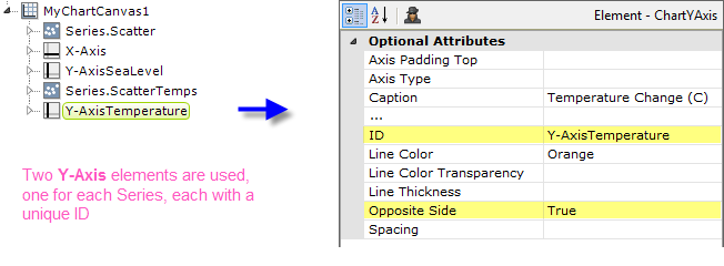
To add a second Y-axis to the chart, add a second Y-Axis element to the definition, as shown above. Set its Opposite Side attribute to True and give both Y-Axis elements a unique element ID. This creates the secondary Y-axis, on the right side of the chart.

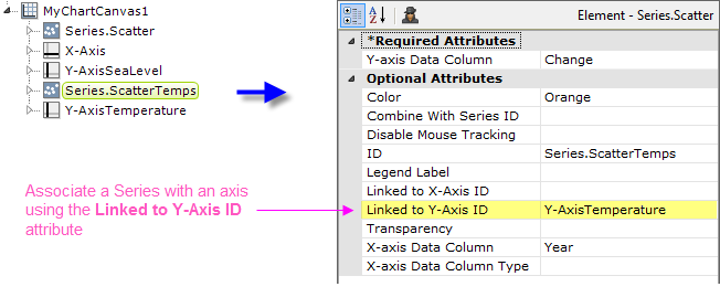
But which Series will use which Y-axis? You associate a Series with a Y-Axis element by setting the Series' Linked to Y-Axis ID attribute, as shown above, to the element ID of the desired Y-Axis element. Do this for each Series element.