Series.Bar Range - Using Multiple Series
You can add additional series to the chart by adding additional Series elements:

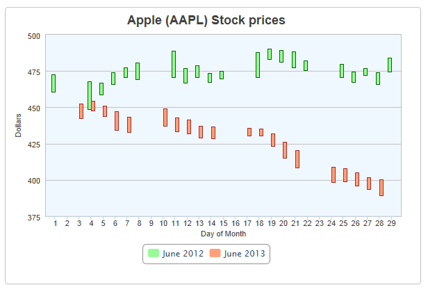
The example above shows two Series, for a set of stock prices from different years, along with a legend.

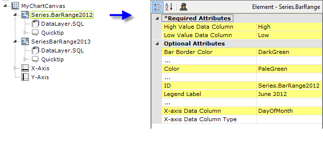
The example above shows the two Series elements, their datalayers and optional Quicktips, and the X-Axis and Y-Axis elements used to produce the previous chart. You can adjust which data range appears "in front" of the other in the chart and in the legend by changing the order of the Series elements in the definition. Setting the Series elements' Legend Label attribute will automatically cause the legend to be displayed.
![]() When using multiple series, you may be able to reduce the number of data queries and improve performance by using local data to read all of the data once, see Datalayers. Then, link its datalayer to share it to the series, see Link Datalayers. At each Series element,
link its datalayer to the shared Local Data datalayer and filter the data to meet the needs of each individual series.
When using multiple series, you may be able to reduce the number of data queries and improve performance by using local data to read all of the data once, see Datalayers. Then, link its datalayer to share it to the series, see Link Datalayers. At each Series element,
link its datalayer to the shared Local Data datalayer and filter the data to meet the needs of each individual series.
You can combine different types of Series elements, for example, Series.Area and Series.Bar, to produce combinations of visualizations.