Web Options Dialog Box
You can use the Web Options dialog box to define web options of a web control. This topic describes the options in the dialog box.
Designer displays the Web Options dialog box when you right-click a web control in the configuration panel of a library component and select Web Options from the shortcut menu, and provides different options in the dialog box according to the type of the web control:
You see these button for all the web control types:
OK
Select to apply all changes and close the dialog box.
Cancel
Select to close the dialog box without saving any changes.
Apply
Select to apply all changes and leave the dialog box open.
Help
Select to view information about the dialog box.
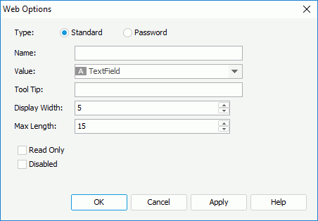
Text Field Options
You see the following options for the Text Field web control:

Type
Specify the type of the text field.
- Standard
Select to display the text field as a standard text field. - Password
Select to display the text field as a password text field, which means that the value specified in the text field is hidden using asterisks.
Name
Specify the name of the text field.
Value
Select the value of the text field.
Tool Tip
Specify the tool tip of the text field, which displays when the report users hover the mouse over the text field at runtime.
Display Width
Specify the display width of the text field.
Max Length
Specify the maximum length of the string that is allowed in the text field.
Read Only
Select to make the field read-only to others.
Disabled
Select if you want to disable the text field.
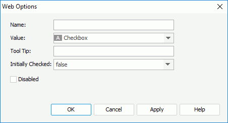
Checkbox Options
You see the following options for the Checkbox web control:

Name
Specify the name of checkbox.
Value
Select the value of the checkbox.
Tool Tip
Specify the tool tip of the checkbox, which displays when the report users hover the mouse over the checkbox at runtime.
Initially Checked
Specify whether or not the checkbox is selected by default.
Disabled
Select if you want to disable the checkbox.
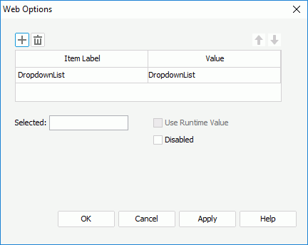
Drop-down List Options
You see the following options for the Drop-down List web control:

 Add button
Select to add a new item in the drop-down list.
 Remove button
Select to delete the specified item from the drop-down list.
 Move Up button
Select to move the specified item higher in the drop-down list.
 Move Down button
Select to move the specified item lower in the drop-down list.
Item Label
The column shows the display text or format that you select for the item values.
Value
The column shows the values that you specify for the items. You can either type the value in the cell or select the ellipsis button  to specify a field to control the value using the Insert Fields dialog box.
Selected
Specify the value to be selected in the drop-down list by default.
Use Runtime Value
Designer does not support the option for a Drop-down List web control in a library component.
Disabled
Select if you want to disable the drop-down list.
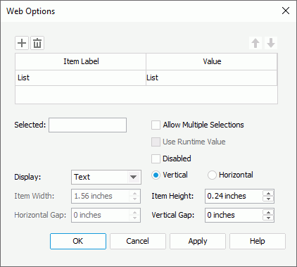
List Options
You see the following options for the List web control:

 Add button
Select to add a new item in the list.
 Remove button
Select to delete the specified item from the list.
 Move Up button
Select to move the specified item higher in the list.
 Move Down button
Select to move the specified item lower in the list.
Item Label
The column shows the display text or format that you select for the item values.
Value
The column shows the values that you specify for the items. You can either type the value in the cell or select  to specify a field to control the value using the Insert Fields dialog box.
Selected
Specify the value to be selected in the list by default.
Allow Multiple Selections
Select to allow selecting multiple items in the list at the same time.
Use Runtime Value
Designer does not support the option for a List web control in a library component.
Disabled
Select if you want to disable the list.
Display
Specify to display the list as Text, Button, Checkbox, or Radio Button. When you select Radio Button, Designer disables the Allow Multiple Selections option.
Vertical
Select to display items in one column vertically in the list, and add a vertical scrollbar in the list if it cannot completely display all the items within the specified height.
Horizontal
Select to display items horizontally following the Z order in the list.
Item Width
Designer enables this option when you select Horizontal. You can use it to specify the width of each item in the list.
Item Height
Specify the height of each item in the list.
Horizontal Gap
Designer enables this option when you select Horizontal. You can use it to specify the horizontal gap between two adjacent items in the list.
Vertical Gap
Specify the vertical gap between two adjacent items in the list.
 sPrevious Topic