Using Basic Web Controls in the Configuration Panel of a Library Component
This topic introduces how you can use the basic web controls in the configuration panel of a library component for specific purposes.
You can use the following basic web controls which are used as variables in the configuration panel of a library component: Text Field, Checkbox, List, and Drop-down List, so as to filter or sort the records in the table, chart or crosstab of the library component, or change the properties of an object in the library component at runtime.
This topic contains the following sections:
Using Text Fields
- Open the configuration panel of the library component and do one of the following:
- Select Insert > Web Controls > Text Field, then drag the text field to the required destination.
- From the Components panel, drag the Text Field icon
 in the Web Controls category to the required destination.
- Right-click the text field and select Web Options from the shortcut menu. Designer displays the Web Options dialog box.
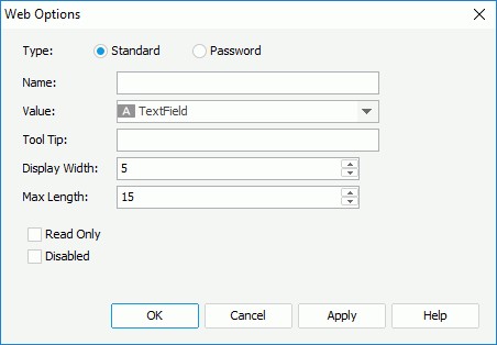
- Select the type of the text field: Standard or Password.
Standard means that the text field is a normal text field. Password means that the text field is a password box in which the typed characters are displayed as asterisks.
- Specify the name, value for the text field in the Name and Value text boxes.
- In the Tool Tip text box, specify the tool tip you want to show for the text field. The tool tip displays when the dashboard users hover the mouse over the text field in JDashboard.
- Set the character width in the Display Width text box, and the maximum number of characters the user can specify in the Max Length text box.
- Select the Read Only option if you would like to set this text field to be read-only.
- Select the Disabled checkbox if you want to make the text field disabled.
- Select OK to finish defining the web options of the text field.
- Specify the web action you want to apply to the text field: Filter, Sort, or Change Property.
To apply the Filter web action:
- Right-click the text field and select Web Behaviors > Filter from the shortcut menu. Designer displays the Filter - Web Behavior dialog box.
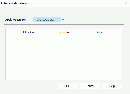
- From the Apply Action To drop-down list, select the data component the records of which you want to filter.
- In the Filter On column, specify the field on which to filter the records. The field may be a column in the component, or be specified by the value of the text field.
- Specify the operator to compose the filter condition.
- In the Value column, specify the value of how to filter the field. The value may be specified by yourself, or be the value of the text field. When you type the value, if multiple values are required, you should separate them with ","; if a value contains the character "," or "\", type the character as "\," or "\\".
- Select OK to accept the settings.
Then at runtime, when the dashboard users specify a value for the text field and select OK in the configuration panel, JDashboard filters the records in the specified data component.
- Right-click the text field and select Web Behaviors > Sort from the shortcut menu. Designer displays the Sort - Web Behavior dialog box.
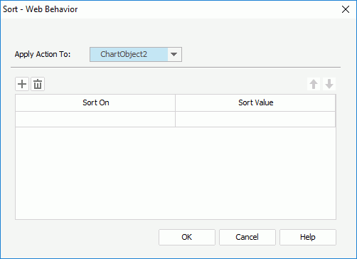
- From the Apply Action To drop-down list, select the data component the records of which you want to sort.
- In the Sort On column, specify the field by which to sort the records. The field may be a column in the component, or be specified by the value of the text field.
- Specify the sort value. The value may be Ascending or Descending, or be the value of the text field.
- Select
 to add more sort conditions and specify the sort-by fields and sort direction according to your requirements.
To delete a sort condition, select it and select the Remove button
 ; to adjust the order of the sort conditions, select a condition and select the Move Up
 or Move Down
 button.
 - Select OK to accept the settings.
Then at runtime, when the dashboard users specify a value for the text field and select OK in the configuration panel, JDashboard sorts the records in the specified data component.
To apply the Change Property web action:
- Right-click the text field and select Web Behaviors > Change Property from the shortcut menu. Designer displays the Change Property - Web Behavior dialog box.
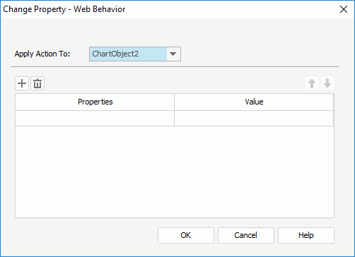
- From the Apply Action To drop-down list, select the object the properties of which you want to change.
- In the Properties column, specify the property you want to change. All the properties of the object you select from the Apply Action To drop-down list are available here.
- In the Value column, specify the value of the property. The value may be typed in by yourself, or be specified by the value of the text field.
- Select
 to add more property conditions and specify the properties and values according to your requirements.
 To delete a property condition, select it and select
 ; to adjust the order of the property conditions, select a condition and select
  or
or  .
. - Select OK to accept the settings.
Then at runtime, when the dashboard users specify a value for the text field and select OK in the configuration panel, JDashboard changes the properties of the specified object in the library component.
- Right-click the text field and select Web Behaviors > Filter from the shortcut menu. Designer displays the Filter - Web Behavior dialog box.
![]() You can also apply the Change Property web action to the following objects in the library component body: fields and labels in tables/crosstabs, some chart elements such as legend and chart axis, markers and areas in geographic maps, labels, parameter controls, and the Submit button of parameter form controls.
You can also apply the Change Property web action to the following objects in the library component body: fields and labels in tables/crosstabs, some chart elements such as legend and chart axis, markers and areas in geographic maps, labels, parameter controls, and the Submit button of parameter form controls.
Using Checkboxes
- Open the configuration panel of the library component and do one of the following:
- Select Insert > Web Controls > Checkbox, then drag the checkbox to the required destination.
- From the Components panel, drag the Checkbox icon
 in the Web Controls category to the required destination.
- Right-click the checkbox and select Web Optionsfrom the shortcut menu. Designer displays the Web Options dialog box.
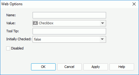
- Specify the name, value of the checkbox in the Name and Value text boxes.
- In the Tool Tip text box, type the tool tip you want to show for the checkbox button. The tool tip displays when the dashboard users hover the mouse over the checkbox in JDashboard.
- Set Initially Checked to true if you want the checkbox to be selected by default.
- Select the Disabled checkbox if you want to make the checkbox disabled.
- Select OK to finish defining the web options of the checkbox.
- Specify the web action you want to apply to the checkbox.
Using Lists/Drop-down Lists
- Open the configuration panel of the library component and do one of the following:
- Select Insert > Web Controls> List/Drop-down List , then drag the list/drop-down list to the required destination.
- From the Components panel, drag the List
 /Drop-down List
 icon in the Web Controls category to the required destination.
- Right-click the list/drop-down list and select Web Options from the shortcut menu. Designer displays the Web Options dialog box.
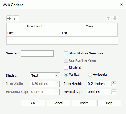
- Specify the item labels and the value of each item in the items box by inputting some strings as the labels and values respectively.
If you want to use a DBField, formula field, or parameter field to control the value, select the ellipsis button
 in the Value column to insert one with the Insert Fields dialog box, and then select the format for the inserted field from the drop-down list in the Item Label column. Select the All radio button in the Insert Field dialog box if you want to add an "All" value to the list/drop-down list. Then when the dashboard users select "All" as value of the list/drop-down list at runtime, all filter actions defined on the list/drop-down list will not take effect, and if you applied some other web action that needs value from the list/drop-down list, JDashboard returns a "Null" value.
 - In the Selected field, specify the selected value for the list/drop-down list.
- If you want to disable the list/drop-down list, select the Disabled option.
- For a list web control, you can select the Allow Multiple Selections checkbox if you want to allow multiple items to be selected in the list, specify to display the list as Text, Button, Checkbox, or Radio Button, use the vertical or horizontal layout to display items in the list, and specify the width/height of each item and the vertical/horizontal gap between two adjacent items in the list.
- Select OK to finish defining the web options of the list/drop-down list.
- Specify the web action you want to apply to the list/drop-down list.
![]() If you have specified a tool tip for a text field or checkbox, the tool tip displays differently on different browsers:
If you have specified a tool tip for a text field or checkbox, the tool tip displays differently on different browsers:
- On Internet Explorer, the tip text is automatically wrapped if its length exceeds the maximal tip width the browser allows. In addition, for Internet Explorer, you can manually add a new line by adding "
" or "
" ahead of the text when editing it in the Tool Tip text box.
- On Firefox, the tip text displays in one line with the maximal tip width the browser allows, and the text that it cannot display within the width is cut off and replaced by an ellipsis (...).
 Previous Topic