Inserting UDOs into a Page Report
This topic describes how you can insert UDOs in a page report. It also presents an example to show how you can insert a quadrant chart into a banded object using a UDO.
You can insert UDOs in banded panels in query-based page reports as listed in Component Placement.
- Make sure you have modified setenv.bat in
<install_root>\binto include the required classes. - Start Designer.
- Create a new page report, or open an existing page report. The report should contain a banded object created using a query resource.
- Do one of the following:
- From the Components panel, drag the UDO icon
 in the Others category to the banded panel where you want to insert the UDO.
 - Select Insert > UDO or Home > Insert > UDO.
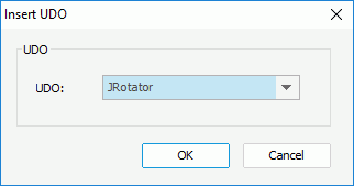
Designer displays the Insert UDO dialog box.

- From the Components panel, drag the UDO icon
- The UDO drop-down list contains all the UDOs that you have registered in setenv.bat. Select the required UDO.
- Select OK in the dialog box.
- If you use menu command to insert the UDO, select the mouse button in the desired banded panel to insert the UDO there.
- If you take the dragging and dropping method to insert the UDO, Designer inserts the UDO there.
After you insert a UDO into a report, when you publish the report to Server, be sure to include its class path in the setenv batch file in Server too (<server_root>\bin\setenv.bat).
Example: Using UDO to Insert a Quadrant Chart into a Banded Object
Logi Report provides you with a demo UDO, with which you can insert a quadrant chart into a banded object. This demo UDO requires four jar files: myudo.jar, jfreechart-1.0.13.jar, jfreechart-1.0.13-swt.jar, and jcommon-1.0.16.jar. You can get the file myudo.jar in <install_root>\help\samples\UDODemo\JQuadrantChart, and you can further edit it if you want. You can download the rest three jars from the website: http://www.jfree.org/jfreechart.
To insert a quadrant chart into a banded object using the demo UDO:
- Append the four jars to the ADDCLASSPATH variable of the batch file setenv.bat in
<install_root>\bin. - Add the following to the file udo.ini in
<install_root>\lib:Begin
name=JQuadrantChart
template=jet.udodemo.JQuadrantTmpl
resultobject=jet.udodemo.JQuadrantRslt
resultcreator=jet.udodemo.JQuadrantCrtr
resultviewer=jet.udodemo.JQuadrantRndr
objecteditor=jet.udodemo.JQuadrantDsgn
End - Start Designer.
- Select File > Open Catalog to open the catalog file SampleReports.cat in
<install_root>\Demo\Reports\SampleReports. - Create a page report with a standard banded object in it using the query WorldWideSales in Data Source 1 of the catalog and group the banded object by the Product ID field.
- In the Data panel, select <New Summary...> from the Summaries node.
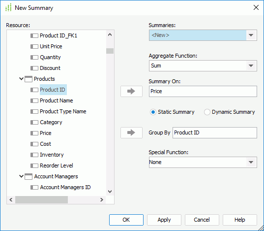
- In the New Summary dialog box, specify the Aggregate Function as Sum, add the field Price from the Products table to the Summary On text box, select the Static Summary radio button, specify the Group By field as Product ID from the Products table, and then select OK.

- Type Sum Price in the Summary Name dialog box and select OK to create the summary.
- Repeat steps 6 to 8 to create another summary "Sum Cost", which uses Sum as the aggregate function, summarizes on the Cost field and is grouped by the Product ID field.
- Resize the group header panel of the banded object and add the two summaries to the panel as follows:

- Select the banded page header panel (BPH) and select Insert > UDO.
- In the Insert UDO dialog box, select JQuadrantChart from the UDO drop-down list, and then select OK.
- Select the mouse button in the banded page header panel to insert the UDO there.
- Keep JQuadrantChart focused and go to the Report Inspector to define its properties as follows:
- Column Name: Product ID
- Quadrant Origin X: 750
- Quadrant Origin Y: 200
- X Values: Sum Price
- Y Values: Sum Cost
- Resize the banded page header panel and save the report
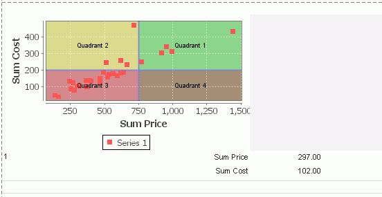
- Select the View tab to preview the report. The report displays as follows:

The following tables lists the special properties of this demo UDO. You can edit the property values to suit your requirements.
| Property Name | Description |
|---|---|
| Chart Title | Specifies the title of the quadrant chart.
Data type: String |
| Column Name | Specifies the field whose values will be used as the values of the X axis, which can only be the outermost group-by field of the banded object.
Data type: String |
| Quadrant Font Bold | Specifies whether to make the text in the quadrant chart bold. This property takes effect only when you have set the property Show Quadrant Text to "true" and specified certain text for the property Quadrant1 Text, Quadrant2 Text, Quadrant3 Text, or Quadrant4 Text.
Data type: Boolean |
| Quadrant Font Color | Specifies the color of the text in the quadrant chart. Choose a color from the drop-down list, type a hexadecimal RGB value (for example, 0xff0000), or select Custom from the drop-down list to specify the color. This property takes effect only when you have set the property Show Quadrant Text to "true" and specified certain text for the property Quadrant1 Text, Quadrant2 Text, Quadrant3 Text, or Quadrant4 Text.
Data type: String |
| Quadrant Font Face | Specifies the font of the text in the quadrant chart. Choose an option from the drop-down list. This property takes effect only when you have set the property Show Quadrant Text to "true" and specified certain text for the property Quadrant1 Text, Quadrant2 Text, Quadrant3 Text, or Quadrant4 Text.
Data type: Enumeration |
| Quadrant Font Size | Specifies the font size of the text in the quadrant chart. Type an integer value to change the size. This property takes effect only when you have set the property Show Quadrant Text to "true" and specified certain text for the property Quadrant1 Text, Quadrant2 Text, Quadrant3 Text, or Quadrant4 Text.
Data type: Integer |
| Quadrant Origin X | Specifies the value of the X axis for the origin point.
Data type: Float |
| Quadrant Origin Y | Specifies the value of the Y axis for the origin point.
Data type: Float |
| Quadrant Separator Color | Specifies the color of the lines used to separate the quadrants of the chart. Choose a color from the drop-down list, type a hexadecimal RGB value (for example, 0xff0000), or select Custom from the drop-down list to specify the color. This property takes effect only when the property Show Quadrant Separator is "true".
Data type: String |
| Quadrant Separator Width | Specifies the width of the lines used to separate the quadrants of the chart. Type a numeric value to change the width. This property takes effect only when the property Show Quadrant Separator is "true".
Data type: Float |
| Quadrant1 Color | Specifies the color for the first quadrant of the chart. Choose a color from the drop-down list, type a hexadecimal RGB value (for example, 0xff0000), or select Custom from the drop-down list to specify the color.
Data type: String |
| Quadrant1 Text | Specifies the text to display in the first quadrant of the chart. This property takes effect only when the property Show Quadrant Text is "true".
Data type: String |
| Quadrant1 Transparency | Specifies the transparency for the first quadrant of the chart, in percent. Type a numeric value to change the transparency.
Data type: Integer |
| Quadrant2 Color | Specifies the color for the second quadrant of the chart. Choose a color from the drop-down list, type a hexadecimal RGB value (for example, 0xff0000), or select Custom from the drop-down list to specify the color.
Data type: String |
| Quadrant2 Text | Specifies the text to display in the second quadrant of the chart. This property takes effect only when the property Show Quadrant Text is "true".
Data type: String |
| Quadrant2 Transparency | Specifies the transparency for the second quadrant of the chart, in percent. Type a numeric value to change the transparency.
Data type: Integer |
| Quadrant3 Color | Specifies the color for the third quadrant of the chart. Choose a color from the drop-down list, type a hexadecimal RGB value (for example, 0xff0000), or select Custom from the drop-down list to specify the color.
Data type: String |
| Quadrant3 Text | Specifies the text to display in the third quadrant of the chart. This property takes effect only when the property Show Quadrant Text is "true".
Data type: String |
| Quadrant3 Transparency | Specifies the transparency for the third quadrant of the chart, in percent. Type a numeric value to change the transparency.
Data type: Integer |
| Quadrant4 Color | Specifies the color for the fourth quadrant of the chart. Choose a color from the drop-down list, type a hexadecimal RGB value (for example, 0xff0000), or select Custom from the drop-down list to specify the color.
Data type: String |
| Quadrant4 Text | Specifies the text to display in the fourth quadrant of the chart. This property takes effect only when the property Show Quadrant Text is "true".
Data type: String |
| Quadrant4 Transparency | Specifies the transparency for the fourth quadrant of the chart, in percent. Type a numeric value to change the transparency.
Data type: Integer |
| Show Quadrant Separator | Specifies whether to show the lines used to separate the quadrants of the chart.
Data type: Boolean |
| Show Quadrant Text | Specifies whether to show the text in the quadrants of the chart.
Data type: Boolean |
| X Values | Specifies the field whose values you want to display as the values of the X coordinate. You can only use the fields with numeric values in the group header panel of the banded object.
Data type: String |
| Y Values | Specifies the field whose values you want to display as the values of the Y coordinate. You can only use the fields with numberic values in the group header panel of the banded object
Data type: String |
 Previous Topic