Creating Motion Charts
A motion chart is a chart moving at runtime based on the value changes of a specified motion field. In a motion chart, a motion control section is added on its platform, which contains the following elements:

- A play button allowing you to make the chart play its dynamic trend or to be static.
- A motion bar which contains a defined motion field. The chart will update its dynamic trend based on the value changes of the motion field.
- A speed control. The moving speed of the chart can be controlled by dragging the slider on the speed control.
- For a bubble chart, there is also a trail control, which allows you to make the chart show trails of bubbles or lines (when null values appear, the trails of bubbles or lines will not be available).
At runtime you can use the motion control section to make the chart move. Select the play button and the chart will show its dynamic trend based on the value change of the motion field which is bound in the motion bar. To stop it, select the button again. You can also control its moving speed by dragging the slider between Slow and Fast on the speed control. For a bubble chart, you can control whether the chart will be moving in bubble or line trail.
Motion charts are not supported in page reports that are created using query resources. Meanwhile to have a better and stable performance for motion charts, you are recommended to use the Google Chrome web browser.
The following shows an example on how to create a motion chart in a web report and play it in Web Report Studio.
- Make sure SampleReports.cat is the currently open catalog file. If not select File > Open Catalog to open it from
<install_root>\Demo\Reports\SampleReports. - Select File > New > Web Report to create a web report.
- Select Insert > Chart. The Create Chart wizard appears.
- In the Data screen of the wizard, select WorldWideSalesBV from Data Source 1. Select Next.
- Select Bubble 2-D in the Type screen. Select Next.
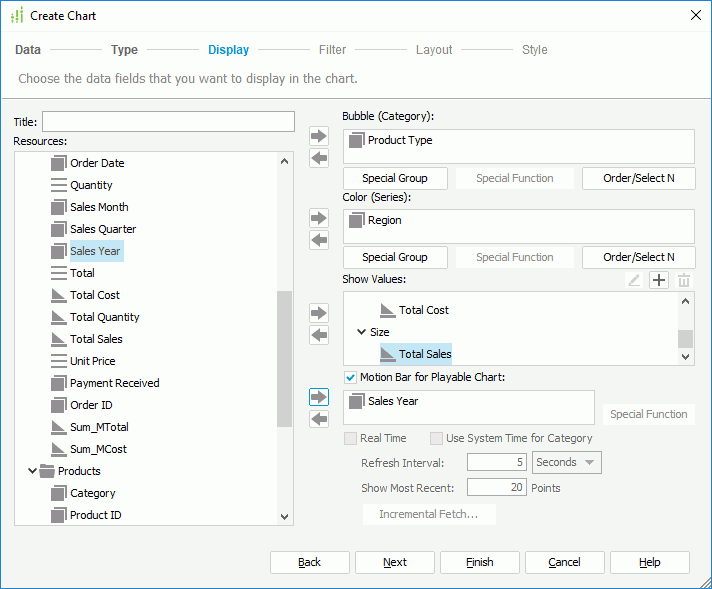
- In the Display screen, add the group objects Product Type to the Bubble (Category) box and Region to the Color (Series) box.
- In the value box, add the aggregation objects Sum_MTotal, Total Cost and Total Sales respectively on X-Axis, Y-Axis and Size. Note when a value is added for the bubble X axis, this value will be displayed on the category axis instead of the one specified in the Category box, while the value defined in the Category box will still be included in data calculation.
- Select Motion Bar for Playable Chart, add the group object Sales Year as the motion field.

- Select Finish to create the motion chart.
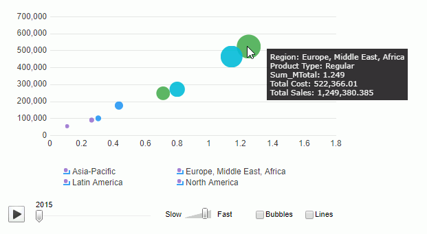
- Save the report and select View > Preview As > Web Report Result. The chart shows as follows:

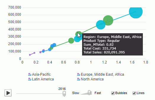
- Select the Bubbles and Lines checkboxes, and select the play button, then the value of the motion field will change, and the bubbles in the chart will move based on the value change of the motion field in line trail. See the result below, when the value of the motion field is changed to 2016, the display value of the bubble also changes accordingly.

 Previous Topic