Format Bubble Gauge Dialog
The Format Bubble Gauge dialog helps you to format a bubble gauge. It appears when you right-click any bubble in a bubble gauge chart and then select Format Bubble Gauge from the shortcut menu.
The dialog contains the following tabs: Staff Graph, Frame, Range Color, Hint and Behaviors (the Behaviors tab is available to charts in library components only).
OK
Applies the changes and closes the dialog.
Cancel
Does not retain any changes and closes the dialog.
Apply
Applies all changes and leaves the dialog open.
Help
Displays the help document about this feature.
Staff Graph
Specifies properties for the bubbles in the bubble gauge.
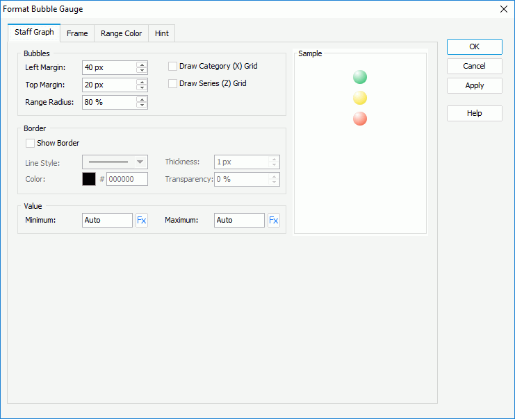
Bubbles
Specifies properties of the bubbles.
- Left Margin
Specifies the gap between the left labels and left bubbles, in pixels. - Top Margin
Specifies the gap between top labels and top bubbles, in pixels. - Range Radius
Specifies the relative size of a bubble in a percentage of total bubble size. - Draw Category (X) Grid
Specifies whether to draw category grid. - Draw Series (Z) Grid
Specifies whether to draw series grid.
Border
Specifies properties for the border of the bubbles.
Show Border
Specifies whether to show the border of the bubbles. When it is selected, the other border properties will be enabled.- Line Style
Specifies the line style to apply to the border. - Thickness
Specifies the thickness of the border, in pixels. - Color
Specifies the color of the border. - Transparency
Specifies the transparency for color of the border.
- Line Style
Value
Specifies the minimum and maximum values for the color range. The values are equally divided into three ranges, each of which is filled with the color you specify in the Range Color tab automatically. Applied only when you do not specify ranges for the values in the Range Color tab.
- Minimum
Specifies the minimum value to be displayed in the chart. You can also use a formula to control the property. - Maximum
Specifies the maximum value to be displayed in the chart. You can also use a formula to control the property.
Frame
Specifies properties for the frame of the bubble gauge.
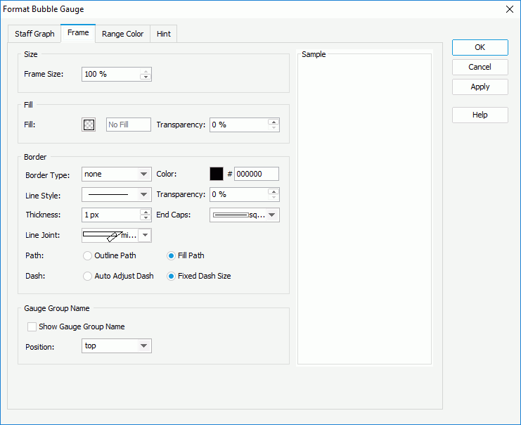
Size
Specifies the size properties of the frame.
- Frame Size
Specifies the size of the frame.
Fill
Specifies the color and transparency of the frame.
- Fill
Specifies the color to fill the frame. - Transparency
Specifies the transparency to fill the frame.
Border
Specifies the properties for border of the frame.
- Border Type
Displays the type of the border. - Color
Specifies the color of the border. To edit the color, select the color indicator and select a color from the color palette or input the hexadecimal value (for example, 0xff0000) of a color in the text box. - Line Style
Specifies the line style to apply to the border. - Transparency
Specifies the transparency for color of the border. - Thickness
Specifies the thickness of the border, in pixels. End Caps
Specifies the ending style of the border line.- butt
Ends unclosed sub paths and dash segments with no added decoration. - round
Ends unclosed sub paths and dash segments with a round decoration that has a radius equal to half of the width of the pen. - square
Ends unclosed sub paths and dash segments with a square projection that extends beyond the end of the segment to a distance equal to half of the line width. - Line Joint
Specifies the line joint style for the border line.- miter
Joins path segments by extending their outside edges until they meet. - round
Joins path segments by rounding off the corner at a radius of half the line width. - bevel
Joins path segments by connecting the outer corners of their wide outlines with a straight segment. - joint round
Joins path segments by rounding off the corner at the specified radius.
- miter
Path
Specifies the fill pattern of the border line.- Outline Path
Specifies the fill pattern of the border line to be outline path. - Fill Path
Specifies the fill pattern of the border line to be whole path.
- Outline Path
- Dash
Specifies the dash size of border line.- Auto Adjust Dash
Specifies to adjust the dash size automatically. - Fixed Dash Size
Specifies to use fixed dash size.
- Auto Adjust Dash
Gauge Group Name
Specifies properties for the gauge group name.
- Show Gauge Group Name
Specifies whether to show names for the bubbles in the bubble gauge which are values of the field on its category axis. If the bubble gauge contains no category field, the group name shows Report by default.- Position
Specifies the position of the names relative to the bubbles.
- Position
Range Color
Specifies different colors to fill the bubbles in different ranges.
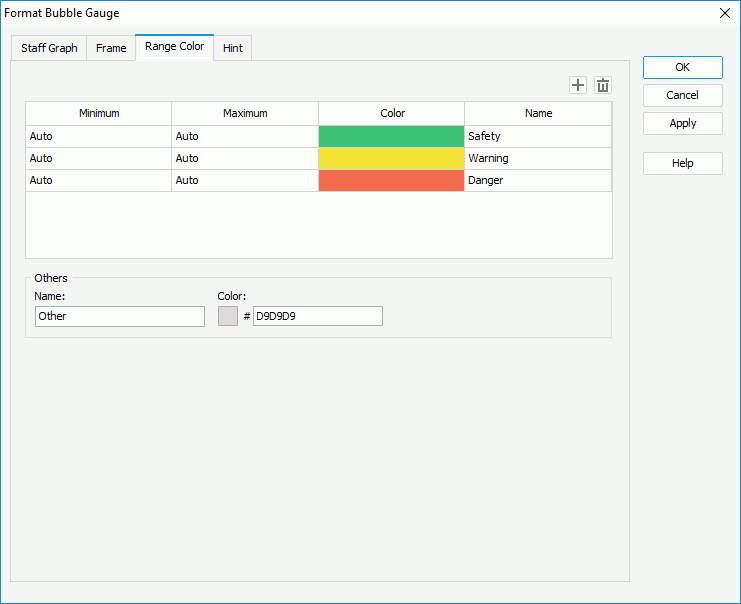

Adds a new color range.

Removes the selected color range.
Minimum
Specifies the minimum value of the range.
Maximum
Specifies the maximum value of the range.
Color
Specifies the color schema of the range. Select in the color cell to customize the color on the color palette.
Name
Displays the name of the range.
Others
Specifies the properties for values that do not fall into any of the ranges you defined.
- Name
Specifies the name for the values. - Color
Specifies the color for the values. To edit the color, select the color indicator and select a color from the color palette or input the hexadecimal value (for example, 0xff0000) of a color in the text box.
Hint
Specifies properties for the hint of the bubble gauge.
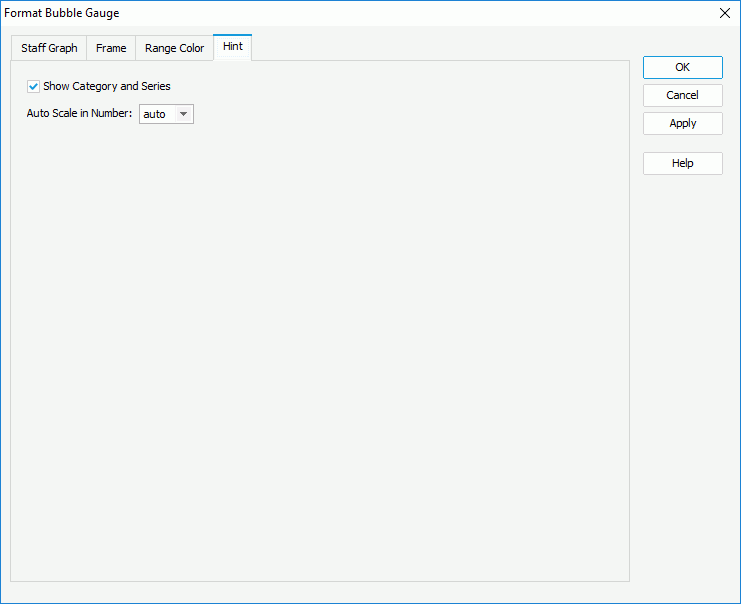
Show Category and Series
Specifies whether to include the category and series values in the hint.
Auto Scale in Number
Specifies whether to automatically scale the values displayed in the hint that are of the Number data type when the values fall into the two ranges:
- When 1000 <= value < 10^15, the following quantity unit symbols of the International System of Units are used to scale the values: K (10^3), M (10^6), G (10^9), and T (10^12).
- When 0 < value < 0.001 or value >= 10^15, scientific notation is used to scale the values.
The option "auto" means that the property setting follows that of the chart.
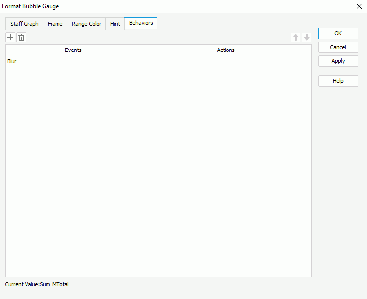
Behaviors
Specifies web behaviors to the bubble gauge. This tab is only available to charts in library components.

Adds a new web behavior line.

Removes the selected web behavior.

Moves the selected web behavior up a step.

Moves the selected web behavior down a step.
Events
Specifies the trigger event.
Actions
Specifies the action you want the event to trigger.

Opens the Web Action List dialog to bind a web action to the event.
 Previous Topic