Formatting the Gauge
The appearance of a gauge chart can be customized using many options. The formatting options vary with the subtypes: Gauge Dial 2-D, Gauge Bar 2-D, and Gauge Bubble 2-D.
- Right-click any pointer in a dial of the dial gauge chart, and then select Format Dial Gauge on the shortcut menu to bring up the Format Dial Gauge dialog.
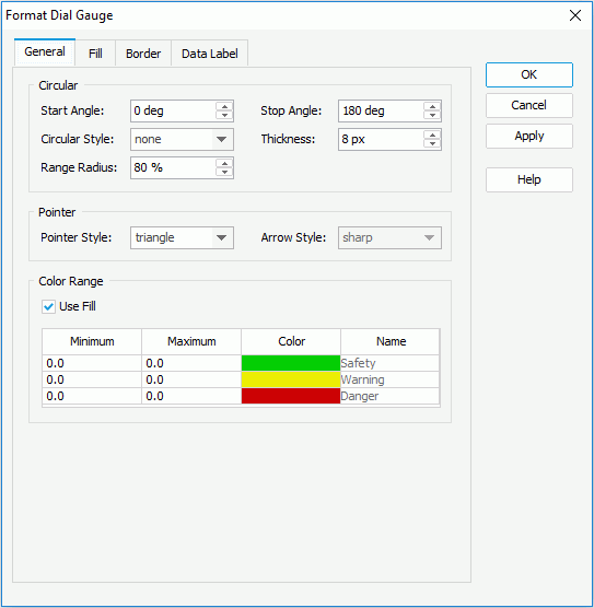
- In the General tab, specify the general options for the dials in the chart.
In the Circular box, set the start angle and stop angle of the dials, the dial curve style, the width of the dials, and the relative size of a dial.
In the Pointer box, set the pointer style and arrow style.
In the Color Range box, specify whether or not to fill the dial with colors, and if to fill, select in the corresponding cells to set the minimum and maximum values and colors from the color palette for the three predefined ranges in each dial.
- In the Fill tab, specify the color and the transparency of the color schema to fill the selected pointers in the same data series (to change the color, select the color image and select a color from the color palette or input the hexadecimal value of a color directly in the text box). If required, select the Color List button to specify the color pattern for pointers in the same data series respectively in the Color List dialog.

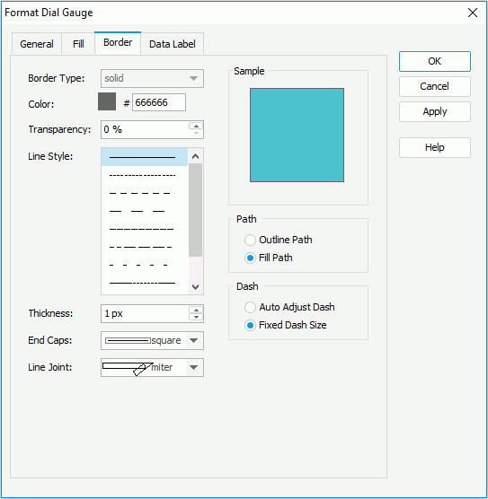
- In the Border tab, set the border mode for the pointers, including the border style, color, transparency, line style, thickness, end caps style, and line joint mode. You can also specify whether the border is to be outlined, and whether or not to automatically resize the border dashes if the border is drawn with dashes.
- In the Data Label tab, set the font formats and effects of the data labels.
- For a dial gauge chart in a library component, you can define web behaviors on the dial gauges in the Behaviors tab.
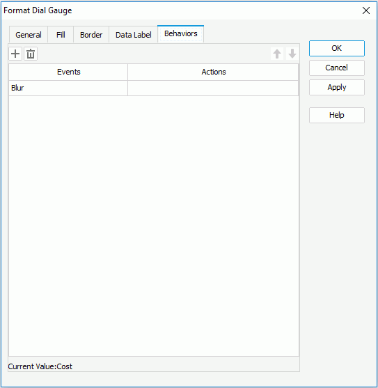
Select a trigger event from the drop-down list in the Events column, then select in the Actions column and select
 that appears in the text box to open the Web Action List dialog, where you can bind a web action to the dial gauges which will be triggered when the specified event occurs on the dial gauges. The web actions you can bind include Filter, Sort, Parameter, Property and SendMessage. For details about these web actions, refer to Applying Web Actions to a Label.
To add a web behavior line, select
 , and if a web behavior is not required, select
  to remove it.
 Select
 or
or  to adjust the order of the behaviors. Then, when an event that has been bound with more than one action happens, the upper action will be triggered first.
 - When done, select OK to apply the settings.
- Right-click any data marks in a scale of the bar gauge chart, and then select Format Bar Gauge on the shortcut menu to bring up the Format Bar Gauge dialog.
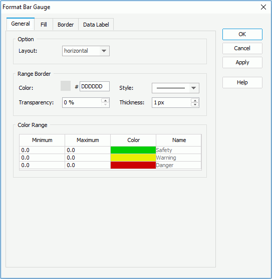
- In the General tab, set the general options for the bar gauge chart.
In the Option box, decide the layout of the scales in the gauge chart.
In the Range Border box, set the color, style, transparency, and thickness of the scale borders (to change the color, select the color image and select a color from the color palette or input the hexadecimal value of a color directly in the text box).
In the Color Range box, select in the corresponding cells to specify the minimum and maximum values and colors from the color palette for the three predefined ranges in each scale.
- In the Fill tab, specify the color and the transparency of the color schema to fill the selected data marks in the same data series. If required, select the Color List button to specify the color pattern for data marks in the same data series respectively in the Color List dialog.
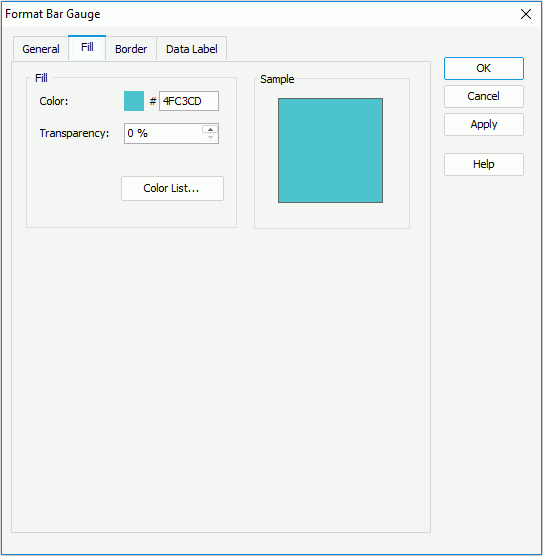
- In the Border tab, set the border mode for the data marks, including the border style, color, transparency, line style, thickness, end caps style, and line joint mode. You can also specify whether the border is to be outlined, and whether or not to automatically resize the border dashes if the border is drawn with dashes.

- In the Data Label tab, set the font formats and effects of the data labels.
- For a bar gauge chart in a library component, you can define web behaviors on the bar gauges in the Behaviors tab.
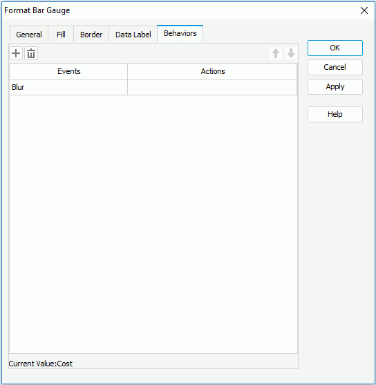
Select a trigger event from the drop-down list in the Events column, then select in the Actions column and select
 that appears in the text box to open the Web Action List dialog, where you can bind a web action to the bar gauges which will be triggered when the specified event occurs on the bar gauges. The web actions you can bind include Filter, Sort, Parameter, Property and SendMessage. For details about these web actions, refer to Applying Web Actions to a Label.
To add a web behavior line, select
 , and if a web behavior is not required, select
  to remove it.
 Select
 or
or  to adjust the order of the behaviors. Then, when an event that has been bound with more than one action happens, the upper action will be triggered first.
 - When done, select OK to apply the settings.
To format a bubble gauge chart:
- Right-click any bubble in the bubble gauge chart, and then select Format Bubble Gauge on the shortcut menu to bring up the Format Bubble Gauge dialog.
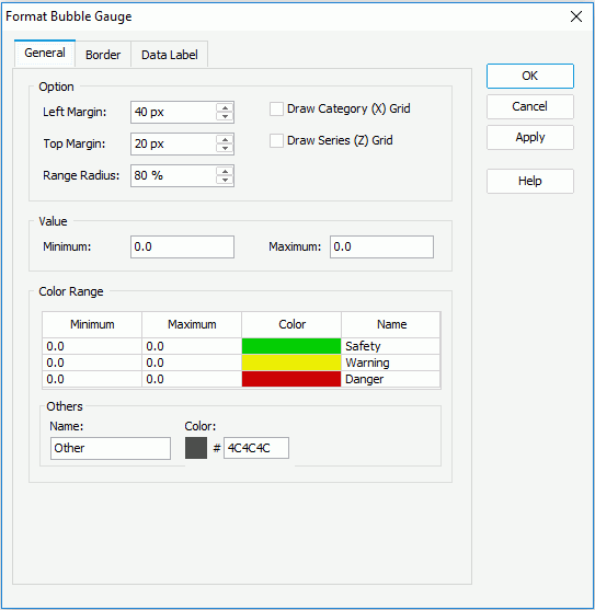
- In the General tab, set the general options for the bubbles in the chart.
In the Option box, set the left margin, top margin, relative radius of the bubbles, and whether or not to draw horizontal/vertical grids.
In the Value box, specifies the minimum and maximum values for the color range. The values will be equally divided into three ranges, each of which will be filled with the color specified in the Color Range box automatically. Values beyond the minimum and maximum will be filled with gray color by default.
In the Color Range box, select in the corresponding cells to specify the minimum and maximum values, colors from the color palette and names for the three predefined ranges in each scale. Then, in the Others box, specify the name and color for values that do not fall into any of the defined ranges (to change the color, select the color image and select a color from the color palette or input the hexadecimal value of a color directly in the text box).
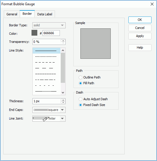
- In the Border tab, set the border mode for the bubbles, including the border style, color, transparency, line style, thickness, end caps style, and line joint mode. You can also specify whether the border is to be outlined, and whether or not to automatically resize the border dashes if the border is drawn with dashes.
- In the Data Label tab, set the font formats and effects of the data labels.
- For a bubble gauge chart in a library component, you can define web behaviors on the bubble gauges in the Behaviors tab.
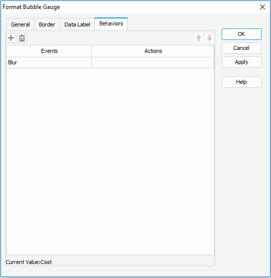
Select a trigger event from the drop-down list in the Events column, then select in the Actions column and select
 that appears in the text box to open the Web Action List dialog, where you can bind a web action to the bubble gauges which will be triggered when the specified event occurs on the bubble gauges. The web actions you can bind include Filter, Sort, Parameter, Property and SendMessage. For details about these web actions, refer to Applying Web Actions to a Label.
To add a web behavior line, select
 , and if a web behavior is not required, select
  to remove it.
 Select
 or
or  to adjust the order of the behaviors. Then, when an event that has been bound with more than one action happens, the upper action will be triggered first.
 - When done, select OK to apply the settings.
See the following dialogs for detailed explanation about options in each dialog:
 Previous Topic