Working with Crosstab Table Columns
Instead of using the wizard, developers can manually build Crosstab Tables using two types of Crosstab Table columns: Label Columns and Value Columns. Crosstab Tables have one Label Column by default; the number of Value Column cells is determined by the number of Crosstab Column values.
Here's how to add a Crosstab Table Label column:
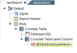
- As shown above, in Logi Studio, select the parent Crosstab Table element and add a Crosstab Table Label Column element beneath it. Configure any of its optional attributes.
- Then, add a Label element beneath the new column and use a regular @Data token to reference values from a column returned by the datalayer.
Next, we want to add Crosstab Table Value Columns elements to create the Value columns for the Crosstab Table. Value columns contain the results of the aggregations of the data from the specified column.
But the results of the aggregations do not appear in the datalayer under any of its column names, so how is it referenced? Special @Data tokens allow you to access Crosstab column and Value data. Here are the tokens:

These special tokens are:
- @Data.rdCrosstabColumn~ - Returns the values in the specified Crosstab Column
- @Data.rdCrosstabValue~ - Returns the aggregated values in the specified Value Column
- @Data.rdCrosstabValCount~ - Returns the number of corresponding records from the Value Column used to calculate the current aggregate value if the aggregation is Sum, Count, or Average.
Let's add a Value Column and set its attributes using the special tokens:

- Beneath the Crosstab Table element, add a Crosstab Table Value Column element, as shown above.
- We want to use data in the column headers, so set the element's Column Header attribute to one of the special tokens: @Data.rdCrosstabColumn~.

- Add a Label element beneath the Crosstab Table Value Columns element and set its Caption attribute to @Data.rdCrosstabValue~, as shown above, to display the aggregated crosstab values.
Grouping Crosstab Table Columns
You can incorporate Crosstab grouping by adding the Secondary Crosstab Label Columns to your Crosstab Filter. This element works like the Extra Crosstab Label Columns element, except it can be used to group Value Columns and Label Columns together.
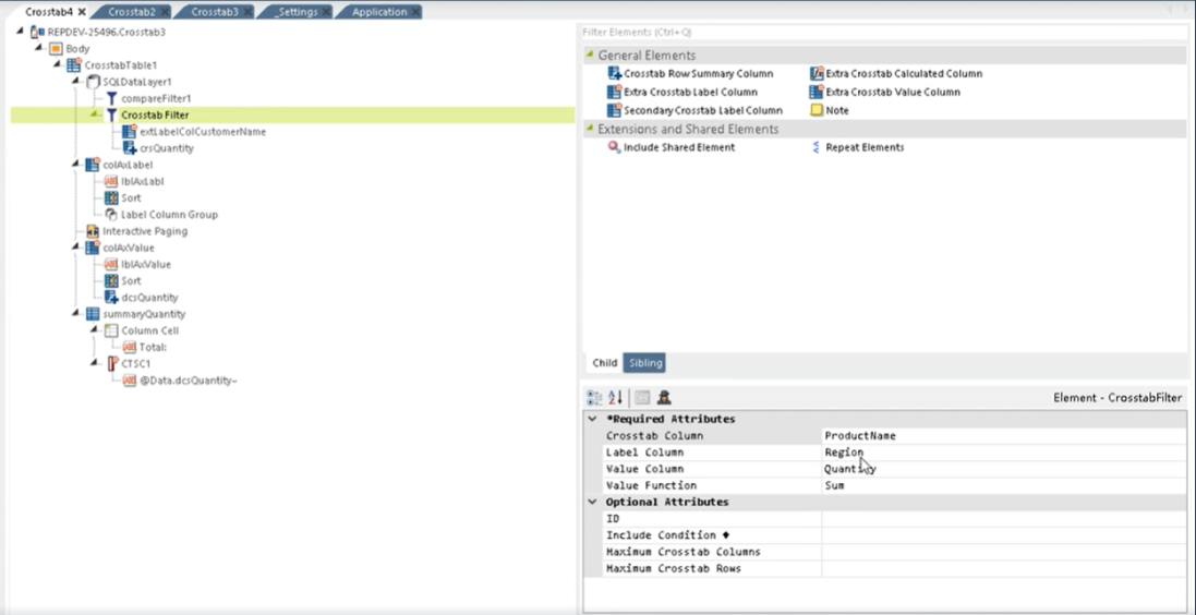
In this example, the Crosstab Filter is grouped by the Label Column Region:
Here's what the Crosstab Table looks like, as is:

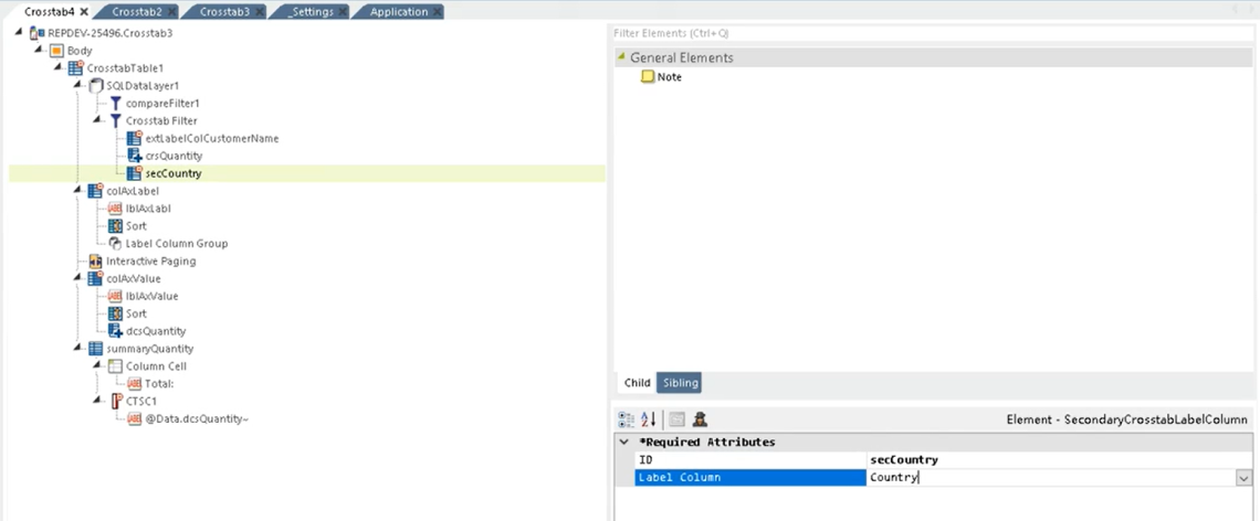
First, add a Secondary Crosstab Label Column and give it an ID and assign a Label Column. In this example, we're adding "secCountry" with the Label Column "Country":
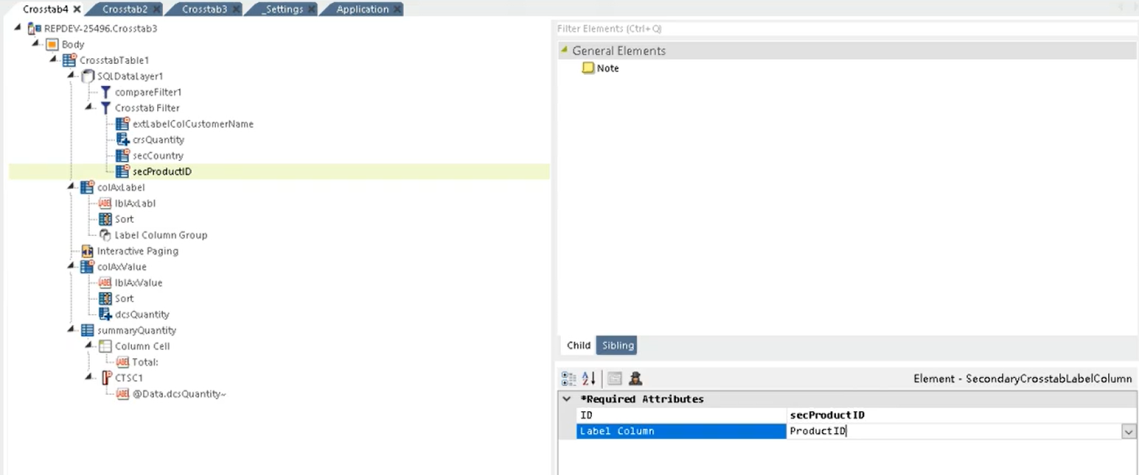
Then, add another Secondary Crosstab Label Column and give it an ID and assign a Label Column. In this example, we're adding "secProductID" with the Label Column "ProductID":
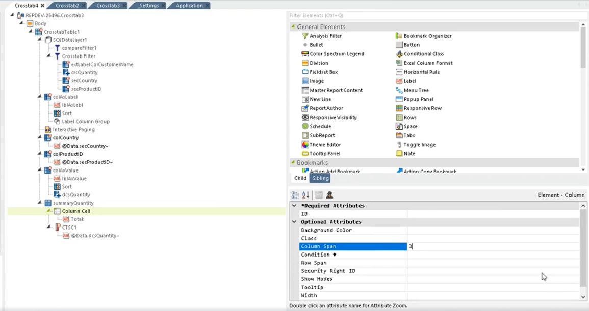
Add two Crosstab Table Label Columns to the Crosstab Filter that reflect the Secondary Crosstab Label Columns. In this example, we're adding a Crosstab Table Label Column with the ID "colCountry", Column Header titled "Country", and a Label element captioned "@Data.secCountry~" and another Crosstab Table Label Column with the ID "colProductID", Column Header titled "Product ID", and a Label element captioned "@Data.secProductID~".
Adjust the Column Span of the Summary Column to reflect the number of Label Columns you are grouping together. In this example, we're adjusting the span to 3 columns:
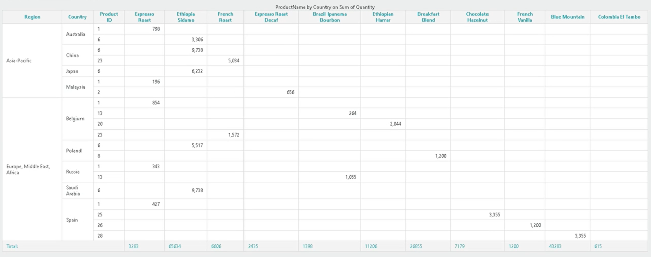
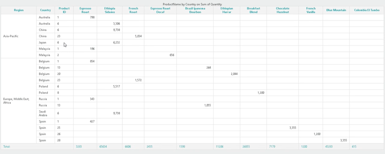
Select Save and refresh your report. Info displays the newly added Country, and ProductID Secondary Crosstab Label Columns:
You can go one step further and add a Label Column Group element for each of the Data Columns you want to group. In this example, we're adding a Label Column Group for "Region" and "secCountry":
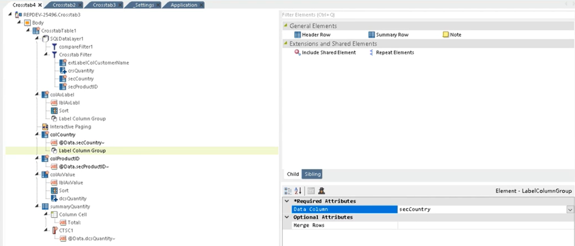
![]() You can also change the Merge Rows attribute to "True" (default value is "False") to merge the cells grouped together. You must do this for each Label Column Group you add.
You can also change the Merge Rows attribute to "True" (default value is "False") to merge the cells grouped together. You must do this for each Label Column Group you add.
Select Save and refresh your report. Info groups the Region and Country columns:
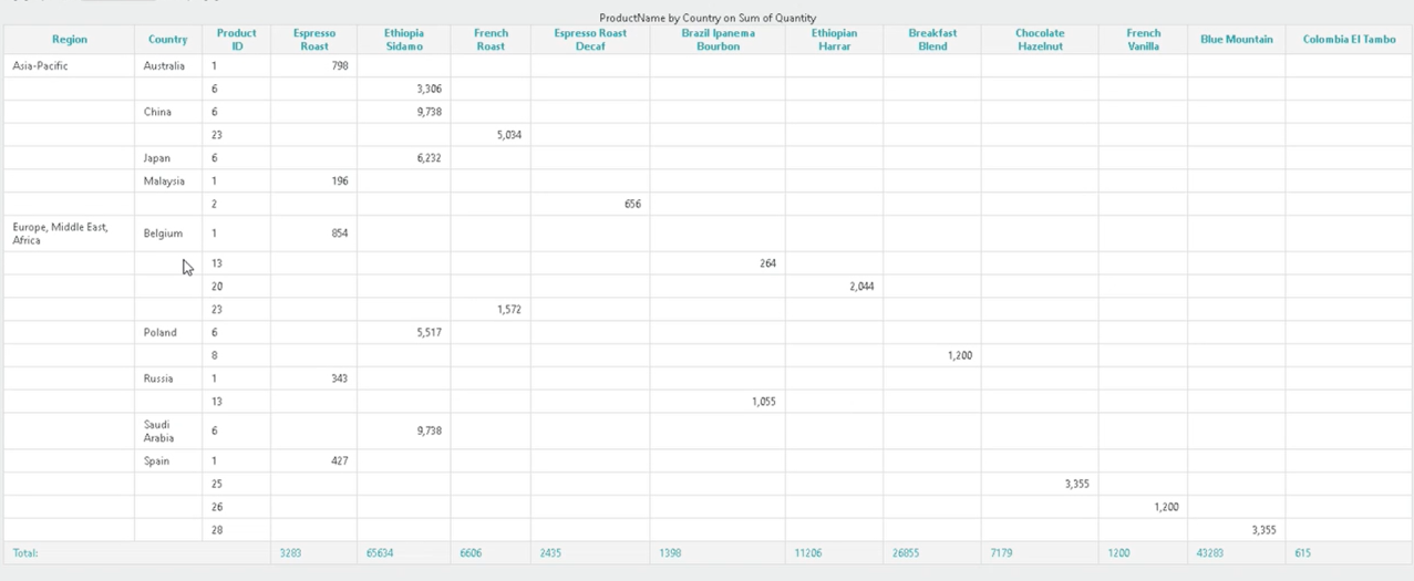
Here's what your Crosstab Table looks like if you merged the cells:
