Trend Line
The Chart Canvas element's Series child elements cause a data visualization (the chart) to be rendered in the canvas. The Trend Line element is available as a child of Series elements and generates a line on the chart that indicates the "trend" of the data. The line connects a number of data points generated using a regression algorithm.
The following topics discuss the Trend Line child element:
About the Trend Line
Trend lines provide a visual clue to data trends and are very useful when the type of Series being used doesn't make that readily apparent. The Trend Line element is available for use with Area, Area Spline, Bar, Line, Scatter, and Spline series.

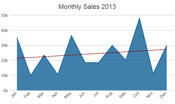
In the example above, the red dotted line is the Trend Line, indicating that the data trend is upward. You can see how that might be difficult to discern from the Area chart itself. The Trend Line can be any color, can be solid, dotted, or dashed, and you have a choice of regression algorithms.