Series.Pie - Using the Quicktips Element
By default, a "quicktip" is displayed when the mouse hovers near or over a pie slice:
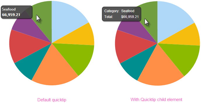
The automatically-generated quicktip displays information for the X- and Y-axis, as shown above, left. However, you may want to display other information or format it differently, perhaps as shown above, right. This "custom" Quicktip is created by adding a Quicktip child element beneath Series.Pie and setting its attributes and, optionally, using its Quicktip Row child element. Use @Chart tokens to include chart data in the Quicktip.
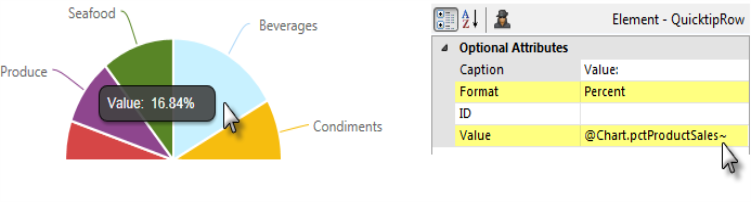
The example above shows another custom Quicktip in use and this time the chart data values are displayed in the Quicktip as percentages. This is done by adding a Percent of Total Column element to your datalayer and using its @Chart token in a Quicktip Row element's Value attribute. The Quicktip Row element's Format attribute is then set to Percent, as shown.
 New for 14.2 You can also configure the tooltip to display values for any available column in the datalayer. To do so, enter a token representing the data column in the Value attribute of the Quicktip Row element.
 To use this feature with DataLayer.ActiveSQL, please make sure the keep Grouped Rows attribute of the SqlGroup element is set to False.
Intrinsic functions are supported in the Quicktip attributes.
The Quicktip Row element has been made context-sensitive with the addition of a Condition attribute.