Working with "More Info Rows"
The More Info Row element provides a mechanism that allows detail information to appear beneath each Data Table row. This detail information can be visible all the time, or can be shown or hidden by clicking a link in one of the Data Table columns. It provides developers with an opportunity to make Data Tables less cluttered and more flexible.

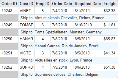
In the example shown above, the "Ship to:" detail data is displayed beneath each data row using a More Info Row element. The font size, font color, number of regular Data Table columns spanned, background color, etc. can be set to differentiate the detail data, if desired. Here's an example of how to implement More Info Rows:

- Beneath the parent Data Table element, add a More Info Row element, as shown above.
- Set its Show Modes attribute value to All. This causes the rows to be shown at all times.
- Set its Span First Column attribute value to 2, which causes the its data to appear beginning underneath the second Data Table column (leaving this attribute and the Span Last Column attribute blank causes the data to span the entire Data Table).
- Add elements beneath the More Info Row element to display the desired text and data (data from the table's datalayer is available here using @Data tokens).
The More Info Row element has a Condition attribute, which allows you to conditionally include the element, for greater control over when the element can be seen, primarily when the More Info Rows are displayed by default.
Showing/Hiding More Info Rows
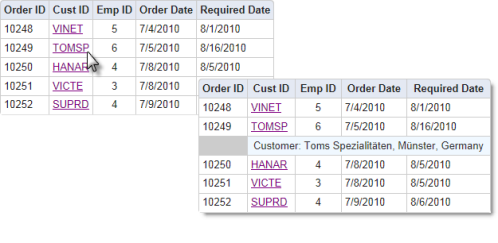
In the next example, the More Info Rows are hidden from view until the user takes some action to display them.

When the user clicks on a customer ID link, the table expands downward to display a More Info Row that displays detail information about the customer. The new row is added right beneath the row that contains the clicked link. Depending on the element's configuration, clicking the link again will hide the new row.
The information in the More Info row can be text, as shown above, or an image, another table, or even a SubReport. Here are the key elements and attributes used to create the example above:

- Beneath the parent Data Table element, add a More Info Row element, as shown above.
- Set its ID to a unique value and its Show Modes attribute value to None, initially hiding all the detail rows.
-
Add elements beneath the More Info Row element to display the desired
text and data (data from the table's datalayer is available here using
@Data tokens).

- Identify the data that you want to be the link that shows and hides your More Info row. Beneath it, add an Action.Show Element element, as shown above.
- Set its Element ID attribute value to the ID of the More Info Row element you added earlier.
- Set its ID attribute to a unique value and its Display attribute to Toggle.
Now run the application and click a Customer ID in the table to display the detail information. Click it again to hide it.
It is possible to "nest" More Info Row elements, so that you have one More Info Row element as a child of a table that's a child of another More Info Row. However, be aware that the lowest More Info Row contents may not export correctly, or at all, so we don't recommend this design arrangement if exporting of expanded rows is desired.
The More Info Row Column element can be used to closely align More Info Row columns with the columns of its parent table. When this element is used, the More Info Row element's Span First Column and Span Last Column attributes are left blank, and the More Info Row Column element's Column Span attribute is used instead to control spanning of parent table columns.
Important information about using SubReports in a More Info Row can be found in SubReports.