Analysis Grid - Pivoting and Summarizing Data
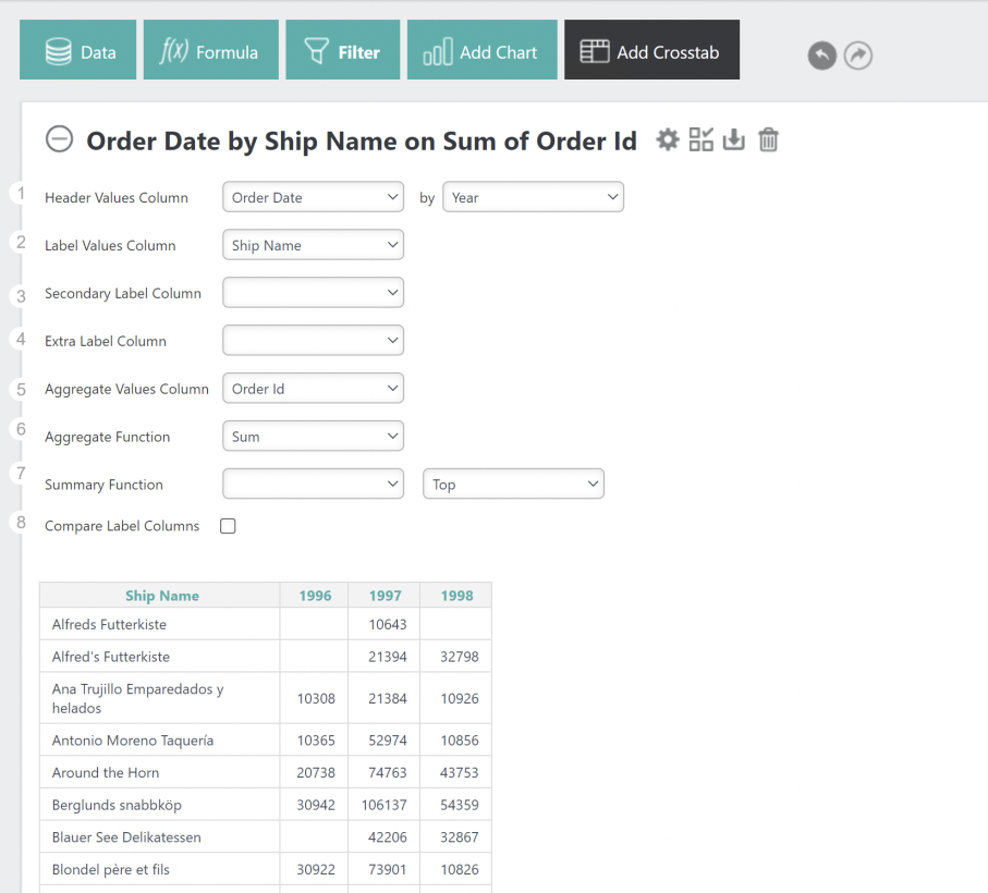
Click the Add Crosstab tab or button to use the feature that lets you create a crosstab (also known as a "pivot") table:

Here's how to use this feature:
- Select the Header Values Column, whose values will be shown horizontally,
as column headers, across the top of the Crosstab Table. Each distinct value adds a crosstab column.
 To prevent unmanageably wide tables, numeric columns in the original data and numeric Formula columns are not available for use here. Additional controls
may appear depending on the data type of the selected column.
- Select the Label Values Column, whose values will be shown vertically, in the left-most column of each row. Each Distinct value adds a crosstab row.
 To prevent unmanageably long tables, numeric columns in the original data and numeric Formula columns are not available for use here.
 New for 14.1 Select the Secondary Label Column, whose values will be shown vertically, as column headers, after the Label Values Column. This column is used to group Value Columns and Label Columns together.
 To prevent unmanageably long tables, numeric columns in the original data and numeric Formula columns are not available for use here.
 - Select the Extra Label Column, whose values will be shown
- Select the Aggregate Values Column, whose values will be aggregated to produce the contents for the rest of the table cells. Set the column to be aggregated into the crosstab cells.
- Select the Aggregate Function to be applied to the column selected in Step 3. Options include Sum, Average, Standard Deviation, Count and Distinct Count, Minimum (v12.2), and Maximum (v12.2). Set the function for calculating the crosstab cells.
- Select a Summary Function to display a summary result.
- If you application has been configured for this, check the Compare Label Columns check box to compare differences
between column values to be displayed, along with a cell shading indicator.
Also, depending on the application configuration, you may see an OK button like the one shown above that applies all of your selection changes to the table as a batch. Otherwise, your table will be updated immediately when you make individual changes.
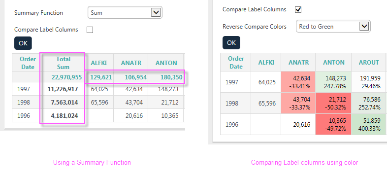
The Summary Function feature and the Label Column Comparison feature provide interesting ways to analyze the data:

As shown above, summarizing the data totals the rows and columns, inserting a row and column to display the results. Comparing Label columns can produce color spectrum backgrounds or directional arrows, and can display the value differences as values or percentages, in the cells.
Hide the crosstab configuration area by clicking the gear icon, or delete the table entirely by clicking the Remove (trash can) icon.
Crosstab Tables are displayed in their own panels, so you can expand and collapse them using their "+" and "-" icons. You can also rearrange the order of chart and table panels by clicking with your mouse near the top of a panel, and dragging it up or down.