Series.Whiskers - Using the Quicktips Element
By default, a "quicktip" is displayed when the mouse hovers near or over a stem or whisker line. This is separate from the quicktips which are displayed for the chart bars.

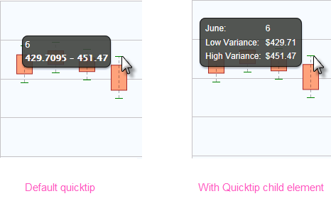
The automatically-generated quicktip displays information for the low and high values, as shown above, left. However, you may want to display other information or format it differently, perhaps as shown above, right, which can be done by adding a Quicktip child element beneath Series.Whiskers and setting its attributes and child elements. Use @Chart tokens to include chart data in the quicktip and intrinsic functions are supported in the Quicktip element attributes.
 New for 14.2 You can also configure the tooltip to display values for any available column in the datalayer. To do so, enter a token representing the data column in the Value attribute of the Quicktip Row element.
![]() To use this feature with DataLayer.ActiveSQL, please make sure the keep Grouped Rows attribute of the SqlGroup element is set to False.
To use this feature with DataLayer.ActiveSQL, please make sure the keep Grouped Rows attribute of the SqlGroup element is set to False.
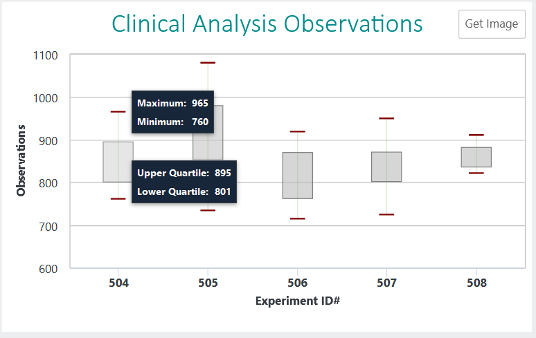
 New for 14.2 Charts aggregations are encouraged to use the ChartCanvas element's attribute, Tooltip Split. This attribute allows you to split a chart's tooltip into one label per series, rather than per segment. The default value for this attribute is False. Once enabled, when hovering over a data point, it displays all the values for the series:

This method is recommended over shared tooltips for charts with multiple line series, and as such, takes precedence over tooltip.shared.