Series.Bar - Using the Quicktips Element
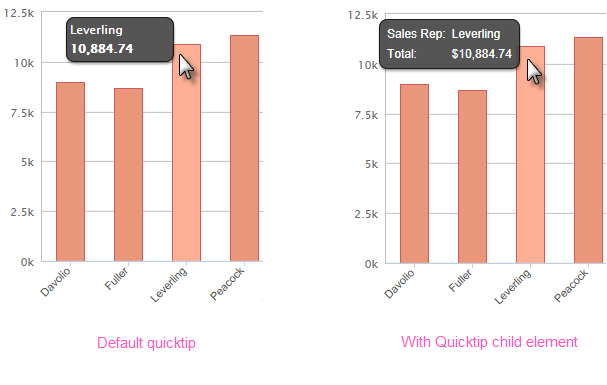
By default, a "quicktip" is displayed when the mouse hovers near or over a data point:

The automatically-generated quicktip displays information for the X- and Y-axis, as shown above, left. However, you may want to display other information or format it differently, perhaps as shown above, right, which can be done by adding a Quicktip child element beneath Series.Bar and setting its attributes and child elements. Use @Chart tokens to include chart data in the quicktip.
 New for 14.2 You can also configure the tooltip to display values for any available column in the datalayer. To do so, enter a token representing the data column in the Value attribute of the Quicktip Row element.
![]() To use this feature with DataLayer.ActiveSQL, please make sure the keep Grouped Rows attribute of the SqlGroup element is set to False.
To use this feature with DataLayer.ActiveSQL, please make sure the keep Grouped Rows attribute of the SqlGroup element is set to False.

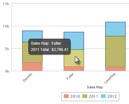
When using stacked series, if each series has its own Quicktips child element, the data shown in the quicktip will vary depending on which stacked segment the cursor hovers over, as shown above. Intrinsic functions are supported in the Quicktip attributes.
To display a percentage for each bar in a Stacked Bar Chart, use the special token @Chart.rdStackedChartPercentage~, like below:

This feature enables the user to hover over the stacked bars and show the percentage for each value. The Title attribute can be used to distinguish between values in a stacked chart.
![]() The format of the percentage will display according to the Format property in QuickTipRow. If this format is not set, it will display the default format "Percent" (0.000%).
The format of the percentage will display according to the Format property in QuickTipRow. If this format is not set, it will display the default format "Percent" (0.000%).