Crosstab Filter with Chart Canvas Charts
The Crosstab Filter is usually associated with a table but, as an element that "pivots" the data in a datalayer, it can also be used with Chart Canvas charts.
This topic contains the following sections:
About Crosstabs
A cross tabulation (often abbreviated as "crosstab") is a table that displays the joint distribution of two or more variables simultaneously. Sometimes called "pivot tables", they make it easy to sort, count, and total their data. The Logi Crosstab Table element makes it easy to implement this kind of table and uses the Crosstab Filter element to shape the data in its datalayer.
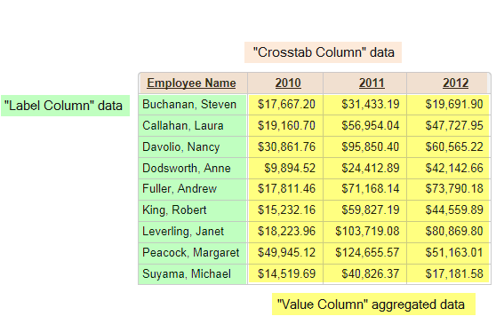
Let's see how the datalayer's data is processed by the Crosstab Filter:

The example above shows each of the column types you specify in the filter and how they appear in a cross-tab table.
- Unique values in the datalayer column named as the Crosstab Column create new columns in the Crosstab Table.
- Unique values in the column named as the Label Column create a new row in the table.
- Values in the column named as the Value Column fill the cells at the intersections of the Crosstab columns and Label rows. These values are the results of an aggregating function that's part of the filter.
The example above displays years for the Crosstab column, employee names for the Label column and a sum of corresponding subtotals for the Value columns. So, when the year is 2010 and the employee is Nancy Davolio, the sum of all corresponding subtotals is $30,861.76.
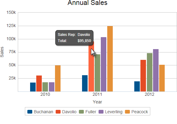
Data that has been "cross-tabbed" can also be visualized in a chart. The following example illustrates how the crosstab data categories described above work in a chart.

The chart shown above uses a crosstab filter to achieve its "grouped bars" effect.
- The Crosstab Column in this case is the employee's Last Name data, and produces an individual bar in each time period for each employee.
- Each unique value in the Label Column creates a new grouping of data by Year in the X-axis.
- Data from the Value Column provides the summed value that dictates the height of each bar.
The following functions are available in the Crosstab Filter for aggregating Value columns:
- Any - Displays a value from any of the rows. This can be used when the specified Value column data is a string that isn't appropriate for aggregation; for example, when there's just one record to represent each cross-tab cell.
- Average - Returns the average of all corresponding records in the specified Value column.
- Count - Returns the total number of corresponding records in the specified Value column.
- DistinctCount - Returns the total number of unique corresponding records in the specified Value column.
- Median - Returns the value that separates the higher half of all values in the specified Value column from the lower half.
- Mode - Returns the value that occurs most frequently in records in the specified Value column.
- StdDev - (Standard Deviation) Returns a simple measure of the variability of data in records in the specified Value column. A low standard deviation indicates that the values tend to be very close to each other, while a high standard deviation indicates that the values are "spread out" over a large range.
- Sum - Returns the sum of all corresponding records in the specified Value column
Aggregations exclude columns with Null values by default. They can
be included by creating the constant
rdCalculationsIncludeNulls
and settingit to True
Creating a Cross-tabbed Chart
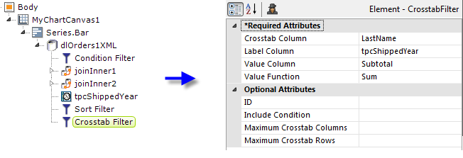
Here are the elements used for the cross-tabbed chart shown earlier:

In the example above, we see that a Series.Bar element has been configured. There are very few attributes needed, and you use the column the Crosstab Filter will generate, rdCrosstabValue, for the Y-axis Data Column attribute.

As shown above, a Time Period Column, a Sort Filter, and the Crosstab Filter have been added beneath the chart's datalayer.
The Sort Filter sorts the data on the employees' last names before the data is cross-tabbed. This puts the resulting bars in alphabetical order, left to right and, more importantly, ensures that the names are in alphabetical order in the legend. (The Legend element is not shown in the definition above).
The attribute values of the Crosstab Filter element are shown above and
you can see how they correlate to the resulting chart.
Adding a Legend
In other circumstances, entering a value in the Series element's Legend Label attribute causes a legend to be displayed and use of the Legend element beneath Chart Canvas is optional, for styling and formatting purposes only.
However, when working with a Crosstab Filter, values are automatically provided to the series for use with a legend (so you can leave the Legend Label attribute blank) but you must add a Legend element to actually display a legend.
The use of a Crosstab Filter with charts produces interesting charts that allow visual analysis in ways that are not otherwise possible.