Using AutoComplete
The AutoComplete element can be used to provide users with data-driven assistance when using Input Text and Input Email elements.


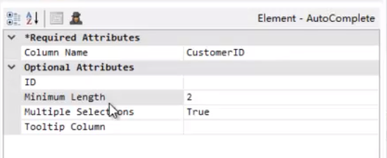
 When the user begins typing into the Input element, a drop-down list of values, shown above, will appear. The list will consist of values from the datalayer column identified in the Column Name attribute. Items in the list will be progressively filtered with each letter typed, and can be selected at any time. Users can configure the number of characters that they want to generate the drop-down list of values by entering a value in the Minimum Length attribute, shown below. In this example, a search would not return any values until 2 characters are entered into the Auto-Column box. This feature helps to increase performance and make searches more efficient by returning a limited set of search results.

When the AutoComplete element's Multiple Selections attributes is set to True, the user may enter or select multiple text items, which will appear in the Input element separated by commas. Items that have already been added to the Input will be automatically filtered out of the remaining choices. The default separator character for multiple selections is a comma. You may change this to another character by manually editing the element's XML source code, in Logi Studio's Source tab, to include an InputValueDelimited attribute and value. For example, this will set the delimiter to a semi-colon:
The resulting @Request variable created when the page is submitted will contain an individual value, or if multiple items have been entered/selected, a comma-separated list of values. Trailing commas will be removed automatically. For more information on parsing comma-separated lists for SQL queries, see Input Select List. The AutoComplete element includes a Tooltip Column attribute. Enter the name of a data column here to display a unique tooltip value for each data item.