Chart Grid Settings Panel
The Chart Grid Panel elements determine what data and which options are available to the user at runtime. Let's examine the panels:
Panel | Description |
|
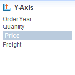
Links in this panel allow the user to select the data available in the datalayer that will be used for the charts' Y-axis values. Chart Y-axis labels only appear in the first chart column. The developer can limit the choices available here and can also designate an initial selection.
|
|
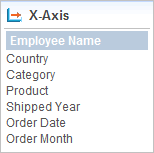
Links in this panel allow the user to select the data available in the datalayer that will be used for the charts' X-axis values. Chart X-axis labels only appear beneath charts in the bottom table row. The developer can limit the choices available here and can also designate an initial selection. |
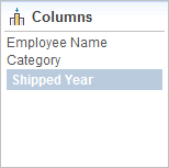
| Links in this panel allow the user to select the data column that will be used for the grid columns. Its distinct values will appear as grid column header text. |
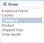
| Links in this panel allow the user to select the data column that will be used for the grid rows. Its distinct values will appear as grid row title text. |
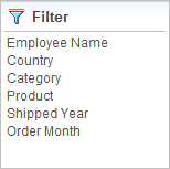
| Links in this panel allow the user to filter the complete dataset by selecting values to be included from a popup list of data values. |
|
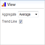
This panel contains dynamic content. When X-axis chart data is text-type data, it's automatically grouped and the Y-axis values aggregated before a chart is generated. The user may select the aggregating function in this panel. Options include Sum, Average, Count, Minimum, and Maximum. When X-axis chart data is numeric- or date-type data, the Aggregate select list is replaced with a Chart Type select list, allowing users to select between Line or Scatter
charts. This panel also allows the user to include a trend line on the charts. Columns with Null values are excluded by default. To include nulls, create the constant rdCalculationsIncludeNulls and set it to True. |
The report definition for a Chart Grid, with all its panel elements, looks like the example below:
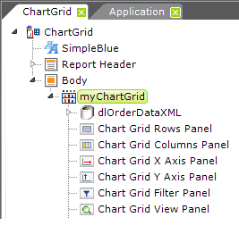
![]() Regardless of the arrangement of the elements, the panels will always be displayed in the browser above the grid.
Chart Grid Panel elements are not required. By default, if you leave them out, all panels will be displayed. To hide a panel, include its grid panel element and set its Show Panel attribute to False. This value can also be set using @Request and @Session tokens.
Each Chart Grid Panel element has an Allow ChartGrid Columns attribute, which specifies one or more Chart Grid Columns to be displayed in this panel. If no columns are specified, then all columns of the matching data type are displayed; multiple columns can be enumerated using a comma-separated list of Chart Grid Column element IDs.
Chart Grid Panel elements also have an Initial ChartGrid Column ID attribute, which specifies which Chart Grid Column will be selected when the grid is first displayed.
Regardless of the arrangement of the elements, the panels will always be displayed in the browser above the grid.
Chart Grid Panel elements are not required. By default, if you leave them out, all panels will be displayed. To hide a panel, include its grid panel element and set its Show Panel attribute to False. This value can also be set using @Request and @Session tokens.
Each Chart Grid Panel element has an Allow ChartGrid Columns attribute, which specifies one or more Chart Grid Columns to be displayed in this panel. If no columns are specified, then all columns of the matching data type are displayed; multiple columns can be enumerated using a comma-separated list of Chart Grid Column element IDs.
Chart Grid Panel elements also have an Initial ChartGrid Column ID attribute, which specifies which Chart Grid Column will be selected when the grid is first displayed.
