Aligning Input Elements
One challenge when working with Logi Studio is to get user input elements neatly aligned. The Input Grid element has been provided to assist you in doing this. The Input Grid is not an actual Input element but is instead a container for Input elements that lets you align them. It can be thought of as a two-column table with the first column containing the caption describing an Input element and the second column containing the Input element itself. Adding multiple rows allows a data input form to be created. The overall width of the table and the width of the caption column can be set using attributes.

In the example shown above, user input elements are placed in a report definition without using the Input Grid element. As you can see, the alignment of the elements on the page is poor and the captions are not vertically centered on the controls.

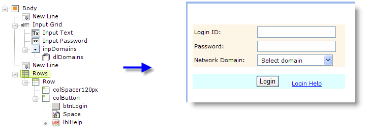
In the second example, above, the user input elements have been made the children of an Input Grid element and the resulting, more precise, layout on the page is evident. For the purpose of this example, the Input Grid element was assigned a style class that colored its background, so you can see it more clearly. Attribute settings have made the entire grid 300 pixels wide and the caption space 120 pixels wide. ![]() In this definition, New Line elements between the input elements
are no longer
necessary.
In this definition, New Line elements between the input elements
are no longer
necessary.

There are some limitations, however. No other elements, such as Buttons or Labels, for example, can be placed within the Input Grid. These elements need to be carefully placed outside the grid, in their own HTML table using Rows, Row, and Column Cell elements, as shown above, if similar alignment is desired. Once again, for clarity in the example, this table has been assigned a style class to give it a colored background.

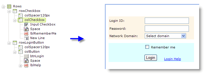
There are also times when you may wish to have the caption follow the control, rather than precede it. This can't be done within the Input Grid. Instead, as shown above, another row has been added to the table below the Input Grid and an Input check box element placed in it. The Input check box's Caption attribute has been left blank and a separate Label element provides the "caption" following the check box.
The Input Grid and HTML tables are useful elements for alignment. We've seen how you can combine them and there are a variety of combinations that can work. For example, if you create a one-row, two-column table first and then put an Input Grid into each column, you can even make a two column (or more) data entry form.
Alignment Using Style Classes
The user input elements typically have two attributes related to style sheet classes: one for the entire element and one for the caption. This allows, for instance in an Input Select List, the font for the caption and the list items to be set to a certain font and size and the caption only to be set to bold.

It also allows other style selectors, such as padding, to be applied to the caption to align it correctly. For example, in the horizontal arrangement of radio buttons shown above, padding-right: 3pxcan be applied to the Caption to increase the space between each caption and the next button.

The default alignment for the caption of a Input Text Area element is centered vertically, as shown above left. This may not look very good in a stack of input elements, so the vertical-align: top;style selector can be applied to position the caption at the top of the input box. These are just a few examples of the many things that can be done using style classes. Be sure to distinguish between situations where style classes need to be applied to the elements themselves and to the objects that contain the elements, such as an Input Grid or HTML Table.