Input Radio Buttons
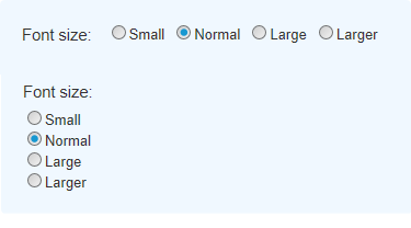
The purpose of this element is to provide at least two "radio buttons", small circles with captions. They are "mutually exclusive": only one radio button in a group can be selected at a time. The buttons can be arranged horizontally or vertically.

Using It
This element requires a datalayer to provide the items that will appar as button options. One button will be displayed for each record in the datalayer. If list of options is short and unchanging, the DataLayer.Static element can be used to "hard code" the options. If the list is longer, the DataLayer.XML element can be used to read the data from an XML file. If the options are dynamic, elements such as DataLayer.SQL can be used to retrieve the items from a datasource, possibly with grouping to provide unique values.
If the datasource provides one, the value passed to the next Report or Process task can be different from the displayed text. The control automatically sizes itself to accommodate the displayed text.
The element has many of the attributes common to all Input elements and also these additional attributes:
| Attribute | Description |
|---|---|
Caption Column | (Required) Specifies the name of the datalayer column that contains the text to be displayed beside the radio buttons. This text is always displayed to the right of the button. In order to display text to the left, leave this attribute blank and precede the element with Label and Space elements. |
Value Column | (Required) Specifies the name of the datalayer column that contains the value to be passed to the next report or process task. For example, if the "Larger" radio button is selected in the list, the value "4" might be passed to the next report. This allows the flexibility to display and pass different values and even different types of values, such as numbers. |
Default Value | Specifies which radio button will be selected by default; enter the actual the value (from the "Value" column), not the displayed text, in order to set this. Can be used with @Request tokens passed from another report or a process task, or other tokens. |
Radio Button Direction | Specifies the physical arrangement of the radio buttons: in a horizontal (Across) or vertical (Down) layout, as shown in the image above. |
Tooltip Column | Specifies the name of an optional column in the datalayer that contains explanatory text to be displayed as a tooltip unique to each radio button. |
This element can be used by itself or within an Input Grid element to make alignment with other Input elements easier.
![]() This element cannot be used beneath a Data Table element, so you cannot display radio buttons inside table columns.
This element cannot be used beneath a Data Table element, so you cannot display radio buttons inside table columns.
Getting Its Data
The value (from the "Value" column) associated with the selected radio button (from the "Caption" column) is available in the next Report or Process with an @Request token. For example, if the element's ID is set to radFonts then the token @Request.radFonts~will equal that value.
If there is no default selection and no radio button is selected and the page is submitted, then this @Request token will not exist. This is an important distinction to note when creating conditional processing that evaluates this token.
More Information
For additional information, see the Element Reference entry for Input Radio Buttons.