Using Responsive Visibility
The Responsive Visibility element can be the child of a variety of other elements and, as its name implies, it controls their visibility. Developers can use its attributes to specify which viewport sizes cause the parent element to be hidden from view.

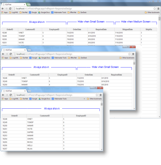
In the example above, Data Table Columns elements have been given child Responsive Visibility elements and, as the browser window gets progressively smaller, additional data table columns are hidden.
Implementation
Here's an example showing how the element discussed above is used:

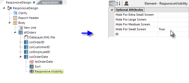
In the example shown above, a Responsive Visibility element has been added as a child of a Data Layer Column element. Its attributes are set as shown. The column will not be displayed for Small Screen size viewports.

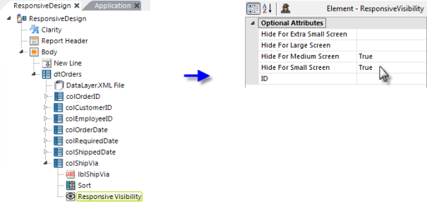
Now we've added more data table columns and another Responsive Visibility element.
![]() If you decide to hide an
element at a larger viewport size, you will most likely also want to hide
it at smaller sizes, otherwise it will disappear then reappear for
progressively smaller viewports.
If you decide to hide an
element at a larger viewport size, you will most likely also want to hide
it at smaller sizes, otherwise it will disappear then reappear for
progressively smaller viewports.