Using Responsive Rows and Columns
Logi applications have long had Rows, Row, and Column Cell elements available for construction of an HTML table object as a container for content. The Response Row and Responsive Column elements provide similar functionality but also dynamically resize to accommodate viewport sizes.

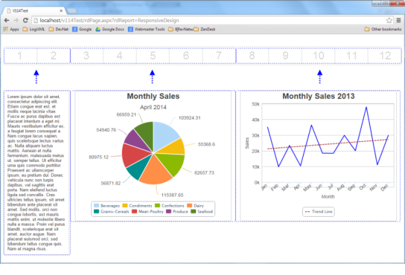
The Responsive Row element adds a "fluid grid" to the report page, as shown above, which fills 100% of the width of its parent element. The grid consists of 12 columns. This is similar to grids found in the Bootstrap and Foundation frameworks.

The Responsive Column element is a child of Responsive Row and is the container for column contents. Developers can configure how many grid columns each Responsive Column will span for each viewport size (or whether it will be displayed at all). In the example shown above, there are three Responsive Columns and, for the Large Screen viewport, they span two, five, and five Responsive Row grid columns. Normally these two elements are transparent, without borders or background color, though they can be styled.

In the example above, we see how content fits into the Responsive Column elements and how they span the grid in a Large Screen viewport.

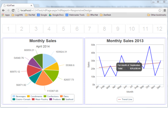
Notice what happens when the viewport width is changed to a Medium Screen size: the Responsive Row grid columns get proportionally smaller, as shown above. Responsive Column elements can be configured by the developer to react when the viewport window gets smaller, too. In this case, the first column is no longer visible at all and the other two now span six Responsive Row grid columns each.

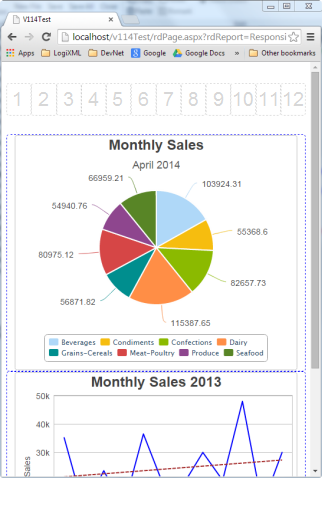
And, finally, as the viewports gets even smaller, the Responsive Column elements can be configured to span all the Responsive Row grid columns, as shown above, producing a "stacked" appearance.
Implementation
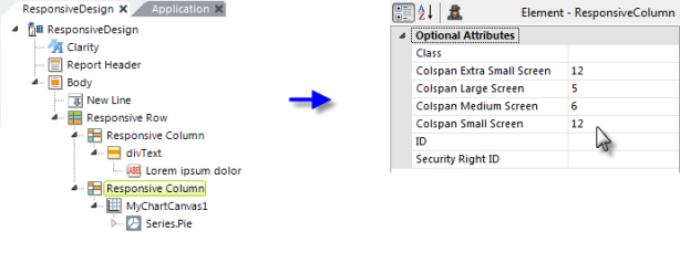
Here's an example showing how the elements discussed above are used:

The Responsive Row element can be the child of a variety of other elements. In the example above, it's been added directly beneath the Body element. It has no required attributes.
However, take note its Collision Behavior attribute. Responsive Row content works best when it dynamically shrinks and grows to fit the column width. Normally, report developers should give Responsive Column elements enough width so that the content fits. But there are times when, as the viewport gets smaller, content just can't shrink enough to fit. For example, a data table can only become so small or an image may have a fixed width. The Collision Behavior attribute specifies what to do when Responsive Columns "collide" in different viewport sizes because their contents can't shrink appropriately. Attribute value options include
- HorizontalScrollbar - (the default) displays a horizontal scroll-bar and some of the content is out of view.
- Wrap - moves the Responsive Column down to the next row.
- Overlap - makes the contents overlap each other.

Next, you need to add one or more Responsive Column elements to the definition. It has no required attributes.
Its Colspan attributes are used to specify how many Responsive Row grid columns each Responsive Column should span, for each viewport size. With a value of 12, the Responsive Column will span the entire grid, while a value of 0 will cause it to be hidden. In the example above, this column will only be visible for Large Screens, where it will span two grid columns.
![]() If you specify a value for a larger viewport size, make sure you
also specify values for smaller viewport sizes or you may get a surprise
when a smaller viewport is used.
If you specify a value for a larger viewport size, make sure you
also specify values for smaller viewport sizes or you may get a surprise
when a smaller viewport is used.
If more than 12 Responsive Column elements are used, they'll be wrapped into another row below the first 12 elements when displayed.

Another Responsive Column element example is shown above. Its Colspan attributes are set to produce the behavior seen in the examples at the beginning of this topic.
![]() You cannot refresh Responsive Row and
Responsive Column elements directly by specifying their IDs in an
Action.Refresh Element element. However, you can enclose the entire
table in a Division and refresh it, or place the Responsive Column's child
elements in a Division and refresh it.
You cannot refresh Responsive Row and
Responsive Column elements directly by specifying their IDs in an
Action.Refresh Element element. However, you can enclose the entire
table in a Division and refresh it, or place the Responsive Column's child
elements in a Division and refresh it.