Add Filtering Widgets to the Dashboard
The dashboard editing tool includes several built-in filtering widgets and they can be added to a dashboard and configured to filter one or more visualization widgets. To add filtering widgets to a dashboard, open the built-in widgets panel and find one of widgets you want to use.
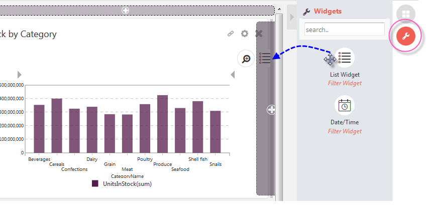
In the example shown above, the List Filter Widget is being dragged onto a drop zone in the dashboard.
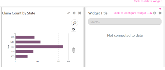
The widget will expand in place and can be moved, resized, and deleted just like other widgets. Click its gear icon to open its settings panel:
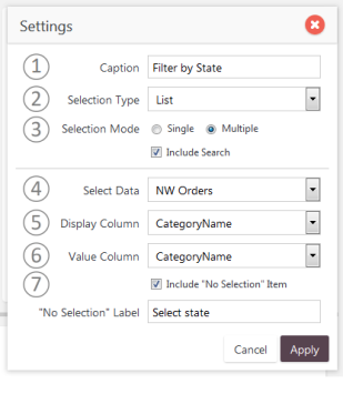
Configuration options will vary by filter widget type, but the example above is typical. The options above include:
- Caption - Specifies the caption that will appear for this widget.
- Selection Type - Specifies whether the filtering values will be appear in a simple list, filling the panel, or a drop-down list.
- Selection Mode - Specifies whether multiple filtering values can be selected, and whether a search feature is available.
- Select Data - Specifies the Dataview whose data will be filtered.
- Display Column - Specifies the data column that will supply text shown in the selection list.
- Value Column - Specifies the data column that will be targeted by the filtering.
- Include "No Selection" - Specifies if the list will include a "blank" entry and, if so, what its text will be.
Click Apply to save the filter configuration. Once the filter has been configured, a new icon for connecting the filter to visualization widgets will appear at the top:
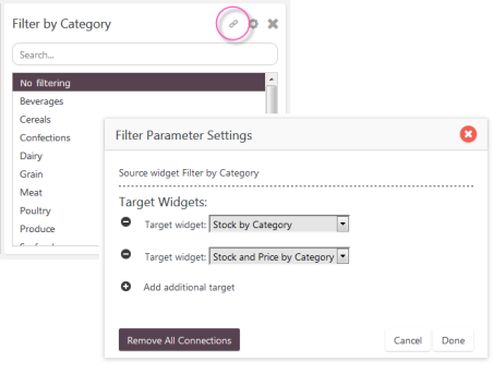
Click the Link icon, circled above, to open the Filter Parameter Settings panel, which is where you select the visualization widgets that will be filtered. Use the ![]() icons to add and remove target widgets. The list of target widgets only includes those that have been created using the same Dataview as the one specified for this filter. Click Done when ready.
icons to add and remove target widgets. The list of target widgets only includes those that have been created using the same Dataview as the one specified for this filter. Click Done when ready.
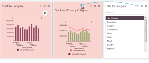
A faster way to select target widgets is to use the Blue Dot Connecter, as shown above, to make the connections. The visualization widgets available for filtering (those using the same Dataview) will temporarily turn pink as you start to drag the Blue Dot. Once connections have been made, the Link icon will turn red.
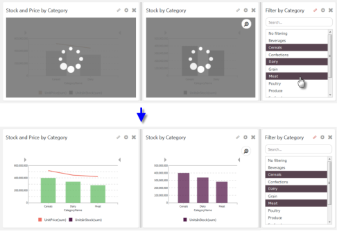
As you select Category filter values, they're applied to all of the visualization widgets linked to the filter, as shown above.