Change the Theme
Your data table report is using the Signal theme, which was configured in the Hello World application's _Settings definitionby default when it was created. However, you can experiment with other themes by assigning them to this report definition.
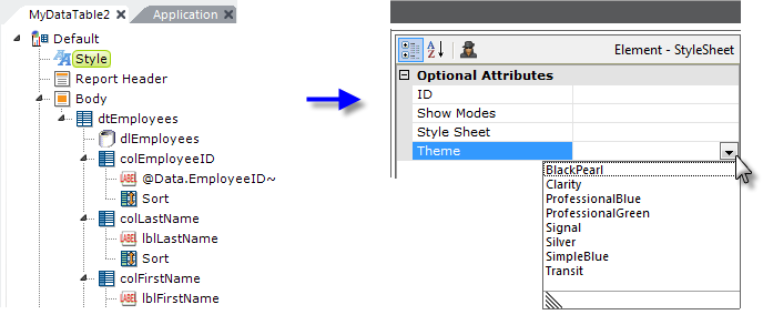
In your definition, select the report root element and add a Style element at the top of your definition, as shown above, Then select it and, using its drop-down list of choices, set the Theme attribute to something other than Signal.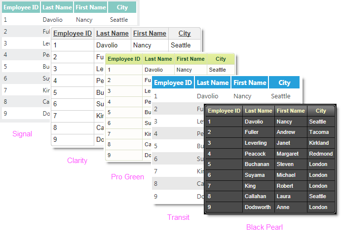
Now preview the report and see what you get. Try a few other themes to see how they differ.
Themes are pre-configured settings and scripts that impart a specific look to the definition. They can be applied, as you did here, at the report definition level or, for the entire application, in the _Settings definition.
Finally, here are a few things to explore on your own:
- Examine the Label elements to ensure you understand how an @Data token relates to a column of data.
- Select any Data Table Column element, right-click it, and select Remark.
 The element and all of its child elements now appear in a different color in the definition and, when you preview the report, that column is no longer visible.
Congratulations on completing this Data Table Tutorial.