Tooltip Panel Element
The Tooltip Panel element is a flexible option for including more complex tooltips. This topic describes how to add a panel element.
You can add the Tooltip Panel element as a child beneath these elements:
- Button
- Column Cell
- Data Table Column
- Division
- Image
- Label
As an element, the Tooltip Panel can have a variety of child
elements, allowing you to get more creative with what you include in the
tooltip.
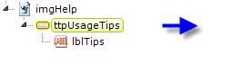
The example above shows an Image element with a
Tooltip Panel element placed beneath it, with a child
Label element. The Tooltip Panel has a full set of attributes that
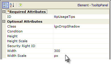
can be used to customize the tooltip. Let's see what it can look like:
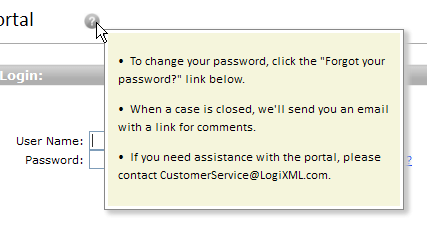
In the example shown above, we see a Tooltip Panel that appears when the mouse cursor hovers over the "help" icon. Style has been used to color the panel background and give it a drop shadow, and the child Label element has been set to HTML format so that the help text will be displayed as an unordered list with bullets.
 The Tooltip Panel element has Condition and
Security Right ID attributes, so its appearance can be controlled
dynamically. For example, separate sets of tooltips for different users
are possible.
The Tooltip Panel element has Condition and
Security Right ID attributes, so its appearance can be controlled
dynamically. For example, separate sets of tooltips for different users
are possible.
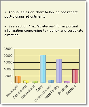
A variety of elements, including Charts, Gauges, Images, SubReports, and others, can be included as children of the Tooltip Panel, as shown in the example above, giving you the opportunity to make your tooltip contain more than just text.