Charts
Charts are an essential tool for business intelligence and Logi JReport provides access to more than 40 different chart types and styles. In addition to the standard chart types like bar, line, pie and scatter charts, Logi JReport also allows you to work with more advanced charts including back to back, heat map, bullet, spark line, bubble, gauge, donut and other charts. Logi JReport supports the option to use live charts including motion, scrollable, and real time charts that let you dynamically view data trends over time. Motion charts use auto-playable parameters to show, for example, month-by-month changes over the course of a year for easy analysis of historical data. Scrollable charts are useful when there is too much data to be viewed at once and let you zoom into a subset of data. Furthermore, real time charts display live, incremental data that is automatically updated to reflect changes. Real time charts are used for monitoring application metrics, system performance, or other real time data sources.
The following shows some chart examples. For more detailed information about working with the Chart component in Logi JReport,select here.
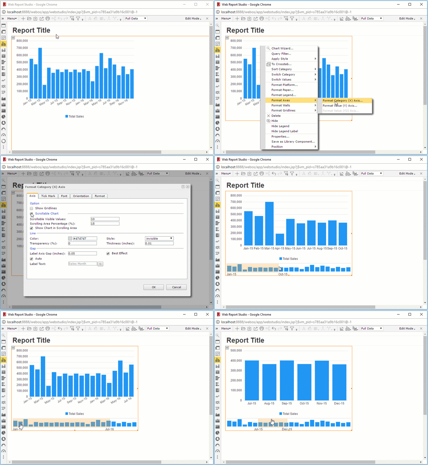
Scrollable Charts
In a scrollable chart, values displayed on the chart are not fixed. A scrollbar on the scrollable chart can help you to control the visible value range on the X axis of the chart. This is often used where the X axis is a date or a time such as stock quotes; however, it can be used with any type of value. As shown below, any time the number of categories becomes too large to be easily identified on the screen, consider adding a scrollable option.

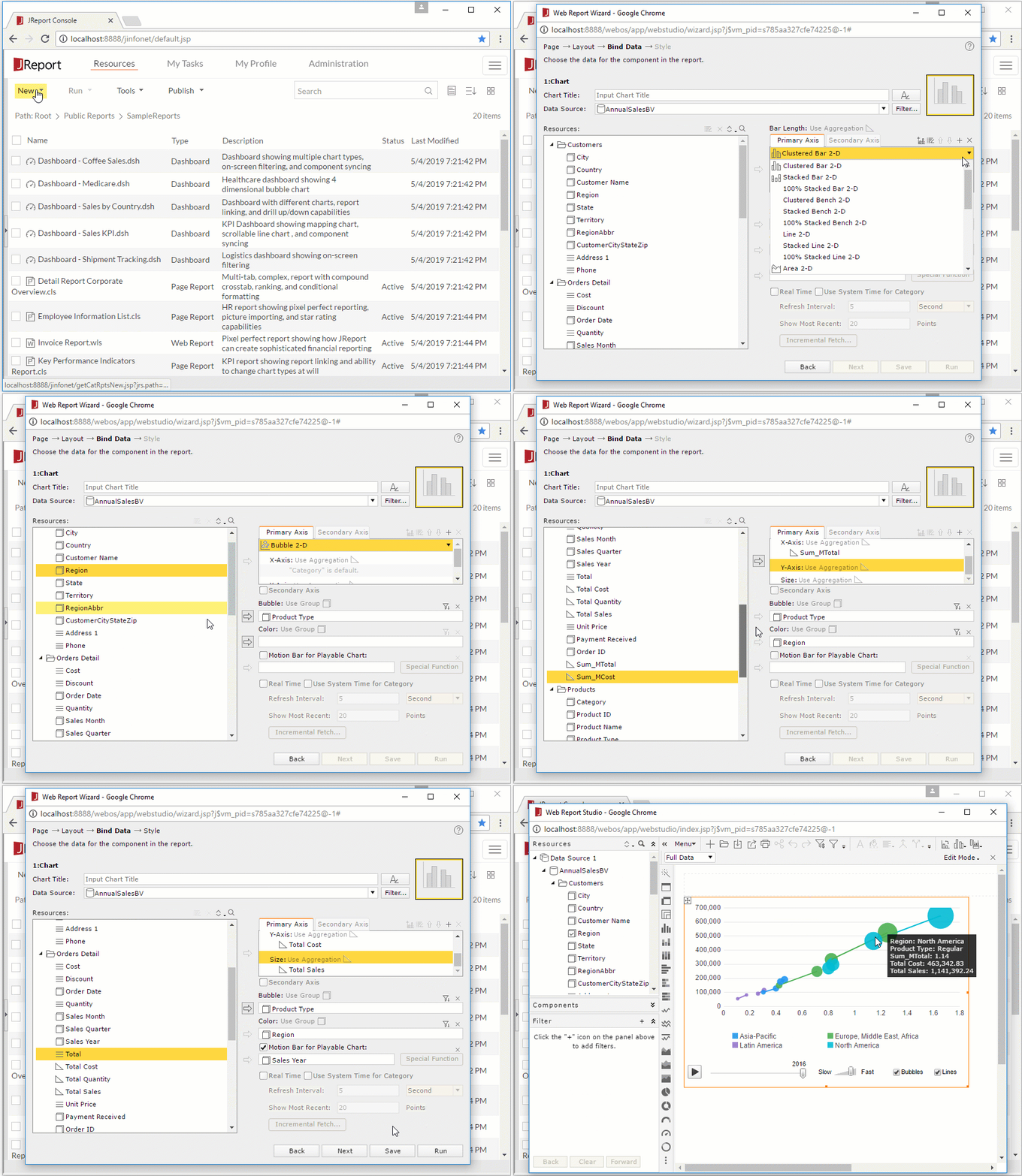
Motion Charts
You can make a chart move at runtime based on the value changes of a motion field by creating a motion chart. In a motion chart, the chart is playable. You can start or stop the chart to play the dynamic trend of the motion field, control the moving speed of the chart, and if you create a bubble motion chart, you can even use a trail control to make the chart move showing a bubble or line trail.

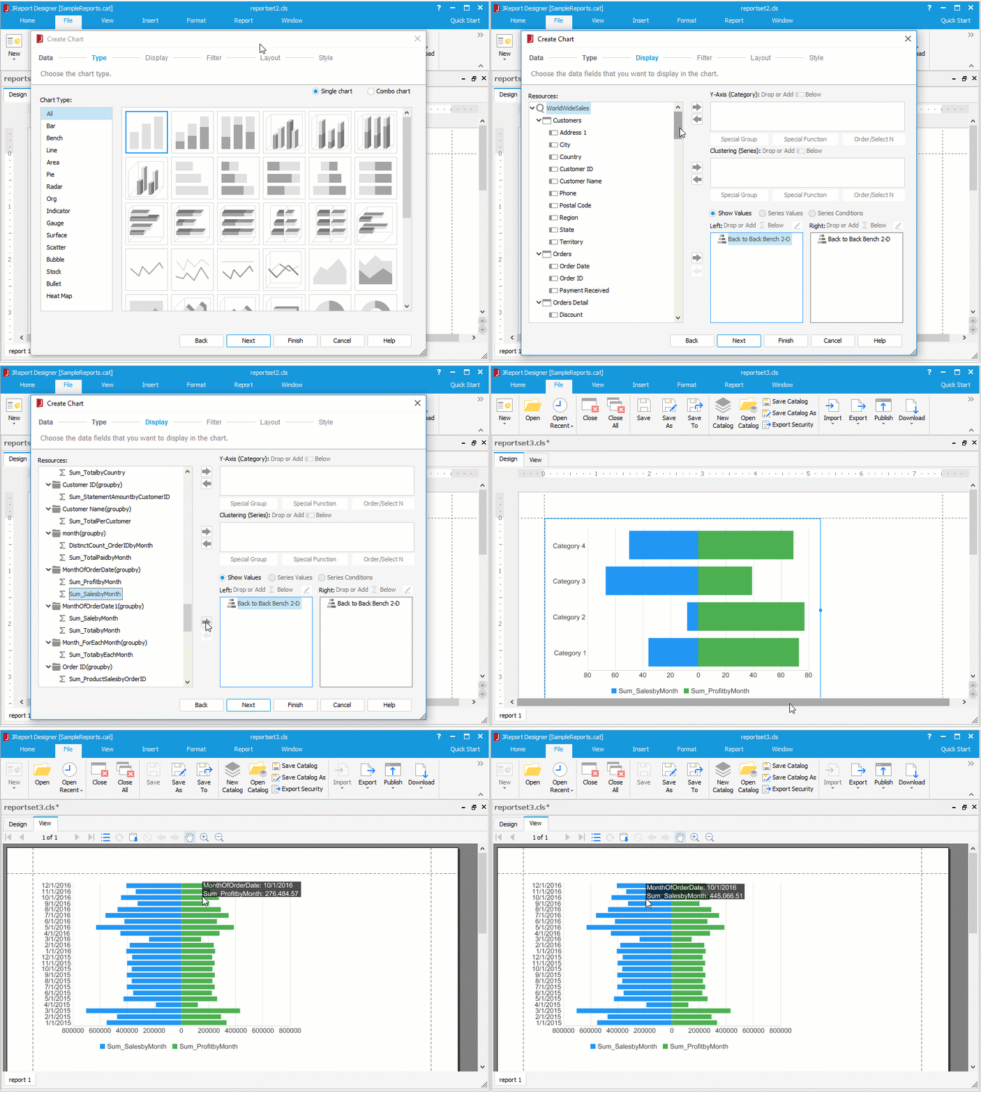
Back-to-Back Bench Charts
Back-to-back bench charts are used for comparing values on the value axis. It displays and compares the contribution of each data value on the origin left and origin right across categories. It is supported on page report only and contains four sub types:
- Back to Back Bench 2-D
Displays and compares the contribution of each data value in two groups across categories. - 100% Back to Back Bench 2-D
Displays and compares the percentage that each data value contributes in two groups across categories. - Back to Back Bench 3-D
Back-to-back bench with a 3-D visual effect. - 100% Back to Back Bench 3-D
100% back-to-back bench with a 3-D visual effect.


