To Crosstab Dialog Box Properties
You can use the To Crosstab dialog box to specify settings for converting a chart into a crosstab. This topic describes the options in the dialog box.
This topic contains the following sections:
Back
Returns to the previous tab.
Next
Goes to the next tab.
OK
Applies the settings and closes the dialog box.
Cancel
Cancels the settings and closes the dialog box.
Help
Displays the help document about this feature.
Display Tab Properties
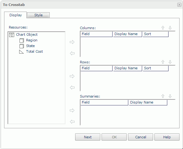
This tab enables you to set the data fields that you want to display in the crosstab.

Resources
Displays the view elements used in the chart.

Adds the selected view element to the crosstab.

Removes the selected view element.
Columns/Rows
Lists the group objects  that will be displayed on the column/row headers of the crosstab.
- Field
Lists the group objects that you selected to display in the crosstab. - Display Name
Specifies the text of the labels for the column/row headers. You can select the text boxes to edit the label text, or select the Auto Map Field Name check boxes beside the text boxes to automatically map the label text to the dynamic display names of the objects. - Sort
Specifies how the selected group objects will be sorted.
Summaries
Lists the aggregation objects  that will be the aggregate fields of the crosstab.
- Field
Lists the aggregation objects that you selected to display in the crosstab. - Display Name
Specifies the text of the labels for the aggregations. You can select the text boxes to edit the label text, or select the Auto Map Field Name check boxes beside the text boxes to automatically map the label text to the dynamic display names of the objects.
 Move Up button
Moves the selected view element higher in the list.
 Move Down button
Moves the selected view element lower in the list.
Style Tab Properties
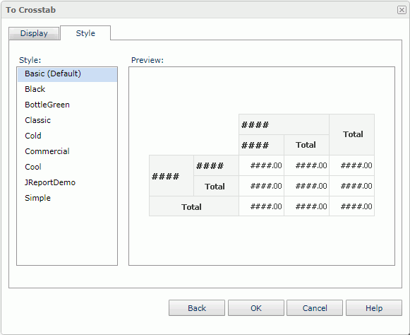
This tab enables you to select a style for the crosstab. It is hidden when there is only one style available.

Style
Lists the styles applicable to the component.
- Custom
There is no style information in this style. Logi Report only uses it to support reports that were created in previous versions when they did not bind any style or their bound styles are not in the style list.
Preview
Displays a diagram to illustrate the effect of the selected style on the component.
Inherit Style
Specifies to take the style of the parent component. The option is available when the chart is in a table or banded object.
 Previous Topic