Formatting the Axes
A chart may contain the following axes: category axis, value axis and series axis (pie, indicator, heat map and organization charts do not have axes). This topic introduces how to format each axis in detail.
Formatting the Category Axis
- Right-click any chart element and select Format Axes > Format Category (X) Axis on the shortcut menu to bring up the Format Category (X) Axis dialog.
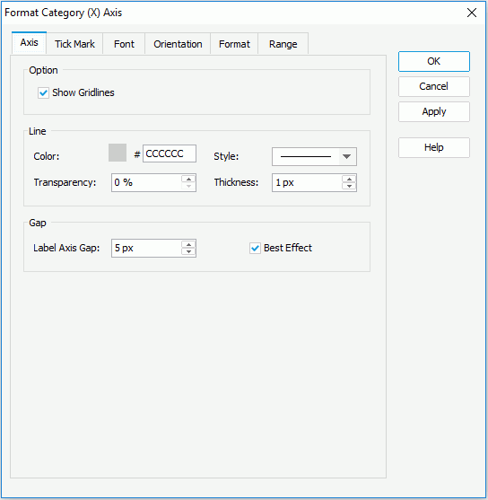
- In the Axis tab, specify settings for the axis.
In the Option box, specify whether to show gridlines perpendicular to the axis, and if necessary, check Show Gridlines. When creating a scatter chart or the axis is used to show numeric data of a bubble chart, you can also specify the maximum and minimum values to be displayed and the difference between two adjacent values on the axis, and the number of tick marks to be shown on the axis.
In the Line box, set the line color, style, transparency, and thickness of the axis (to change the color, select the color image and select a color from the color palette or input the hexadecimal value of a color directly in the text box).
In the Gap box, set the gap between the labels and the axis, and check Best Effect to draw the axis labels for the best result effect.
- Go to the Tick Mark tab to specify properties for the tick marks.
- In the Major Tick Mark and Minor Tick Mark sub tabs, set properties of the major and minor tick marks respectively.
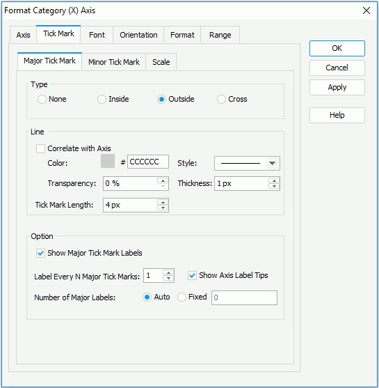
In the Type box, specify whether to show the tick marks and their position which can be inside/outside the chart or across the axis.
In the Line box, specify the color, style, transparency and thickness of the tick marks. If you want to use the same line setting as that of the axis for the tick marks, check Correlate with Axis. Then specify the length of the tick marks.
In the Option box, specify whether to show the tick mark labels. When the tick mark labels are shown on the axis, you can control the frequency at which the tick marks will be labeled, whether to display the complete label text when the mouse pointer points at a label on the axis, and the number of the tick mark labels to be displayed on the axis.
- In the Scale sub tab, check Use Constant Interval to label the major and minor tick marks with constant intervals and specify the minimum and maximum values used to label the tick marks, and the unit between two adjacent tick marks. Then the values for the tick marks will be increased continually based on the specified interval instead of just using values from database. This handles cases where data is missing such as weekend days may not show any activity but still need to be shown in the chart. This sub tab is available only when the field on the category axis is one of the following types: Number, Date, DateTime, and Time, and not applied to scatter charts or when the category axis is used to show numeric data in bubble charts. For additional information, see the example in Labeling Time Series Data by Constant Interval.
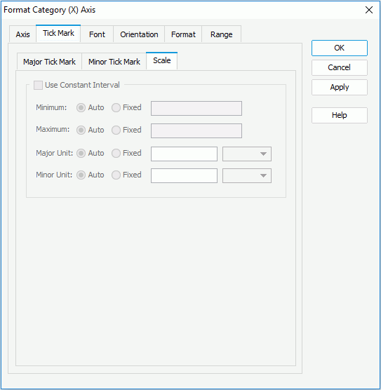
- In the Major Tick Mark and Minor Tick Mark sub tabs, set properties of the major and minor tick marks respectively.
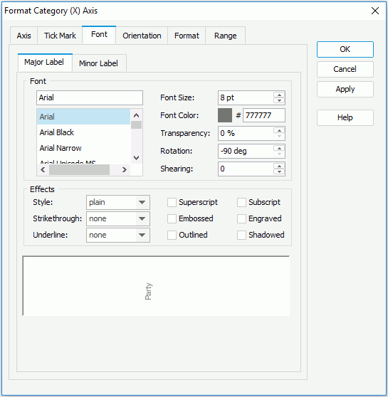
- In the Font tab, format the font of the major and minor tick mark labels respectively, including the font face, size, color, transparency, rotation angle, shearing angle, and effects such as style, strikeout, underline and so on. If you want to apply the font setting of the major tick mark labels to the minor tick marks, check Correlate with Major Label in the Minor Label sub tab.
- In the Orientation tab, set the angles for the major and minor tick mark labels respectively so as to rotate them. You can either drag the Text hand in the Orientation box or type a value in the Angle spinner to perform the operation. You can also make the minor tick marks take the same orientation setting as that of the major tick marks.
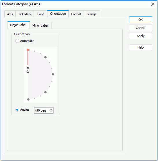
- In the Format tab, specify the data format of the major and minor tick mark labels respectively.
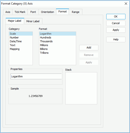
Select a category from the Category box, then select a format from the Format box and select Add to add it to the Stack box. If the formats listed in the Format box cannot meet your requirement, define the format in the Properties text field and select Add to add it as the format of the selected category. You can add more than one format, while for each category, only one format can be added. In the event that a format is not necessary, select it in the Stack box select Remove to clear it.
To make the minor tick mark labels apply the format setting of the major tick marks, check Correlate with Major Label in the Minor Label sub tab.
- In the Range tab, you can divide the category values into different range groups and edit data labels for them. For details, refer to Editing Range Groups on Category Values.
- For a chart in a library component, you can define web behaviors on its axis in the Behaviors tab.
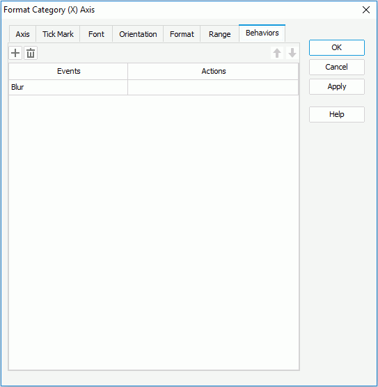
Select a trigger event from the drop-down list in the Events column, then select in the Actions column and select
 that appears in the text box to open the Web Action List dialog, where you can bind a web action to the axis which will be triggered when the specified event occurs on the axis. The web actions you can bind include Filter, Sort, Parameter, Property and SendMessage. For details about these web actions, refer to Applying Web Actions to a Label.
To add a web behavior line, select
 , and if a web behavior is not required, select
  to remove it.
 Select
 or
or  to adjust the order of the behaviors. Then, when an event that has been bound with more than one action happens, the upper action will be triggered first.
 - When done, select OK to accept the changes.
See also the Format Category (X) Axis dialog for report, or library component for detailed explanation about options in the dialog.
Formatting the Value Axis
- Right-click any chart element and do either of the following:
- Select Format Axes > Format Value (Y) Axis on the shortcut menu to bring up the Format Value (Y) Axis dialog.
- Select Format Axes > Format Value (Y2) Axis on the shortcut menu to bring up the Format Value (Y2) Axis dialog for a combo chart.
Take Format Value (Y) Axis dialog for example.
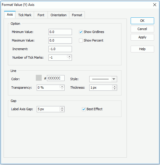
- In the Axis tab, specify settings for the axis.
In the Option box, specify the maximum and minimum values to be displayed and the difference between two adjacent values on the axis, the number of tick marks to be shown on the axis, and whether or not to show the value labels on the axis in percent. If you want to show gridlines perpendicular to the axis, check Show Gridlines.
In the Line box, set the line color, style, transparency, and thickness of the axis (to change the color, select the color image and select a color from the color palette or input the hexadecimal value of a color directly in the text box).
In the Gap box, set the gap between the labels and the axis, and check Best Effect to draw the axis labels for the best result effect.
- In the Tick Mark tab, specify properties of the major and minor tick marks respectively.
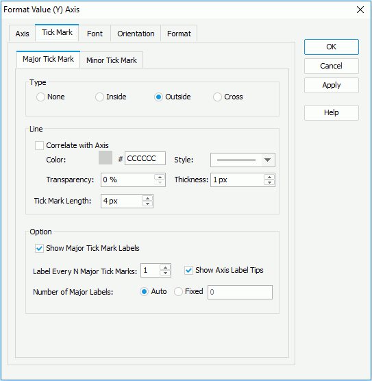
In the Type box, specify whether to show the tick marks and their position which can be inside/outside the chart or across the axis.
In the Line box, specify the color, style, transparency and thickness of the tick marks. If you want to use the same line setting as that of the axis for the tick marks, check Correlate with Axis. Then specify the length of the major/minor tick marks.
In the Option box (only available for minor tick marks), specify whether to show the major tick mark labels. When the major tick mark labels are shown on the axis, you can control the frequency at which the major tick marks will be labeled, whether to display the complete label text when the mouse pointer points at a label on the axis, and the number of the major tick mark labels to be displayed on the axis.
- In the Font tab, format the font for text in the major tick mark labels on the axis, including the font face, size, color, transparency, rotation angle, shearing angle, and effects such as style, strikeout, underline and so on.

- In the Orientation tab, set an angle for the major tick mark labels on the axis so as to rotate them. You can either drag the Text hand in the Orientation box or type a value in the Angle spinner to perform the operation.
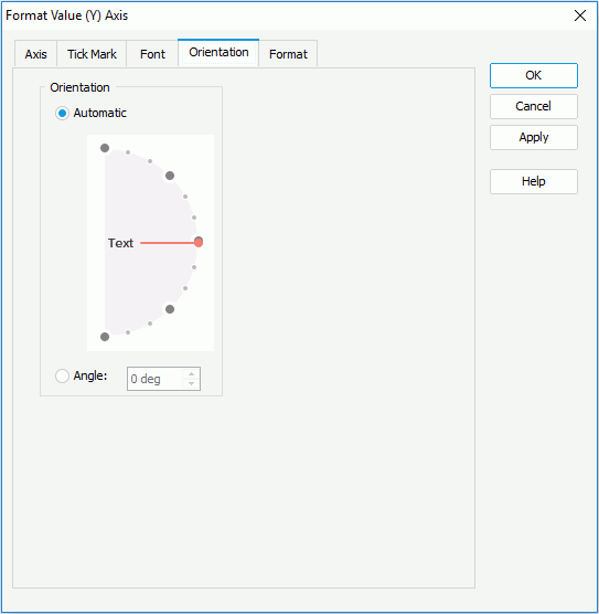
- In the Format tab, specify the data format of the major tick mark labels on the axis.
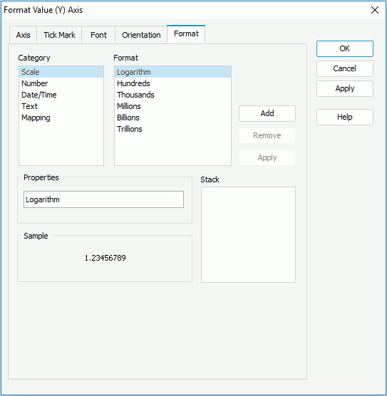
Select a category from the Category box, then select a format from the Format box and select Add to add it to the Stack box. If the formats listed in the Format box cannot meet your requirement, define the format in the Properties text field and select Add to add it as the format of the selected category. You can add more than one format, while for each category, only one format can be added. In the event that a format is not necessary, select it in the Stack box select Remove to clear it.
- When done, select OK to accept the changes.
Formatting the Series Axis
- Right-click any chart element and select Format Axes > Format Series (Z) Axis on the shortcut menu to bring up the Format Series (Z) Axis dialog.
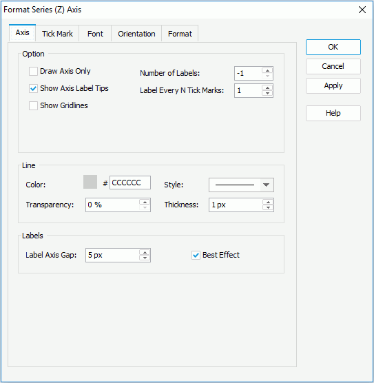
- In the Axis tab, specify settings for the axis.
In the Option box, specify whether or not to only draw the axis (hide the labels), and if not, specify the number of labels to be shown along the axis, the frequency at which the axis will be labeled, whether or not to display the label text when the mouse pointer points at a label on the axis. If you want to show gridlines perpendicular to the axis, check Show Gridlines.
In the Line box, set the line color, style, transparency, and thickness of the axis (to change the color, select the color image and select a color from the color palette or input the hexadecimal value of a color directly in the text box).
In the Labels box, set the gap between the labels and the axis, and check Best Effect to draw the axis labels for the best result effect.
- In the Tick Mark tab, specify properties of the tick marks.
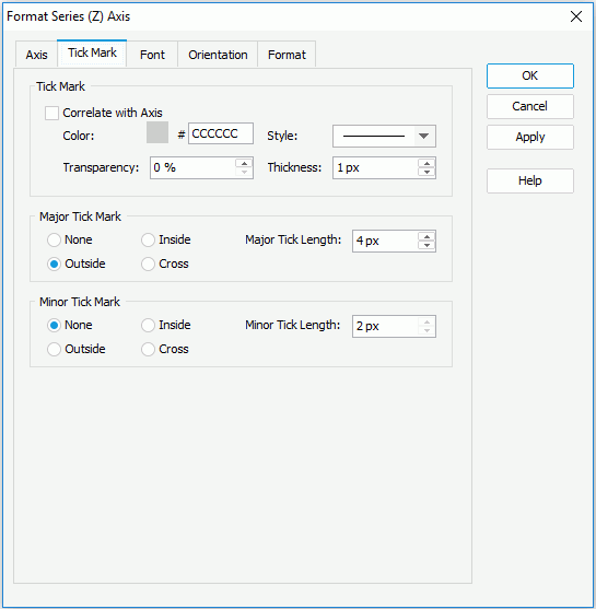
In the Tick Mark box, specify the color, style, transparency and thickness of the tick marks. If you want to use the same line setting as that of the axis for the tick marks, check Correlate with Axis.
In the Major Tick Mark and Minor Tick Mark boxes, set properties for the major and minor tick marks respectively, including whether to show these marks, the position, and length of the marks.
- In the Font tab, format the font for text in the major tick mark labels on the axis, including the font face, size, color, transparency, rotation angle, shearing angle, and effects such as style, strikeout, underline and so on.
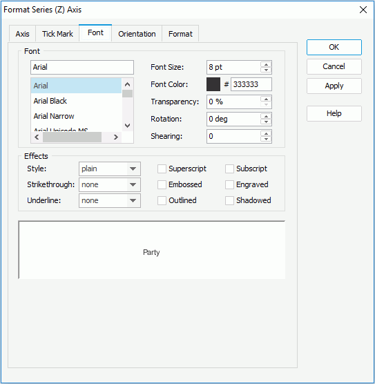
- In the Orientation tab, set an angle for the major tick mark labels on the axis so as to rotate them. You can either drag the Text hand in the Orientation box or type a value in the Angle spinner to perform the operation.

- In the Format tab, specify the data format of the major tick mark labels on the axis.

Select a category from the Category box, then select a format from the Format box and select Add to add it to the Stack box. If the formats listed in the Format box cannot meet your requirement, define the format in the Properties text field and select Add to add it as the format of the selected category. You can add more than one format, while for each category, only one format can be added. In the event that a format is not necessary, select it in the Stack box select Remove to clear it.
- When done, select OK to accept the changes.
 Previous Topic