Print Dialog Box Properties
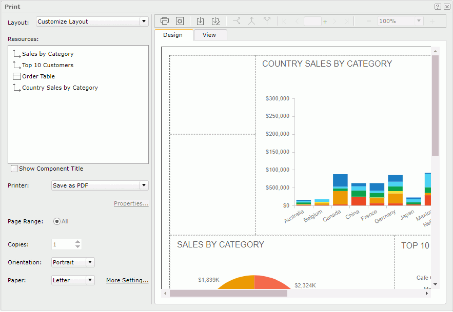
Use the Print dialog box to print one or more library components in a dashboard in the same format. This topic describes how to customize component layout and page properties for printing.
Server displays the dialog box after you select the Print button  on the toolbar or select the Options button
  on the toolbar and then select Print.

Layout
- System Layout
Server calculates the layout based on the position of the printable library components in the current dashboard. Server displays the preview result of the system layout on the right. You can decide the components to print and their printing order in the Resources box. - Customize Layout
Select if you want to rearrange the layout of the library components you would like to print using a tabular. You can customize the layout in the Design tab and preview it in the View tab. - Other customized layouts you saved
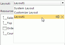
Server also lists the layouts that you have saved for selection. You can do further modifications to them. For each of the customized layouts, you can edit its name or delete it using the two buttons - Rename and Delete - that display on the right when you hover over the layout item on the drop-down list.
Resources
- For System Layout
Select the library components you are going to print and customize their printing order.By default, Server prints all printable library components. You can clear the library components that you don't want to print.
The display order of the library components defines the order in which Server prints them. You can select the two buttons
 and
and  to adjust the printing order.
 - For Customize Layout
Server displays all the printable library components in the dashboard. You can drag the components from the Resources box to the Design tab to customize the layout.
Show Component Title
Select to display the library component titles in the printed output.
Printer
Select the printer with which you want to print the library components. Server displays the printers that the web browser can access, that is, the virtual printers in the Printer list vary according to the operating system and the web browser you are using. If you want to export the output to a PDF or HTML file and then use your local printer to print the file, select Save as PDF or Save as HTML.
Properties
Select to open the Printer Properties dialog box to update the printing properties for a printer.
Page Range
Server prints all the pages.
Copies
Select the number of copies you want to print. The number of copies will take effect on the specified pages. Server disables this property when you select Save as PDF or Save as HTML.
Orientation
Select the orientation for the printed result.
- Portrait
Select to print the result in a standard letter orientation. - Landscape
Select to print the result in a landscape orientation.
Paper
Select the type of paper for printing the result.
More Setting
Select to open the Page Setup dialog box to specify page size and margin for the printed result.
 Print button
Select to start printing. If you have selected Save as PDF or Save as HTML in the Printer drop-down list, Server opens the output file of the library components in an associated program with which you can print the output to a printer.
 Page Setup button
Select to open the Page Setup dialog box to specify the page properties of the output file.
 Save button
Select to save the changes to an existing layout or open the Save As dialog box if you are creating a new layout. Server displays the layouts that you saved in the Layout drop-down list for applying. Other users will also be able to see and use the layouts that you saved when they open the same dashboard.
 Save As button
Select to open the Save As dialog box for saving a new layout with a name or saving an existing layout with another name.
Buttons for managing tabular cells
You can see the following buttons when it is not System Layout and use them for customizing the layout in the Design tab.
 Horizontal Split button
Select to split a cell into two horizontal cells. When there is a library component in the cell, Server places it in the upper cell after the splitting. Merge button
Select to merge the adjacent cells that form a rectangle into one cell. When there is more than one library component in the cells, you cannot merge the cells. Vertical Split button
Select to split a cell into two vertical cells. When there is a library component in the cell, Server places it in the left cell after the splitting.
Design tab
You see the Design tab when it is not System Layout. It is where you customize the component layout. Logi Report decides the page size according to the page setup properties and the ratio setting. A tabular fulfills the page printable area for holding a library component in each cell. Split or merge the cells, and then drag library components from the Resources box into the cells into customize the layout.
By default, for tables and crosstabs, Logi Report only prints their current data view as displayed in the dashboard. For example, if a table contains 10 pages of data and you browse to page 3 when you open the Print dialog box, then the table will only contain the data of page 3 in the printed output. If you want to print their full data, you can use the Filter option on the shortcut menu to switch from Current View to All.
You see these options on the shortcut menu after right-clicking a tabular cell:
- Filter
Select to open the Filter dialog box to choose the data scope of the table or crosstab in the tabular cell. - Remove
Select to remove the library component from the tabular cell.
View tab
You see the View tab when it is not System Layout. It provides a preview of the customized layout. You can select the page navigation and zooming buttons to preview the result.
Buttons for navigating pages
 First button
Select to go to the start page. Previous button
Select to go to the previous page. Turn to Page box
Type a number in the text box and then press Enter to go to that page directly. If the input number is bigger than the total page number, Server displays the last page. If the number is smaller than 1, Server displays the first page. Next button
Select to go to the next page. Last button
Select to go to the last page.
Buttons for zooming in/out the pages

The usage of the tool:
- Select - to zoom out.
- Select + to zoom in.
- Select a percentage from the drop-down list.
- Type a percentage in the text box. The zoom range is from 30% to 400%. If you type a value out of the range, Server restores the ratio to the previously applied percentage.
 Help button
Select to view information about the Print dialog box.
 Close button
Select to close the dialog box without printing.
 Previous Topic