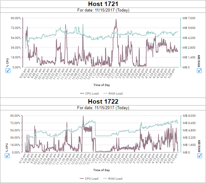
Monitoring Scheduler Load
This topic assumes that you have enabled monitoring to pull performance data for the schedulers. If you need to set that up, see Monitoring: Setup.
With multiple schedulers, there are a few different ways to represent the data:
- Show every host on a single chart and have separate charts for RAM and CPU usage.
- v2017.2+ Show both RAM and CPU usage together on a multi-axis chart, with separate charts for each host.
- Have separate charts for RAM and CPU usage for each host. This may be advantageous if you would like to use SPC charts (v2017.2+), which do not support multiple axes.
For this example, we’ll use the second option, but regardless of the format, we’ll want to combine the charts together into a Dashboard when we’re finished.
To show RAM and CPU on the same chart, you need to configure the SystemStatistics table with a vertical transformation. See SystemStatistics Table for details.
Let’s start by adding the necessary fields to the detail section of an Advanced Report. The CPU and RAM values are available resources, so to see resources in use, we’ll subtract the CPU value from 100, and the RAM value from the total amount of the machine’s memory. We can suppress these rows if we don’t want to see the tabular data in the output.

Then we’ll add filters to limit the data to one host, and to show only one day’s worth of data. Later we can provide a way to change the timestamp filter on the Dashboard, so that others could filter to more specific or more general time periods.
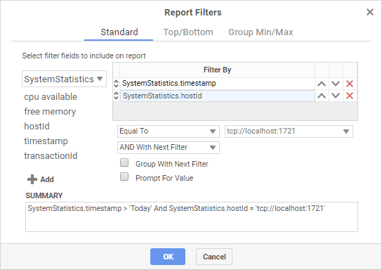
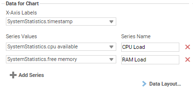
Now we can add the chart to a Report Header or Footer. Use a Column-Based Line Chart, with Timestamp as the Label, and CPU and Memory as Series Values. Remember to sort by the Data Label, ascending, so that the time values are in order.
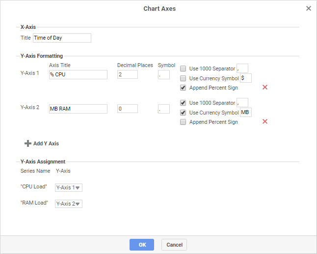
Then open the Appearance tab and click Chart Axes so that we can add separate axes for each series.
Finally dd some advanced attribute customizations to make the chart a bit easier to read. We’ll hide the point anchors and rotate the time labels on a slant.
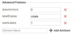
Click OK to finish the chart. Execute the report and check that it looks good. Make any final adjustments, then make a duplicate for each host, and set the hostId filter appropriately for each one.
Finally, make a new Dashboard and organize all the charts together. Add an Interactive Filter on Timestamp so that the time range can be actively changed in the Dashboard view. Then set the reports to refresh automatically, preferably in sync with the scheduler polling interval.
