Using Event Handlers
Another popular method of validating user input is through the use of event handlers. The Validation elements use this same technique but shield you from the underlying details. For better control and more validation variety, you can create your own Event Handlers, as shown in the following examples.
Event Handler Mechanics
The Event Handler element is used for this purpose and it responds to DHTML events. If you're unfamiliar with these events, information about them is available here from Microsoft.

The example above shows a typical arrangement and configuration of elements. The Placeholder text is displayed inside the Input control but disappears if text is entered (it also re-appears if the text entered is deleted).

Next, as shown above, an Event Handler element has been added beneath the first Input Text element ("inpLoginID"). Its DHTML Event property has been set to "onChange". The onChange event only runs ("fires") when the cursor moves to another control and if a change has been made to the data in inpLoginID. In that case, processing is passed to any elements beneath the Event Handler. The onChange event fires at different times for different Input elements. For Input Text and related elements, it fires if a change has been made and the cursor leaves the control. For Input Select List, it fires when the selection is changed. For the Input Radio Buttons and Input check box elements, use the onClick event, which fires when a radio button or check box is clicked.
![]() The use of Event Handlers that "intercept" the onChange event will prevent the Change Flag Element scheme, described with Input Hidden (see User Input Elements) and available to all user input elements, from working so you can't use both.
Now let's see some specific Event Handler use-case examples.
The use of Event Handlers that "intercept" the onChange event will prevent the Change Flag Element scheme, described with Input Hidden (see User Input Elements) and available to all user input elements, from working so you can't use both.
Now let's see some specific Event Handler use-case examples.
Using Event Handlers and Dependent Controls
Developers often encounter requirements to have the contents of one Input Select List change dynamically based on user selections in another Input Select List. The second control is said to be "dependent" on the first one. Event Handlers provide an easy method of enabling this dependency.
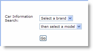
The following example depicts a web page that allows users to get information about automobiles. This is a classic example of Input Select List dependency: once users select from a list of car brands, then a second list, of car models, is populated with choices based on
the brand selection.

Here's how it works: when a car brand is selected, the page is submitted and the next page is called. The selected brand is passed to the next page as a request variable. The "next" page, however, will be the same report definition (the page calls itself or "refreshes") but now the selected brand will be available to it in a @Request token. This token is then used to populate the list of car models that match the selected brand.
Here's the example data, a simple XML file, that we'll use:
CarInfo>
<Car Brand="Alfa Romeo" Model="174 Hatchback" Code="1"/>
<Car Brand="Aston Martin" Model="Spider Open" Code="2"/>
<Car Brand="Audi" Model="Spider Open" Code="3"/>
<Car Brand="Bentley" Model="Spider Open" Code="4"/>
<Car Brand="BMW" Model="3 Series Convertible" Code="5"/>
<Car Brand="BMW" Model="3 Series Coupe" Code="6"/>
<Car Brand="BMW" Model="5 Series Saloon" Code="7"/>
<Car Brand="BMW" Model="5 Series Touring" Code="8"/>
<Car Brand="BMW" Model="7 Series Touring" Code="9"/>
<Car Brand="BMW" Model="M3 Coupe" Code="10"/>
<Car Brand="Cadillac" Model="Spider Open" Code="11"/>
</CarInfo>
For the purposes of this example, BMW is the only manufacturer that's been given multiple models.

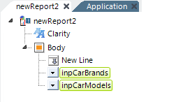
The example report definition, shown above, contains two Input Select List elements.

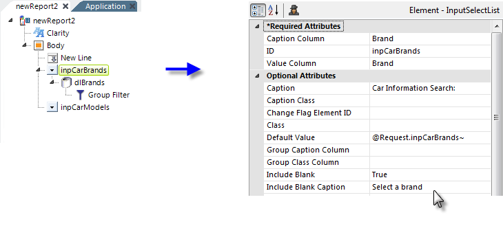
The attribute values for the car brands Input Select List are shown above. Note these two key attributes:
- Value Column - This attribute has been set to the same value as the Caption Column attribute, ensuring that the selected brand name is passed as a request variable.
- Default Value - This attribute is set to the request variable with the same ID as the Input Select List element, ensuring that the selected brand name will remain selected when the page refreshes.
In addition, datalayer and Group Filter elements have been added below the Input Select List. The Group Filter's Group Column attribute is set to the "Brand" column, ensuring that there are no duplicate entries in the list of brands.

As shown above, an Event Handler element has also been added beneath the car brands Input Select List. Its DHTML Event attribute has been set to "onChange". In the case of an Input Select List, this event will fire as soon as a selection has been made. Action.Report and Target.Report child elements have also been added and the target definition file has been set to the name of the current report definition, "newReport2".
![]() Do not use the CurrentReport
option available in the list of choices
for this attribute - Request variables are not passed when this is used.
Do not use the CurrentReport
option available in the list of choices
for this attribute - Request variables are not passed when this is used.

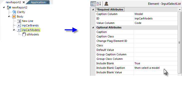
The attribute values for the car models Input Select List are shown above; its attributes are pretty straightforward.

As shown above, datalayer and Compare Filter elements have been added below the Input Select List. The filter is the key to setting the second Input Select List to the models of the chosen brand: its attributes are set to filter the Model data based on the @Request token containing the Brand selection.

Finally, the interaction between the two select lists is shown above. The entire page will not repaint itself when a brand selection is made, so there'll be no annoying page flicker, due to the use of AJAX technology in Logi products. In summary, this example has shown how an event handler can be tied to a change in a user input control and how it can trigger other actions based on that change.