Comparing, Sorting, and Summarizing Columns
It's not uncommon to need to include the difference, either as a value or as a percentage, between two or more Value Columns in a Crosstab Table. There are two approaches to creating this information.
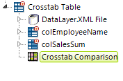
The Crosstab Comparison Element
The Crosstab Comparison element makes it easy to visually understand the differences between values in crosstab columns:
Each column is compared with the previous column and an indicator arrow or colored background is shown if the value increased or decreased. The amount of increase or decrease can be displayed as a numeric and/or percentage difference.
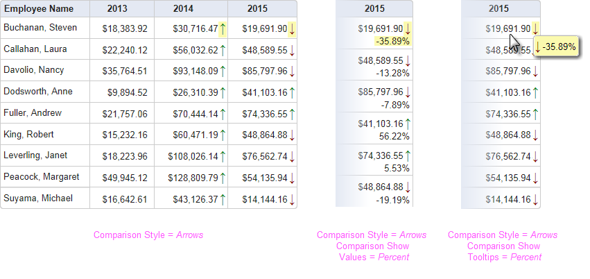
As shown above, comparisons between columns can be indicated by colored arrows and percentages or literal values, within each column cell or in tooltips that appear when the mouse is hovered on a value. Instead of the colored arrows, you can display a colored cell background, covering a spectrum, to indicate the differences.
The unique attributes of the Crosstab Comparison element are:
| Attribute | Description |
|---|---|
Comparison Show Tooltips | Enables display of the numerical difference in a tooltip when the mouse is hovered over a crosstab value. Display options include Percent, Value, All, or the default, None. |
Comparison Show Values | Enables display of the numerical difference in the crosstab cells. Display options include Percent, Value, All, or the default, None. The Format attribute can be used to format the displayed numbers. |
Comparison Style | Specifies how differences will be indicated visually. Options include None, ColorSpectrum, and the default, Arrows. |
Format | Specifies a format for values or percentages displayed. For more information, see Format Data. |
High Color Value | When ColorSpectrum has been selected as the Comparison Style, specifies the color to be used for the highest value in the numeric range. Default: Green |
Low Color Value | When ColorSpectrum has been selected as the Comparison Style, specifies the color to be used for the lowest value in the numeric range. Default: Red |
Medium Color Value | When ColorSpectrum has been selected as the Comparison Style, specifies the color to be used for the value in the middle of the numeric range. |
If the Crosstab Table element's Draggable Columns attribute has been set to True, and the Crosstab Comparison element is in use, when columns are dragged to change their order, their comparison values will be automatically updated.
![]() Because the calculations made by this element do not affect the table's datalayer, it's not possible to summarize or sort the results.
Because the calculations made by this element do not affect the table's datalayer, it's not possible to summarize or sort the results.
Calculating Comparisons Using Tokens
The second approach to Value Column comparisons allows other calculations, such as comparisons to current dates or to external values, and is accomplished entirely within the Label element used to present the results.
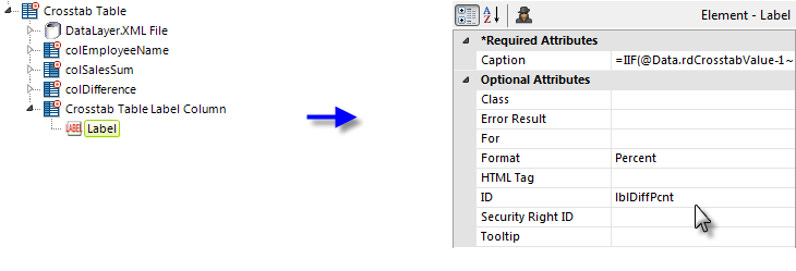
In the example above, a Crosstab Table Label Column element ("colDifference") has been added with a Label element beneath it. The Label element's Caption attribute includes a formula that relies on the fact that Crosstab Table value columns can be individually addressed using the tokens @Data.rdCrosstabValue-0~, @Data.rdCrosstabValue-1~, ...@Data.rdCrosstabValue-n~.
To display the difference between two values, for example, the Label caption would use this formula:
=@Data.rdCrosstabValue-1~ - @Data.rdCrosstabValue-0~
And, we can add the same element again to display the percentage difference between two values. The child Label element beneath it would use this formula in its Caption attribute:
=IIF(@Data.rdCrosstabValue-1~ - @Data.rdCrosstabValue-0~ < 1, (@Data.rdCrosstabValue-1~ - @Data.rdCrosstabValue-0~)/@Data.rdCrosstabValue-0~, (@Data.rdCrosstabValue-1~/@Data.rdCrosstabValue-0~) - 1 )
Both Label elements need to have their Format attributes set properly to display the numeric value correctly.
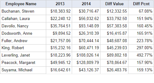
With both of these difference calculations included, the resulting Crosstab Table looks like the example shown above. Again, because the calculations do not affect the table's datalayer, it's not possible to summarize or sort the results.
Sorting and Summarizing Columns
As mentioned earlier, you can apply a Sort Filter element beneath your datalayer, before or after the Crosstab Filter, to sort the actual data. In addition, you can use sorting elements within the table columns.
The sorting and summary features for Crosstab Table Label Columns are functionally similar to those for Data Table columns: Sort and Data Column Summary child elements are added beneath them.
However, because of its special dynamic-column nature, the Crosstab Table Value Columns element has its own special sort element: the Crosstab Value Column Sort element is used to sort by value columns.

When using a standard Data Column Summary element to summarize crosstab Value columns, set its Data Column attribute to rdCrosstabColumn, as shown above.
A standard Summary Row element is added to create a row across the bottom of the Crosstab Table to display the summarized value for each column with a Data Column Summary element.
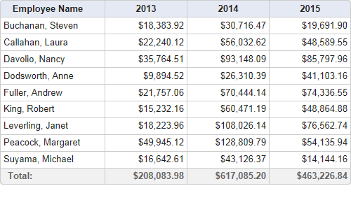
And the results look like the example shown above. By default, the Summary Row element's columns inherit the formatting and alignment of the value column above them.
For more precise control of the summary row, you may use Column Cell elements (beneath Crosstab Table Label Columns) and/or Crosstab Table Summary Column elements (beneath Crosstab Table Value Columns) to construct the row. These allow you to span rows and columns and set custom alignment and formatting.
Summarizing Groups
You can also show summary values in Label Column Group Summary Rows. This feature works like the one mentioned above, but instead of creating a row at the bottom of the Crosstab Table that displays the summarized value for each column, it allows you to total any Data Columns you have grouped together. For information on grouping Crosstabs, see Working with the Crosstab Filter.
Begin by adding a Summary Row element to your Secondary Crosstab Label Columns. In this example, we're adding a Summary Row to the "colCountry" Secondary Crosstab Label Column and giving it the ID "summaryRowCountry":
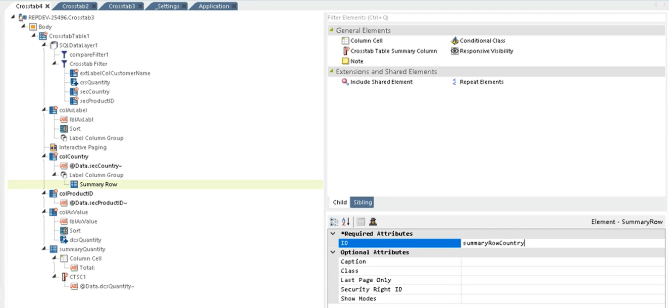
- Save and refresh your report. Info displays the Crosstab Table with a Summary Row for the Country column:

You can adjust the Summary Row span by adding a Column Cell element. In this example, we're adjusting the Column Span attribute to 2.
Then, add a Label element to the Column Cell element and add a Caption based on the Data Column you wish to tally, like below:
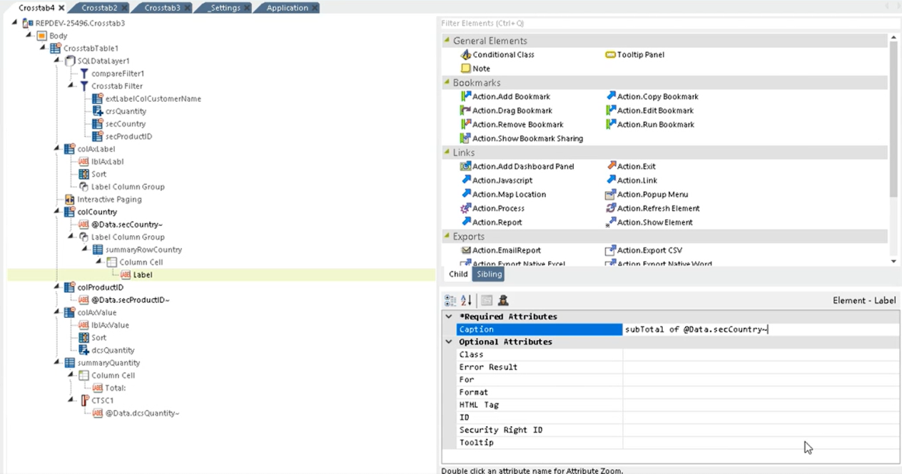
Next, add a Crosstab Table Summary Column to your Summary Row element and give it an ID.
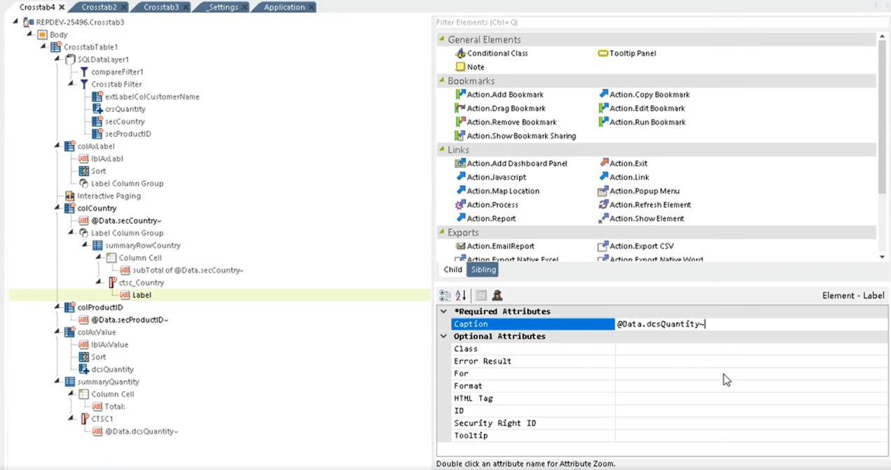
Below the Crosstab Table Summary Column, add a Label element and assign a Caption, based on the Data Column you are summarizing:
Save and refresh your report. Info displays the Crosstab Table with the summarized column(s):
