The Analysis Chart
The Analysis Chart is a dynamic chart set that provides interactive data analysis capabilities.
The following topics introduce developers to the Analysis Chart super-element:
- Analysis Chart Attributes
- Adding Analysis Chart Columns
- Adding Additional Series
- Adding Forecasting
- Saving Individual User Settings
- Adding Charts to Dashboards
- Customizing Analysis Chart Appearance
About the Analysis Chart
The Analysis Chart allow users to display charts at runtime, based on a discrete data set and limited to chart types the developer chooses to include.
![]() Chart Canvas charts are used by default by the Analysis Chart, in all new applications. Older Logi applications that are upgraded to v12 will use the classic static charts for their Analysis Charts. To force upgraded apps to use Chart Canvas charts, add the constant rdFavorChartCanvas
= True
to your _Settings definition.
Chart Canvas charts are used by default by the Analysis Chart, in all new applications. Older Logi applications that are upgraded to v12 will use the classic static charts for their Analysis Charts. To force upgraded apps to use Chart Canvas charts, add the constant rdFavorChartCanvas
= True
to your _Settings definition.
Like Data Tables, the Analysis Chart uses child column elements to include data for display.
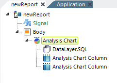
The example above shows a typical set of Analysis Chart elements:
- An Analysis Chart element
- A DataLayer element to retrieve the data
- One or more Analysis Chart Column elements to make data available for analysis
Analysis Chart Column elements do not require any child elements, such as a Label element, in order to make data visible. The element's Data Type attribute determines how each column can be used. "Text"-type columns can be used as Label Columns for Pie and Bar charts. If your chart uses text-type columns, the Relevance option replaces Forecast. Relevance allows you to tune the data shown by Automatic, Rank, and Percentage. "Number"-type columns may be used in the X- and Y-axis of Line and Scatter charts. "Date" columns may be used in the X-axis. In addition, the Format attribute can be used to format the values
that appear in tooltips displayed when the cursor is hovered over various chart areas.  New for 14.1 The Format... option, shown next to the Label Column and Data Column, allows you to format captions and labels for your charts. If you add an Additional Column(s), this option will also be available. For additional information, see New for 14.1 Analysis Grid - Editing Chart Labels and Captions.
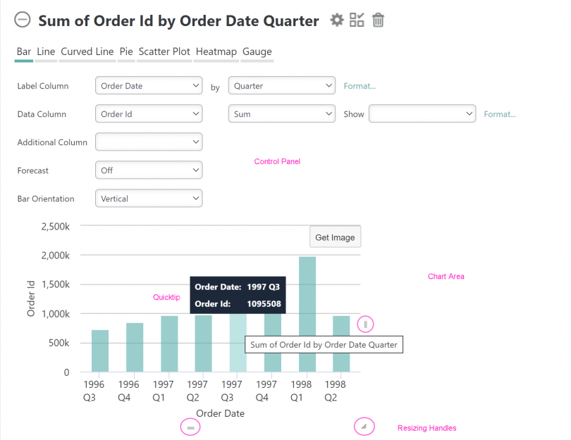
As shown above, the display produced by this element consists of a Control Panel and a Chart Area. By default, the Control Panel will appear above the Chart Area, as shown. However, the Analysis Chart can be configured to display the Control Panel to the left of the Chart Area instead.
The chart's title changes dynamically based on the selections the user makes at runtime; it cannot be set independently by the developer.
Resizing handles, which are only visible when the mouse hovers over the chart, are also provided so that the user can resize the chart at runtime.

Chart type options, shown above, allow the user to select different chart types at runtime. The types available to the user can be restricted by the developer when configuring the element and will also be limited based on the nature of the data. For example, Pie and Bar chart types are only available when there is at least one Analysis Chart Column with its Data Type attribute set to Text.
The default orientation of bar charts that are not based on a time series is Horizontal, to make it easier to read X-axis label data values. This can be changed at runtime by the user to Vertical.
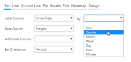
A built-in Group Filter is available for X-axis (Label) values:
For example, if a DateTime type column is selected, the filter appears in the control panel automatically, as shown above. It allows users to group data by Year, Quarter, Month, Week, Day Hour, Minute time periods.
Quicktips are automatically included:
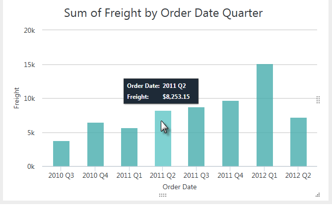
As shown above, this feature displays a pop-up "balloon", containing detail data, when the mouse is hovered over a data point. This feature is available for all chart types and no action on the developer's part is required to enable it.
If your application has been configured for it, you can now use zoom filtering on the following charts:
- Bar
- Line
- Curved Line
- Scatter Plot
For information on configuring this feature, see Analysis Grid Developers - Analysis Grid Attributes.
To utilize this feature, simply select the data you want to zoom in on, like below:
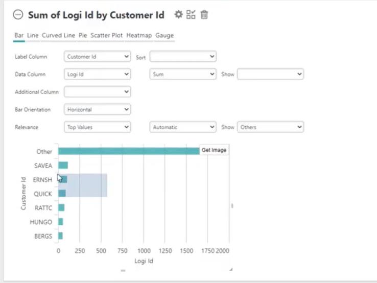
Upon releasing your cursor, Info will re-size the chart:
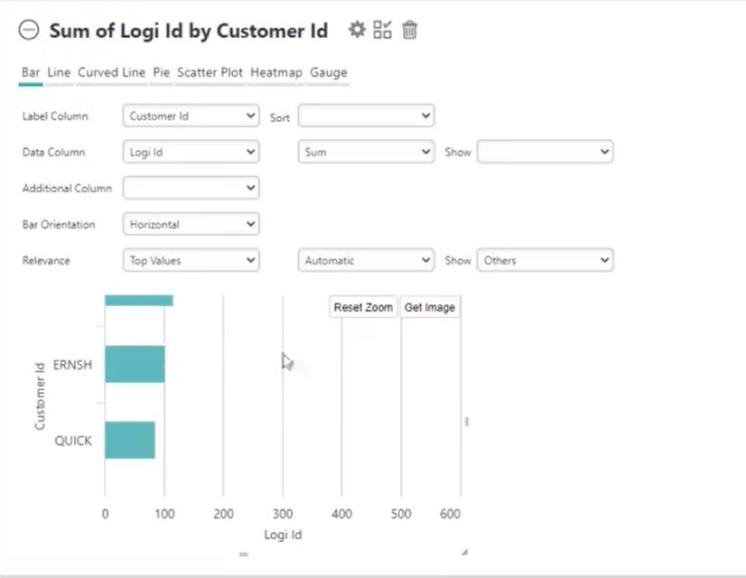
To remove the zoom and return the chart to its original state, select Reset Zoom.
Charts with zoom filtering can also be saved to the Dashboard for future analysis. For more information about Dashboards, see Dashboard for End Users.
If you're working with very large data sets, you may be able to use a special-purpose datalayer for better performance. You can find out more about it and review the restrictions in DataLayer.ActiveSQL.
This datalayer provides the basic SQL query needed to retrieve data but doesn't initially retrieve and cache all of the result set. Instead, in response to runtime manipulations of the Analysis Chart interface, it dynamically modifies its own SQL query and retrieves the minimum required amount of data with each request. This increases the number and frequency of SQL queries the database server must handle (and, generally, does not prove to be a burden on the database server) but improves performance for the user.
A Zero Rows Message element is available as a child element of the Analysis Chart. This element allows developers to display a customized message if the datasource returns no data. The message text and its font type, size, and color can be set using the element's attributes.
Studio Wizard Available
Logi Studio includes a wizard that will help you to build and configure an Analysis Chart:

As shown above, you can launch the wizard from Studio's main menu Wizards tab, or by right-clicking a container element and using its context menus. The wizard will walk you through decisions about connecting to and retrieving data, and about which data columns to use, and will then insert the configured elements into your definition.
Retaining User Settings
With all these possibilities, it may be important for users to be able to save their settings between sessions. Settings can be automatically saved on the web server and made available to users during their next session (this is discussed in more detail below).
Embedded Sub-Report Caveat
![]() We do not recommend that you use this element within an embedded sub-report.
We do not recommend that you use this element within an embedded sub-report.
