Thinkspace - Working with Crosstab Tables
If you'd like to see the data in a crosstab table, that's easy to do.
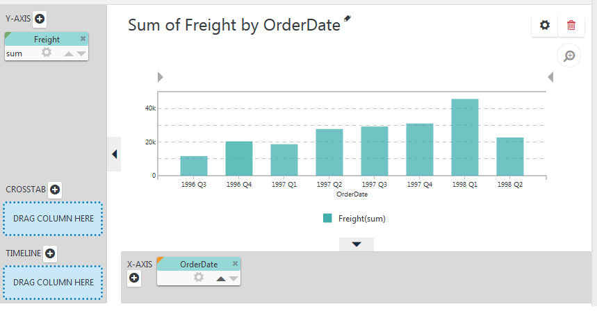
Our starting point once again will be a regular Column chart, showing Freight by OrderDate, as shown above. This time the OrderDate column's Grouping will be set to # of Quarters = 1.
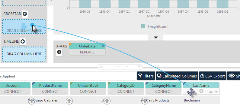
Drag and drop the LastName pill from the data table into the CROSSTAB drop zone, using the Blue Dot Connector, as shown above. The chart will be re-drawn accordingly.
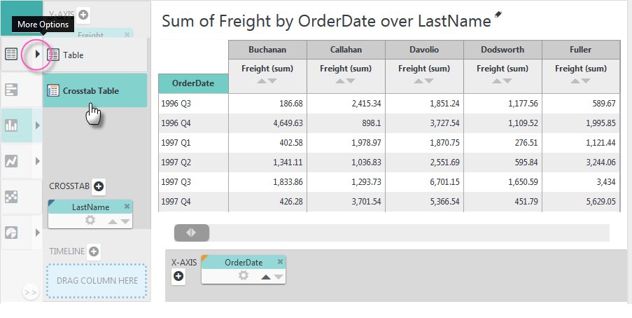
When the LastName pill was dropped, the option for the Table type in the Visualization menu acquired a "More Options" arrow icon, circled above. Click it to see the Table options and select the Crosstab Table option. The Column chart will be replaced with a Crosstab Table.
Depending on the width of your browser window, a horizontal scroll bar may appear so that you can scroll the table to additional columns to the right.
Editing the Crosstab Table
You'll notice that the drop zones were hidden when the crosstab table was rendered. How can we edit the table?
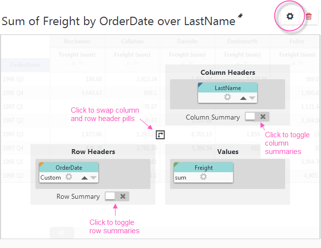
Click the Settings icon in the upper right-hand corner, circled above. A panel with column pills and controls, like those above, will slide open. The pills' Sorting and gear menu icons can be clicked to sort, format, and filter the data, as usual. Let's format the Freight column values.
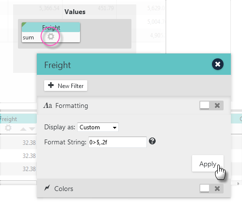
Click the Freight pill's gear icon and select the Formatting option. Select the Custom format display and set the format string to 0>$,.2f as shown above. This will format the values as currency and right-justify them.
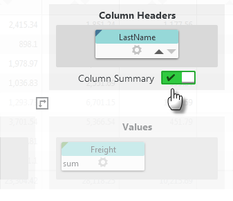
Let's also add a Column Summary, by clicking the button shown above, that will give us the totals in a row across the bottom of the table. Click Apply to save the changes and hide the panel.
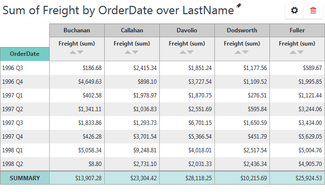
The resulting crosstab table looks like the example shown above.
Adding Multiple Column Headers
It's easy to produce a multi-level crosstab table, by adding more column header values:
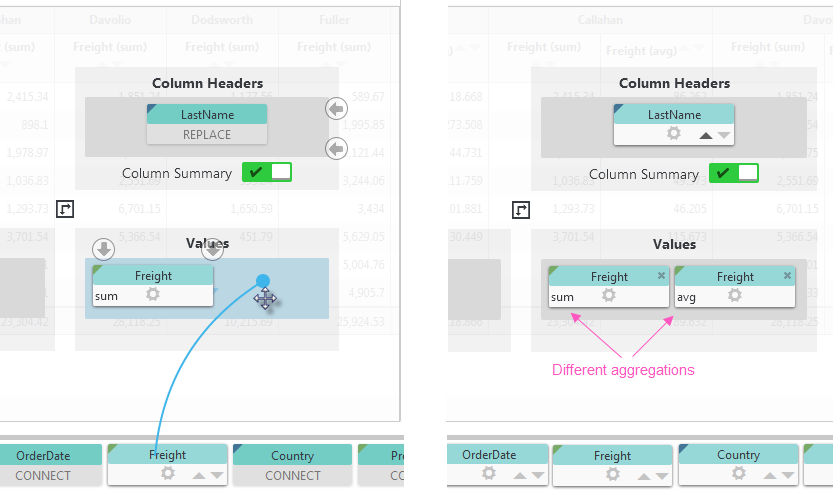
Open the crosstab editing panel again and drag-and-drop the Freight column pill from the data table into the Values drop zone, as shown above, left. Once in the drop zone, this second pill has automatically been given a differentaggregating function than the first pill. You can, of course, select the aggregating function of your choice by clicking the function name. Click Apply to save the changes and hide the panel.
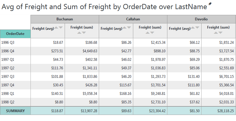
The resulting crosstab table now includes separate columns for the two different aggregations of Freight values, as shown above.
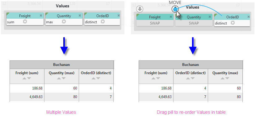
Of course, you can also drop different column pills into the Values drop zone, as shown above, and re-order them by using the Blue Dot Connector.
Adding Multiple Row Headers
We can also produce a multi-level crosstab table by adding more row header values with different groupings:
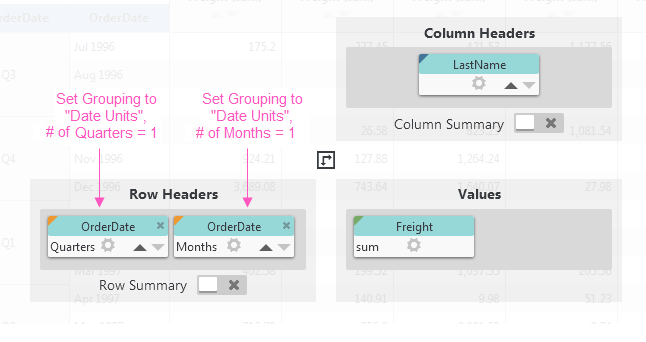
For example, open the editing panel again and drag-and-drop an OrderDate column pill from the data table into the Row Headers drop zone, as shown above. You may need to set the Grouping of the existing OrderDate pill to Date Units, # of Quarters = 1 before you can drop the second pill there.
When you drop the second pill there, it will be automatically grouped differently from the first one. Click its gear icon to check its Grouping configuration and, if it's not already so, set it to Date Units, # of Months = 1. Click Apply to save the changes and hide the panel.
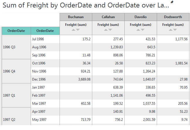
The resulting crosstab table now includes separate rows for each month, within each quarter, as shown above.
Switch to Crosstab Chart
You can also switch between a crosstab table and a crosstab chart pretty easily:
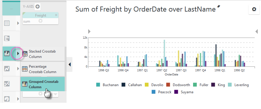
Just open the Visualizations menu and select the crosstab chart of your choice. In the example above, a Grouped Crosstab Column chart has been selected.
Other useful Discovery Module v3.x topics include: Thinkspace Columns, and Thinkspace Charts.