Thinkspace - Adding Another Series
It's often useful to compare several data series on the same chart. In this example, assume we already have a Column chart that shows UnitPrice by CategoryName, and we want to add UnitsInStock to it.
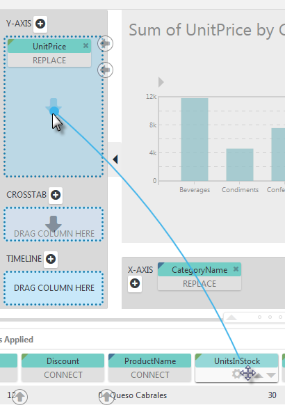
Start by dragging the UnitsInStock column pill onto the Y-Axis drop zone, as shown above.
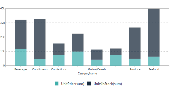
The chart will immediately update, adding the new series by stacking its values, as shown above, on the original series. Repeat the process to add more series.
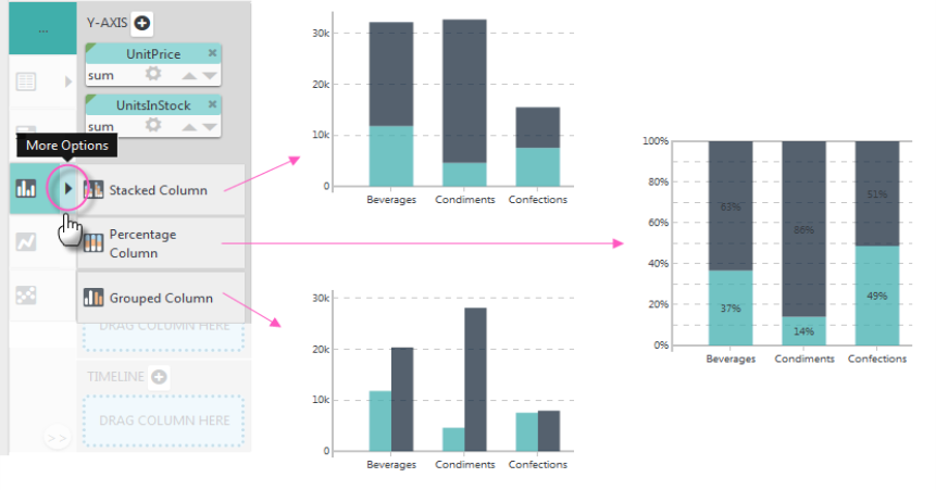
The additional series can be shown as stacked (values), stacked (percentages), or grouped side-by-side. When the second series was added, the option for the selected chart type in the Visualization menu acquired a "More Options" arrow icon, circled above. Click it to see the charting options and select the desired arrangement.
 Don't be surprised if the chart type changes when you do this - the Thinkspace will recommend the best chart based on the new data - or if the chart scale changes.