Your First Chart in Three Easy Steps
Let's make your first visualization, a bar chart, so you can see how easy it is to do. In this, and the following examples, we'll use data from the Northwind database but you can use any data with similar data types to follow along.
In this example, we'll create a chart that shows the sum of freight charges by county. Run your application and access the Thinkspace.
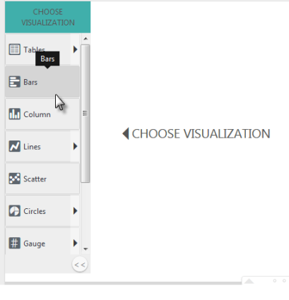
Step 1. After the Thinkspace loads, select the Bars chart from the visualizations menu on the left of the page, as shown above.
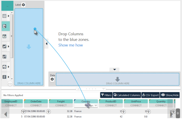
Step 2. Two blue "drop zones" will appear, as shown above. In the data table, click the Country column "pill", drag it to the Label drop zone, and drop it there. We call the line that appears when you drag a pill the "Blue Dot Connector".
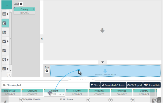
Step 3. Repeat the process by dragging the Freight column pill into the Data drop zone, as shown above.
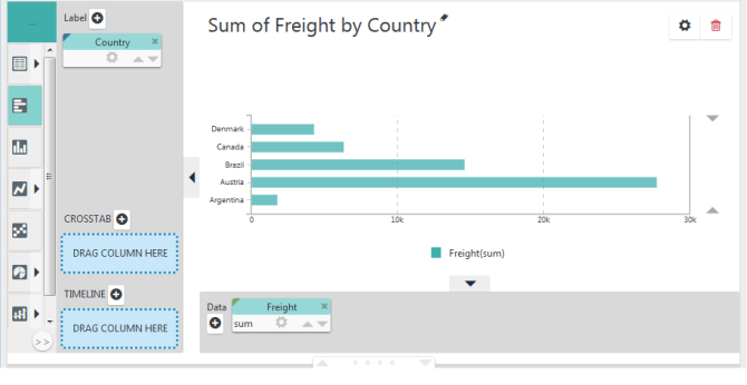
A chart will be instantly generated, as shown above. You've just learned the Thinkspace's most important technique: dragging and dropping pills. That was easy, wasn't it?
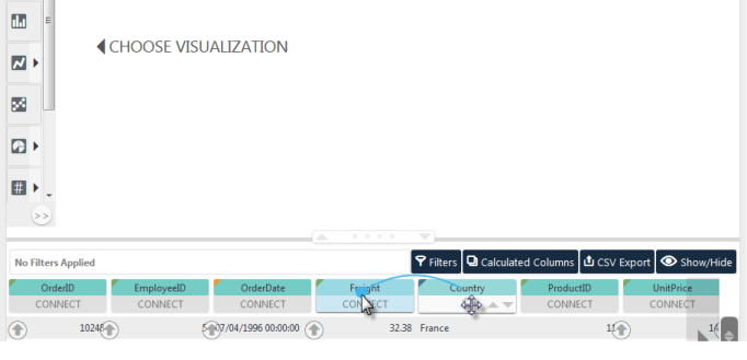
However, it can be even easier. We can combine all three steps into one! Let's start over: click the red trash canicon in the upper-right corner to remove the chart. Now, just drag the data table's Country column pill and drop it onto the Freight column pill, as shown above. The same chart will be rendered.
Here's what happened: The Thinkspace automatically "recommended" the Bars chart as the best fit for the data. The column pill that you dragged the Blue Dot Connector from (Country) was identified as the Y-axis or Label values, and the pill you dropped it on (Freight) was identified as the X-axis or Data values. The chart was then rendered. Notice that the pills for each column also appear next to the chart in the appropriate axis zones.