Additional Thinkspace Features
Let's examine some other Thinkspace features:

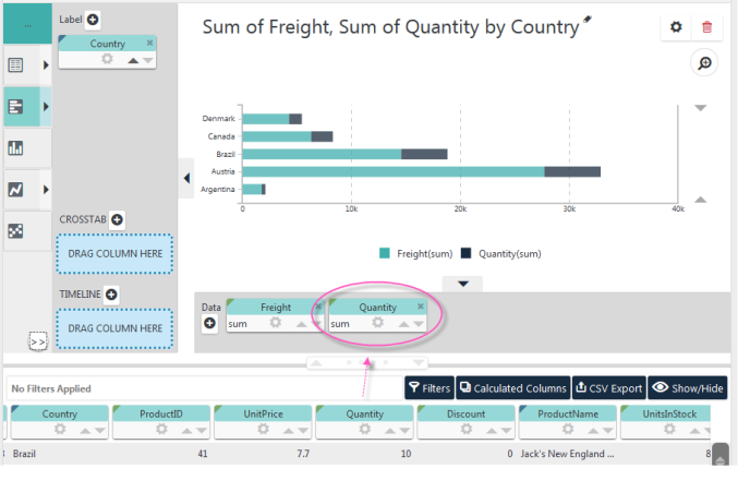
You can also drag-and-drop additional pills into an axis zone to add additional series to the chart. In the example shown above, the Quantity column pill has been dragged into our earlier chart, in the X-axis drop zone, producing a chart with two "stacked" series.

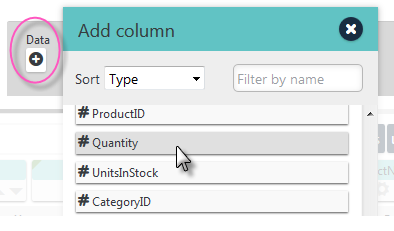
If you have difficulty dragging-and-dropping pills using the Blue Dot Connector, for instance on a mobile device, you can also add columns by clicking the "+" icon, circled above, and selecting them from the Add Column dialog box.

Notice the word "sum", circled above, has appeared in the X-axis pills. This indicates the aggregation the Thinkspace employed after analyzing the data and making an "educated guess" about the best choice to use. We'll discuss this technology in more detail in our topic about working with columns.

If you want to remove a pill that you dragged to a drop zone, just click its "X" icon, shown circled above.

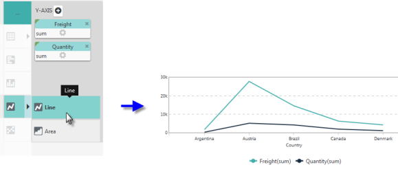
You can use the Visualizations menu, at the left side of the Thinkspace to change the chart type, as shown above. The menu presents the charts the Thinkspace recommends as the best way to visualize the data you've selected. When you select a different chart type, you may see that the X- and Y-axis pills have been swapped, as needed.

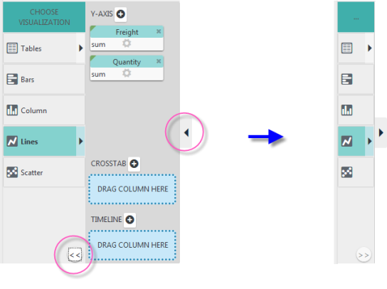
You can control the size of the chart rendering area by using the icons circled above (and one for vertical space, not shown) to expand or collapse the menu and drop zones.
You've just mastered the basics of using the Thinkspace. Well done!
Next, to expand your skills with the Thinkspace, please read our other Discovery Module v3.x topics: