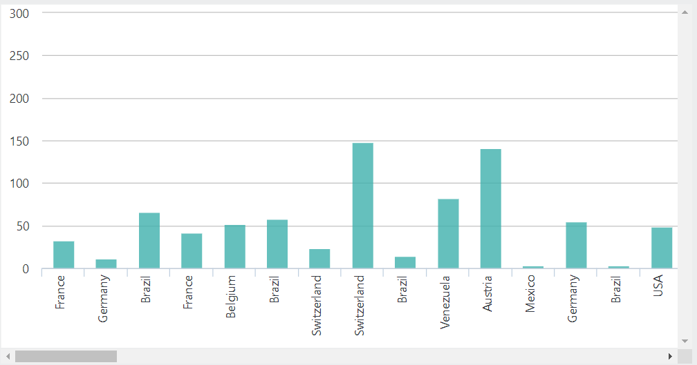
Question
How do I introduce a scrollbar on a larger-than-usual chart for better user experience?
In some cases, you might have more data to display than can fit neatly on your dashboard. If you don't want to summarize data in a different way, you might want to make the chart scrollable.
Answer
Note: There are several ways to introduce paging or summary to a visualization to limit the amount of data returned. The following is a css-only approach that allows for scrolling when you don't want to re-summarize data.
First, start with a basic Chart canvas placed inside a div. Apply CSS class "myClass" to the parent div.
<?xml version="1.0" encoding="utf-8"?>
<Report ID="BarChartScrollable2" SavedBy="" SavedAt="6/5/2020 4:52:22 PM" EngineVersion="12.7.285-SP4">
  <StyleSheet StyleSheet="newStyleSheet3.css" />
  <Body>
    <Division Class="myClass" ID="div" HtmlDiv="True">
      <ChartCanvas ChartWidth="5000">
        <Series Type="Bar" ChartYDataColumn="Freight" ChartXDataColumn="ShipCountry">
          <DataLayer Type="XMLFile" XMLFile="NW_Orders.xml" MaxRows="100" />
        </Series>
        <ZoomControl ZoomControlType="Area" />
      </ChartCanvas>
    </Division>
  </Body>
</Report>
Next, write a CSS class using the overflow: scroll css attribute. Make sure to include your CSS in the Logi Report.
.myClass{
height: 400px;
width: 800px;
overflow: Scroll;
}
Your chart should now have a scrollbar.
