Question:
How can a Logi Info Dashboard element provide a more responsive layout when viewed on small screen devices.
Foreword:
Responsive Web design approach suggests that design and development should respond to the user’s behavior and environment based on screen size, platform, and orientation.
Answer:
Although the Logi Info Dashboard element does not provide native support for Responsive design, it is possible to achieve a more responsive layout by adding a targeted CSS within a CSS Media query for when the browser viewport is less than a specified pixel width.
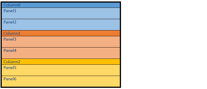
By default, the Logi Dashboard element displays the content using a columnar layout.

The following layout can then be achieved when the browser viewport is reduced and the CSS Media query is triggered.

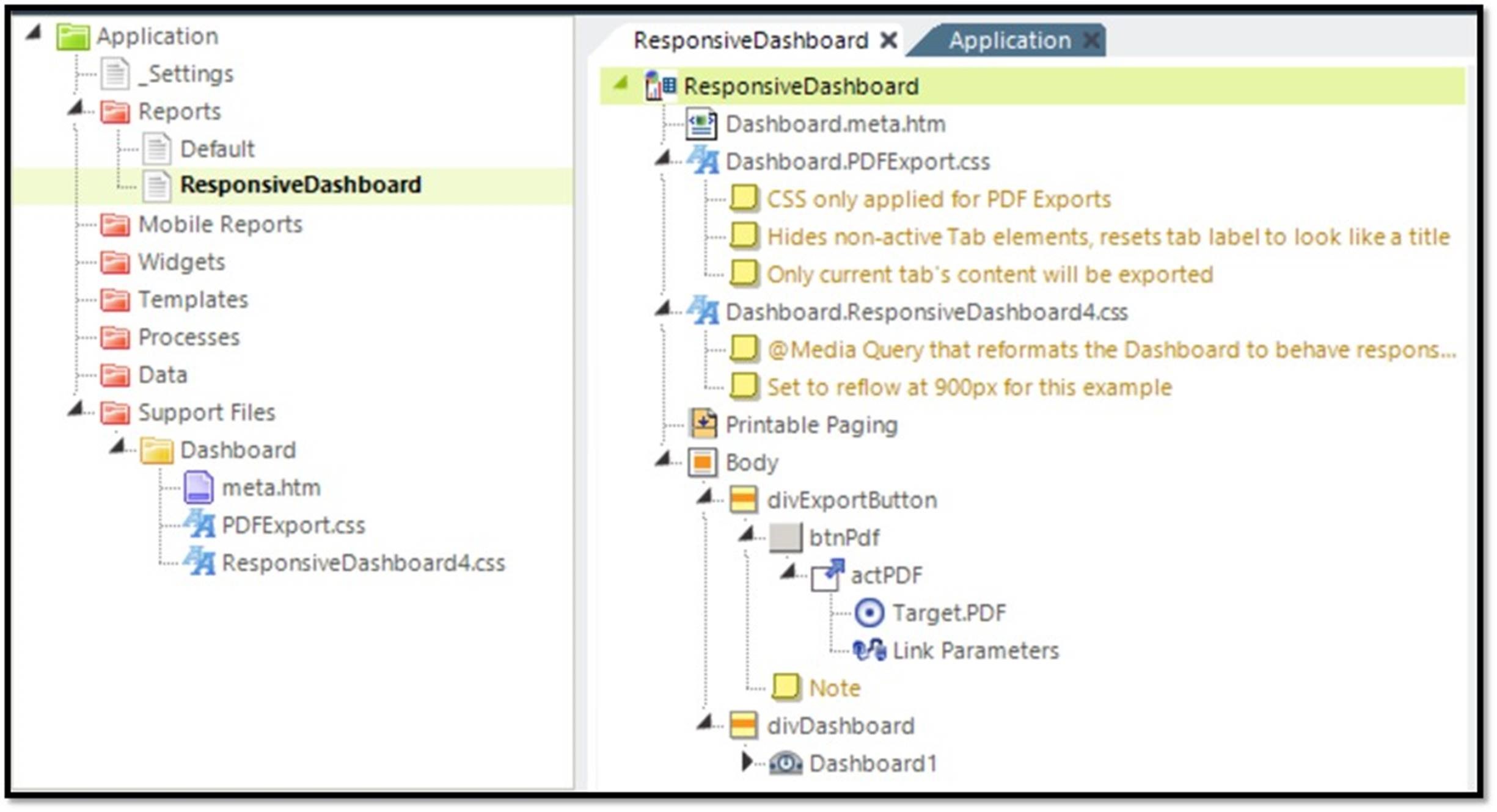
The Dashboard.meta.htm sets the viewport scale, which helps mobile devices render the dashboard properly.
<meta name="viewport" content="width=device-width, initial-scale=1"/>
The DashboardPDFExport.css file is optional. Make sure Dashboard.PDFExport.css has a ShowMode of rdExportPdf or rdExport, something that will only get applied for PDFs. This file removes some of the stylings like drop shadows that PDFs do not typically render well. It also adds a page-break-avoid property to each dashboard panel so that a PDF avoids page breaks within a dashboard panel.
.panelInnerTable {
 page-break-inside: avoid !important;
}
Dashboard.ResponsiveDashboard4.css provides the CSS Media Query and is set by default to 900 pixels. When the browser viewport is less than 900 pixels, the dashboard panels will stack into one column and change width to 100% viewport width.
@media (max-width: 900px){
 #rdDashboardPanelTable > tbody,
 #rdDashboardPanelTable > tbody > tr,
 #rdDashboardPanelTable > tbody > tr > td {
  display: block;
  border-collapse: collapse !important;
  border: 1px;
 }
 #rdDashboardPanelTable > tbody > tr > td,
 .rdDashboardColumn > table > tbody > tr > td {
  border: none !important;
  position: relative;
  width: 100% !important;
  min-width: 100% !important;
 }
}

/* Fixes scroll bar on dashboards at 100% screen width */
.rdDashboardControl {
 width: 82px;
 min-width: 82px;
}

#rdDashboardPanelTable {
 overflow: hidden;
 padding: 2px 10px 2px 2px;
}
Included is a sample that shows the functionality and includes the necessary files to make a dashboard responsive.
