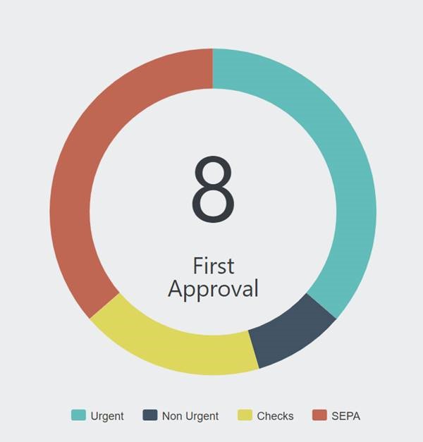
What is a Donut Chart-based KPI with centered value and text?
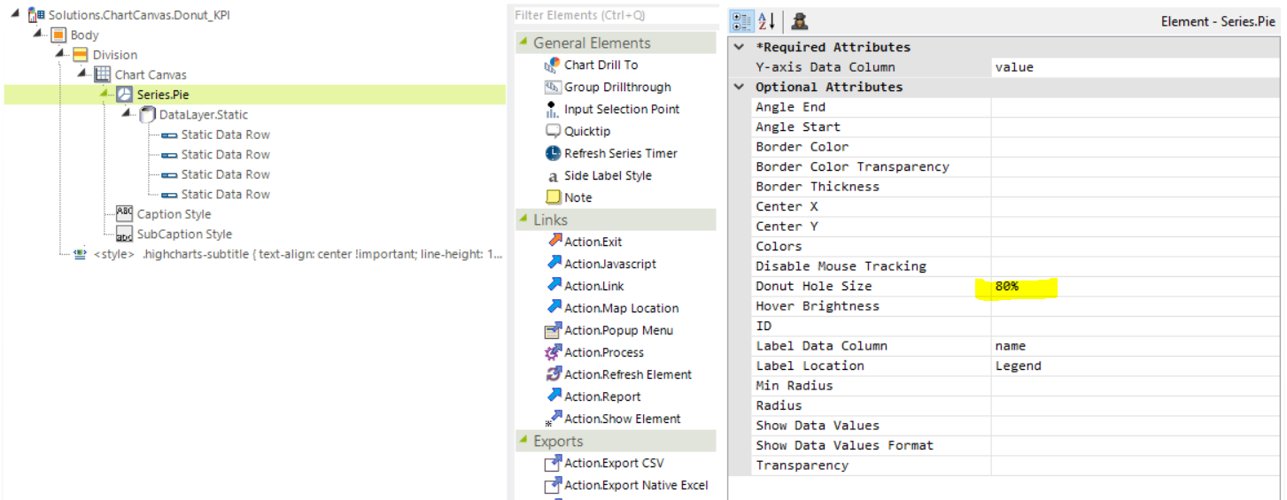
A donut chart is a Logi Info Canvas Chart element with a Series.Pie with a value provided for the Donut Hole Size. Within the donut chart there are options to display a value and title. This article demonstrates one way to achieve this.

How to achieve this type of chart?
- Add a Canvas Chart to your report
- Add a Series.Pie child element to the Canvas Chart element.
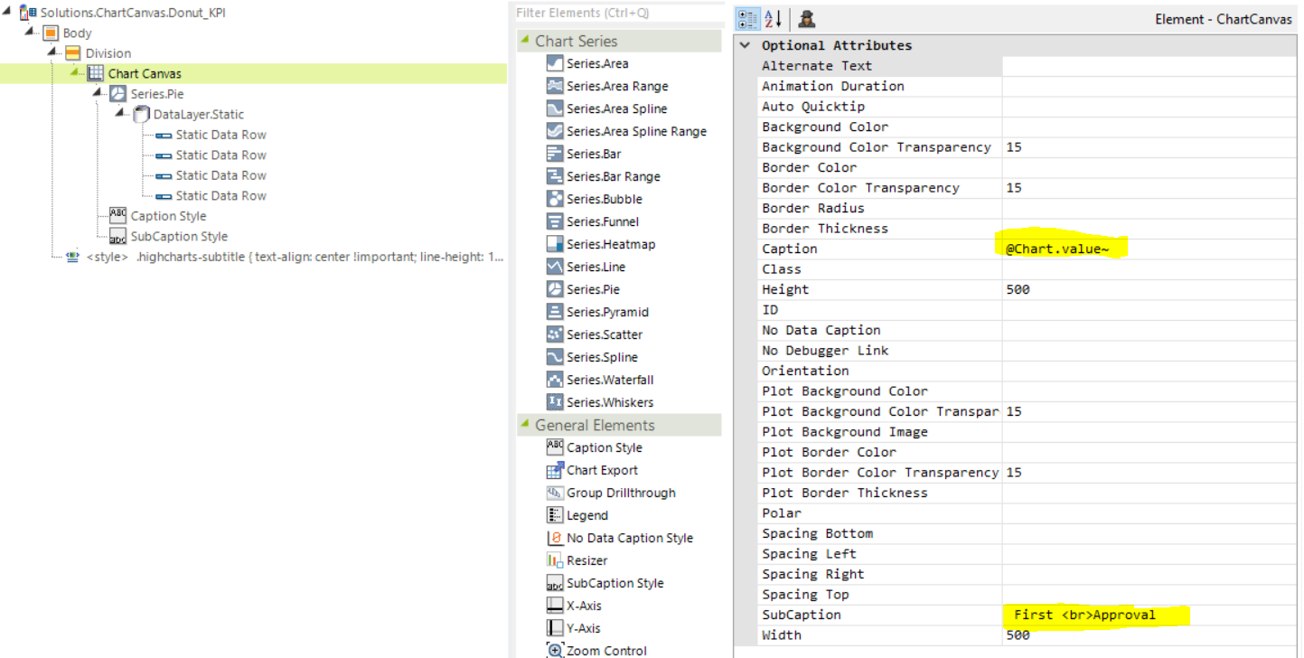
- Provide your datalayer. If you want to provide the centered value or title from the datalayer, similar to a Local Datalayer, only the first row of data is available for the caption and sub-caption as an @Chart token.

- Add a value for the Donut Hole Value.

- In order to center the KPI value and title within the donut chart, add a Caption Style Element and a SubCaption Style Element to the Chart Canvas. Only the Caption Style Element provides a Vertical and Horizontal Alignment
The values provided here depend on the size and components of your chart canvas and may vary. We chose to utilize the Caption as the KPI Value
and the Sub Caption as the KPI Title
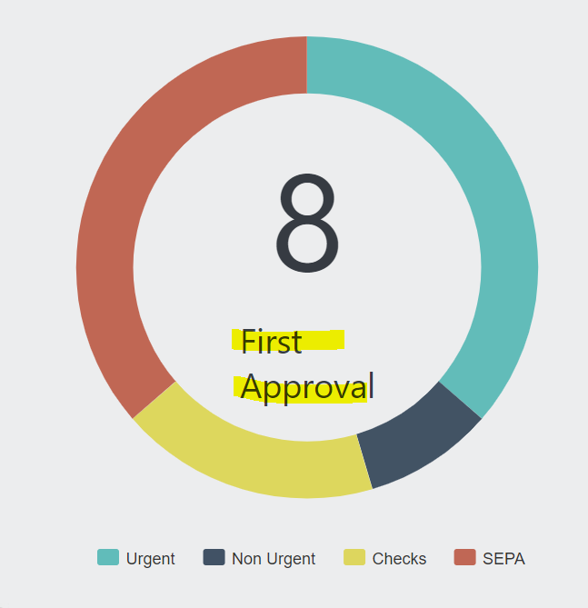
If your Title requires multiple lines of text, set the appropriate Caption Format to HTML. This will allow the injection of <BR> tags. - If we were to render this chart as-in in the browser, we would see that it has one minor flaw:

The Sub-Caption text is not centered as expected, and the line-height with this font is too tall. - The last portion of this solution is to add some targeted css to complete the centered Sub-Caption text
.highcharts-subtitle {
text-align: center !important;
line-height: 1 !important;
}
You can also target a specific Canvas Chart by prepending the ID of the Canvas Chart to the css selector
#ccDonutKPI .highcharts-subtitle {
text-align: center !important;
line-height: 1 !important;
}