Banded Panel Properties
This topic describes how you can use the Banded Panel Properties dialog box to update the properties of a banded panel. Server displays the dialog box when you right-click a banded panel and select Properties from the shortcut menu.
This topic contains the following sections:
You see these elements on all the tabs:
OK
Select OK to apply any changes you made here.
Cancel
Select Cancel to close the dialog box without saving any changes.

Select to view information about the Banded Panel Properties dialog box.

Select to close the dialog box without saving any changes.
General Tab Properties
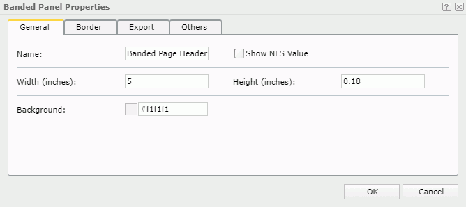
This tab shows some general information of the banded panel.

Name
Specifies the display name of the panel.
Show NLS Value
Select this option to show the translated name for the display name of the object in the Name text box if you have enabled the NLS feature and translated it.
If you select this option, it takes effect only when you have not modified the display name of the object.
Width
Specifies the width of the panel in inches.
Height
Specifies the height of the panel in inches.
Background
Specifies the background color of the panel.
To change the color, select the color indicator to select a color from the color palette. You can select More Colors in the color palette to access the Color Picker dialog box in which you can select a color within a wider range. You can also type a color string in the format #RRGGBB directly in the text box. If you want to make the background transparent, type Transparent in the text box.
Border Tab Properties
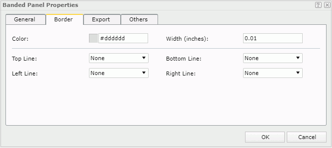
This tab shows information about borders of the banded panel.

Color
Specifies the border color.
To change the color, select the color indicator to select a color from the color palette. You can select More Colors in the color palette to access the Color Picker dialog box in which you can select a color within a wider range. You can also type a color string in the format #RRGGBB directly in the text box. If you want to make the color transparent, type Transparent in the text box.
Width
Specifies the border width in inches.
Top Line
Specifies the style of the top border line.
Bottom Line
Specifies the style of the bottom border line.
Left Line
Specifies the style of the left border line.
Right Line
Specifies the style of the right border line.
Export Tab Properties
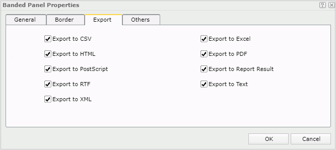
You can use this tab to configure the export settings.

Export to CSV
Specifies whether to include the panel when you save the report result as a TXT file with Delimited Format selected.
Export to Excel
Specifies whether to include the panel when exporting the report to Excel.
Export to HTML
Specifies whether to include the panel when exporting the report to HTML.
Export to PDF
Specifies whether to include the panel when exporting the report to PDF.
Export to PostScript
Specifies whether to include the panel when exporting the report to PostScript.
Export to Report Result
Specifies whether to include the panel in Web Report Studio or when the report is opened in Web Report Result.
Export to RTF
Specifies whether to include the panel when exporting the report to RTF.
Export to Text
Specifies whether to include the panel when exporting the report to Text with Delimited Format unselected.
Export to XML
Specifies whether to include the panel when exporting the report to XML.
Others Tab Properties
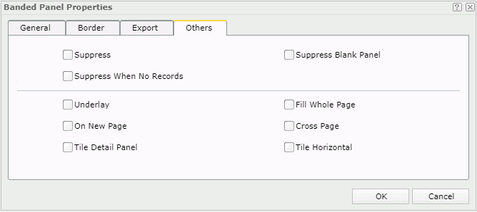
You can use this tab to configure other settings.

Suppress
Specifies whether to show the panel in the report. All formulas and calculations will be skipped if the property is set to true. Available to the following panels in a banded object: banded header panel, banded footer panel, banded page header panel, banded page footer panel, group header panel, group footer panel and detail panel.
Suppress Blank Panel
Specifies whether a panel with no data is included in the report. The default is false which means an empty panel is shown. Available to the following panels in a banded object: banded header panel, banded footer panel, banded page header panel, banded page footer panel, group header panel, group footer panel and detail panel.
Suppress When No Records
Specifies whether to display the panel in the report result when no record is returned to its parent data component. Available to the following panels in a banded object: banded header panel, banded footer panel, banded page header panel, banded page footer panel, group header panel, group footer panel and detail panel.
Underlay
Specifies whether the panel will be layered beneath the next panel in the banded object. A panel layered beneath a subsequent panel can be used to contain a background picture or watermark. Banded page header, page footer, or group footer panels cannot be layered. The default is false which means that the panel is not layered beneath the next panel. Available to the following panels in a banded object: banded header panel, banded footer panel, banded page header panel, banded page footer panel, group header panel, group footer panel and detail panel.
Fill Whole Page
Specifies whether to make the panel extended to the bottom of the page, so that the next panel starts on a new page. Available to the following panels in a banded object: banded header panel, banded footer panel, group header panel, group footer panel and detail panel in a banded object.
On New Page
Specifies whether the panel starts on a new page. This property is applied only when the report has page layout enabled. The default is false which means the panel starts on a new page only if the previous page is filled. Available to the banded header panel, banded footer panel, group header panel, group footer panel and detail panel in a banded object.
Cross Page
Specifies whether the panel can be split across a page break. This property is applied only when the report has page layout enabled. Available to the following panels in a banded object: banded header panel, banded footer panel, group header panel, group footer panel and detail panel.
Specifies whether to tile records in the detail panel. Available only to the detail panel in a banded object.
For a vertical banded object, you can tile each set of records in the detail panel, by selecting this property and also setting the detail panel's width/height equal to or less than 1/2 that of the banded object. The detail panel width defines the width of each record tile.
Tile Horizontal
When you select Tile Detail Panel, you can use the Tile Horizontal property to specify the direction for tiling records in the detail panel.
Select Tile Horizontal if you want to tile records first in the row, and then in the column. Clear the Tile Horizontal checkbox if you want to tile records first in the column, and then in the row.
 Previous Topic